The post appeared first on A Life More Beautiful.
]]>I mean ours was, sort of. But it was also chaos. Sweet chaos with lots of fun and giggles, but chaos all the same.
Summer chaos
I know from talking to other parents that the summer chaos isn’t unique to our family. If you don’t have children or haven’t had young kids in awhile, consider if you will:
- Bed time schedules and routines go out the window.
- Different summer camps each week with different schedules for each child. Lunch this day, camp shirt that day, food restrictions at this camp but none at that camp. Times two kids.
- Swim lessons 4x a week = soppy wet towels and swim suits every day.
- Packing for trips, going on trips, unpacking for trips.
Every week was different. I am embarrassed to say that on the first day of a new camp the coordinator called and reminded me to pick my son up. Ouch. Mommy fail!
Compound that with a work conference, and August…. Well, August was a mess.
School to the rescue
Given the odd summer schedules, I was a *little* excited to have school start in August… Back to routine. Back to normalcy. Hallelujah! School to the rescue.
And then came Hurricane Harvey. Geez.
Summer craziness = sporadic journaling
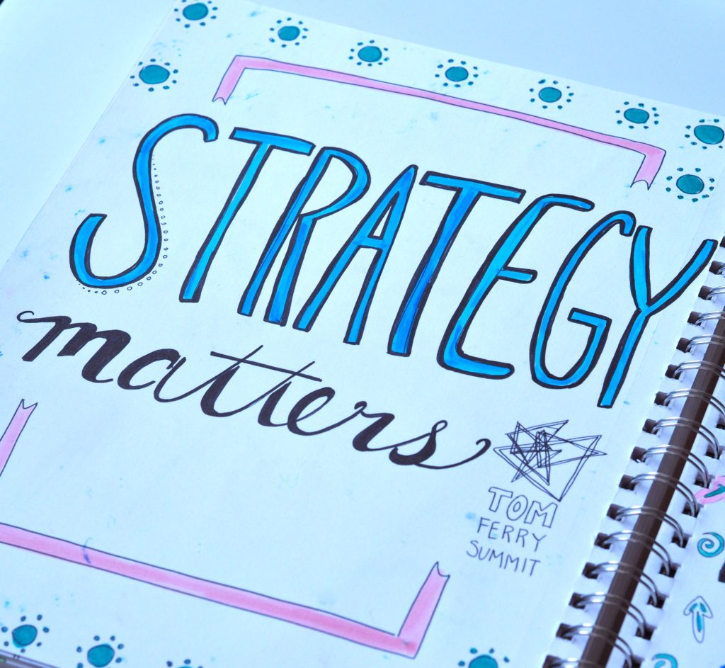
In between the chaos of the summer, I tried to keep up with my art journal. Truly I did. But truth be told, it was about as chaotic as everything else. I did, however, make some fun doodle quotes during the Tom Ferry Summit. So that’s a win…
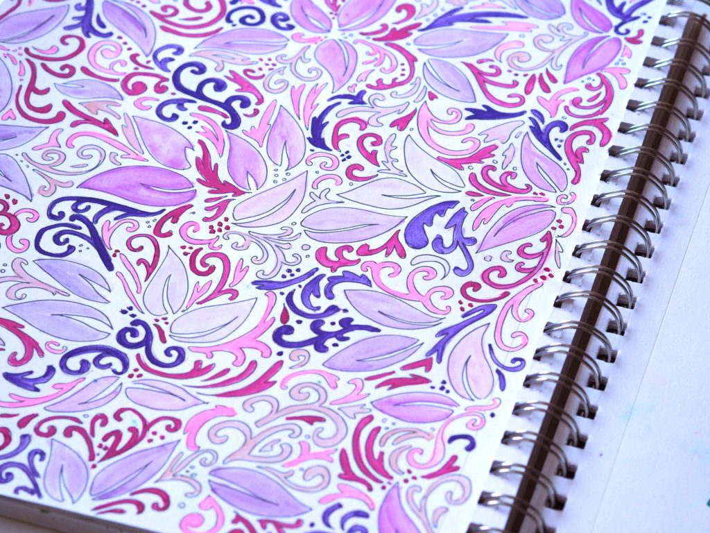
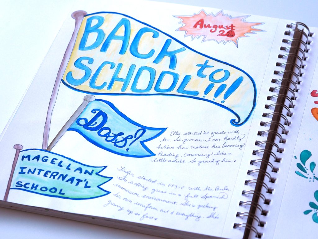
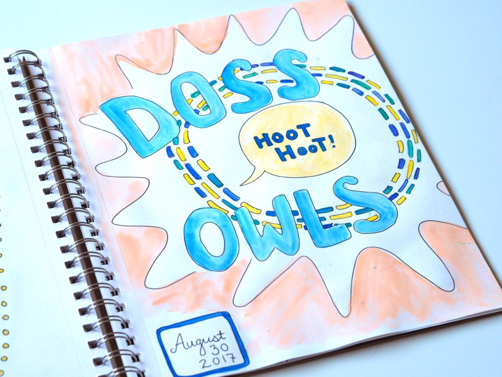
Here’s what the chaos looked like from an artistic perspective in my August 2017 art journal. Thankfully things have settled back down. For now. <wink>





You can see more art journal entries from other months on our pen and paper page.
The post appeared first on A Life More Beautiful.
]]>The post Peak inside my July 2017 art journal appeared first on A Life More Beautiful.
]]>Those of you that know me are probably shaking your head YES right about now.
Well, my July 2017 art journal reflects a recent obsession.
A recent obsession
When we went on our June trip to Cinnamon Shore, we took a crazy leap and decided to put a beach condo under contract. Since then I’ve been busy picking finishes, shopping, and designing the interior. Fun!
But I also became fixated on WHAT we were going to call the condo.
Names count
Names are important after all. It’s what we’d call it. It’s what the kids would call it. It’s what strangers will ask for when making vacation reservations. It was important to me that the name be something that reflected both the style of the house and the vacation experience.
Exploring options
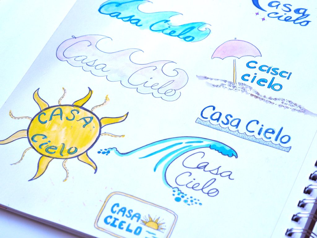
So my art journal became an outlet for me to explore different beach condo names. Page after page of name doodles ensued. You name it, I must have doodled it.
Seas-the-day. Dolphin-ately. Bay Dream Believer.
Carpe Sea’um. Bay Side. Sea-renity.
Deja Blue. Sea ‘N Stars. Shore to Please.
Not too Crabby.
You get the picture. Page after page.
Sure, I doodled other stuff too. But the names! That was my obsession.
My husband was really, really gunning for “wet dreams,” but since the condo will be in the short-term rental pool I didn’t want to attract the, um, wrong crowd. And I just couldn’t see myself saying “hey kids, let’s go hang out at wet dreams this weekend.” Definitely the wrong message…
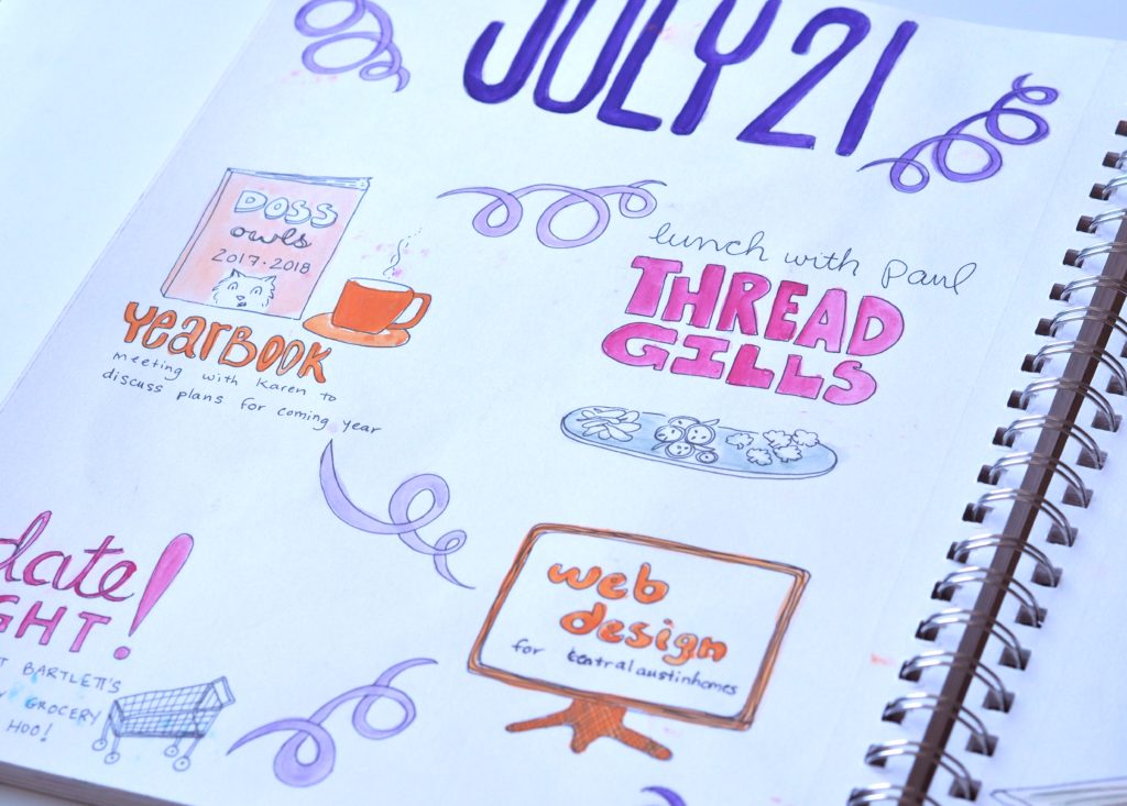
After much sketching, we narrowed it down to Casa Cielo (sky house) or Bay Dreams. We’re still waffling back and forth. Below I’ve included a peak inside my July 2017 art journal, including name doodles. Tell me. What’s your pick?






You can see more art journal entries from other months on our pen and paper page.
The post Peak inside my July 2017 art journal appeared first on A Life More Beautiful.
]]>The post Peak inside my June 2017 art journal appeared first on A Life More Beautiful.
]]>It was rejuvenating. And the results were different. Delightfully different.
For starters, I wasn’t tired.
With fresh eyes and the energy of a new day, I was able to give my art journal 100% instead of my late night dregs. How refreshing! Literally.
I also wasn’t distracted by TV.
There was nothing but me, my sketchpad, and the environment. As a result, I found myself lost in time studying the colors and shapes in my surroundings. My mind just wandered. And I let it. Bliss.
My subject matter also shifted.
Instead of drawing about my day or random doodles (or more likely scrambling to come up with something to sketch), I let myself focus on just one thing. A beach house, memories of the aquarium, a beach scene, whatever. As a result, I created sketches with a single focus which allowed for more detail and more freedom on the page. I’m curious if you notice a difference?
My morning pages (a la Julia Cameron)– as I began to think of them in my head — up being one of the highlights of each day.
I wish I would allow myself this luxury at home. But alas, the days feel like they must be dedicated to more “adult” matters. Sketching gets relegated to the bottom of the list, pushed aside by work, PTA activities, making dinner, homework, and on and on. I guess I’ll just hold out for my next vacation. <wink>
Take a peak
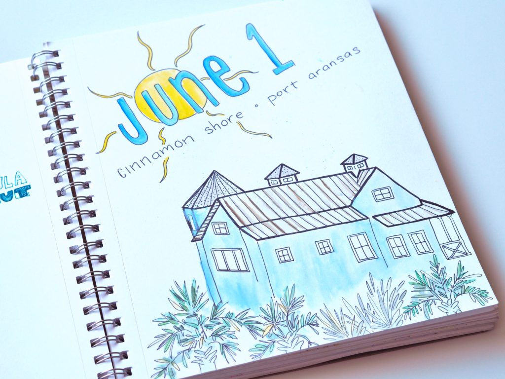
Below I’m giving you a peak inside my June 2017 art journal.





You can see more art journal entries from other months on our pen and paper page.
The post Peak inside my June 2017 art journal appeared first on A Life More Beautiful.
]]>The post What’s hot in Central Austin home interiors appeared first on A Life More Beautiful.
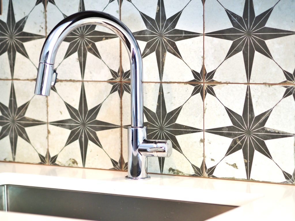
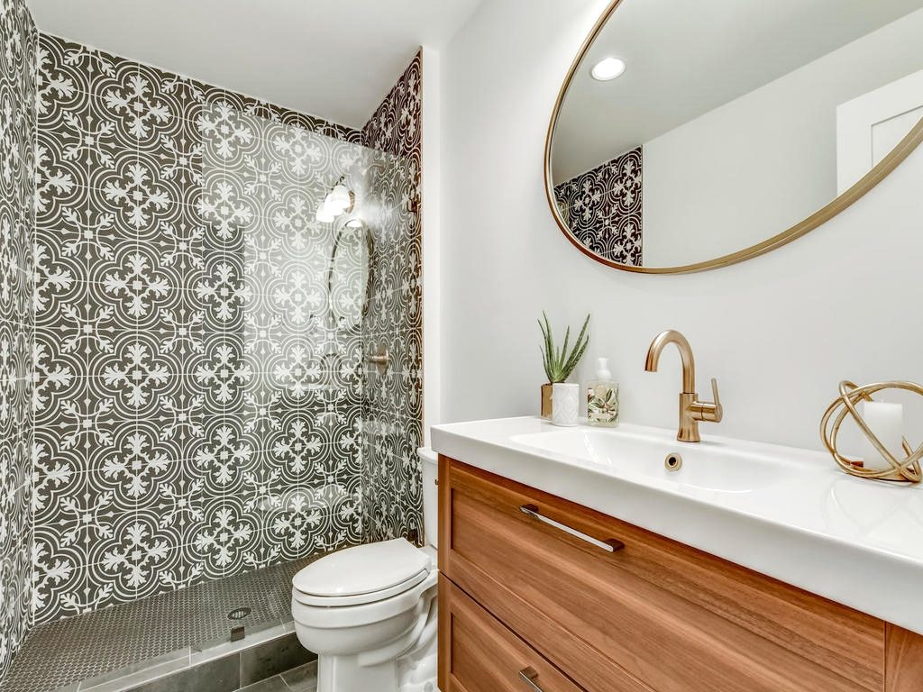
]]>- Patterned tile: Spanish-style encaustic tile with bold designs and bright patterns is popular right now. With affordable ceramic options on the market, it’s easier than ever to make a big design design impact in a small space at a reasonable cost. For example, I used this tile from Home Depot in the kitchen of my recent Balcones project. It cost around $8 a square foot.
- Brass hardware. This is not your shiny brass of the 1980s, but a polished brass with a matte sheen. I’m seeing it in kitchen and bathroom plumbing fixtures, as well as in lighting. Personally, I prefer silver fixtures, but it is nice to use different material every once in awhile.
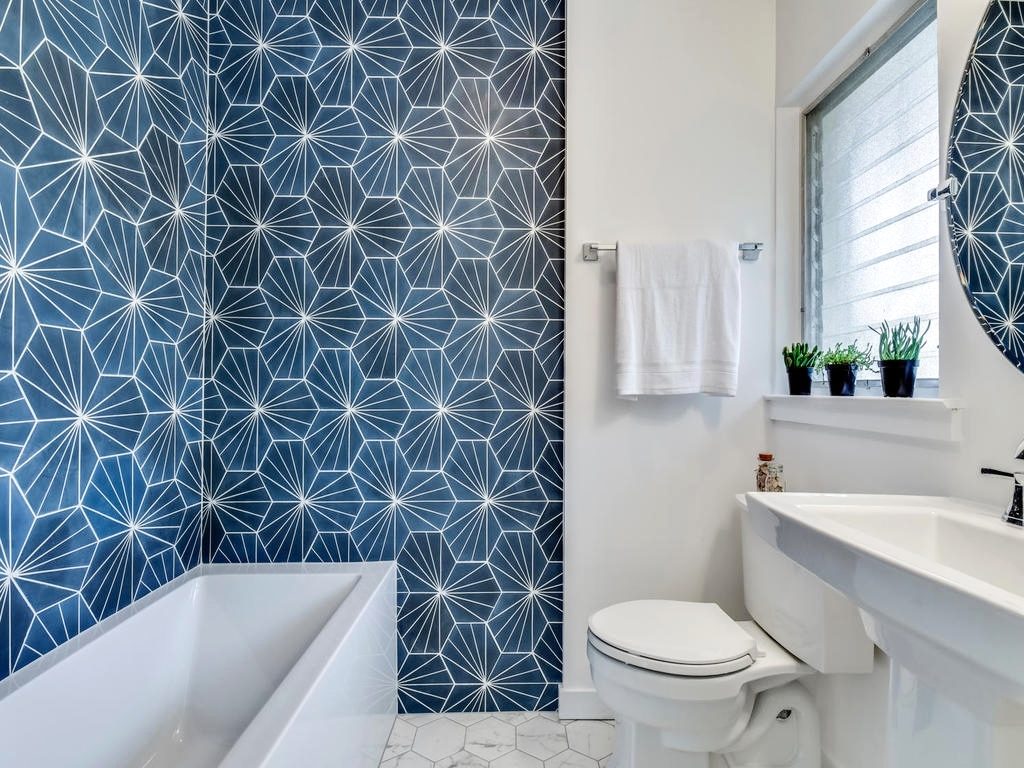
- Geometric patterns: Many homeowners are selecting bold patterns in geometric shapes, like chevrons, triangles, or hexagons. It shows up in everything from tile, to shower curtains, and sculptural objects. Here, this electra blue tile Mission Stone & Tile makes a bold and modern statement.
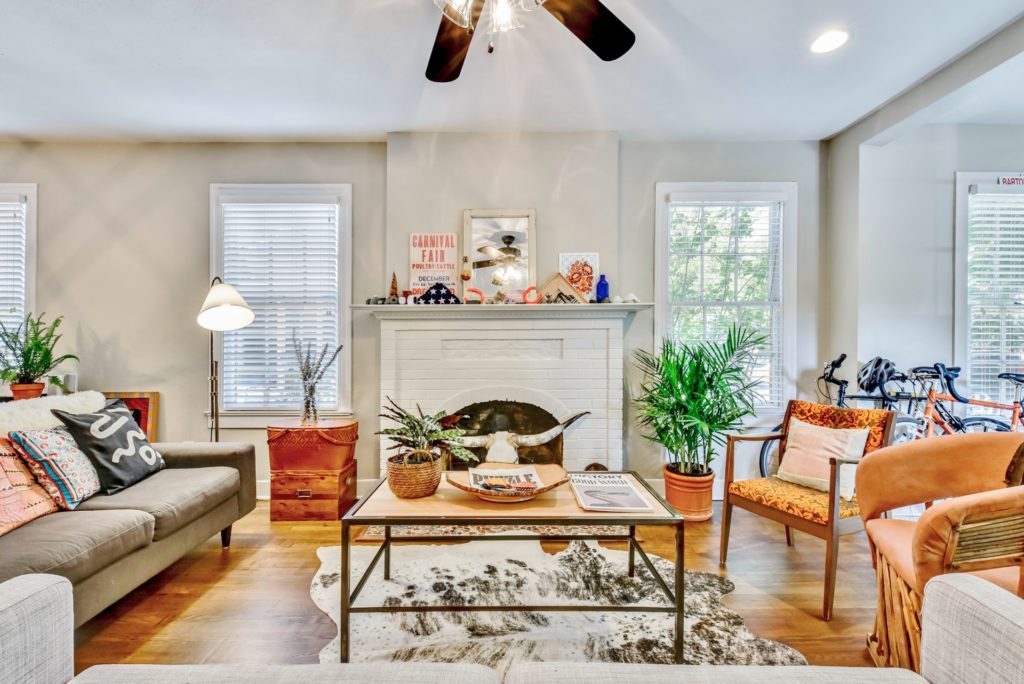
- Boho chic accents: This style can take many forms, but often includes woven wall hangings, textural fabrics, a mish mash of patterns, hanging plants, colorful rugs, and lots of layers. This style especially resonates with the millennials. This home interior trend has been around awhile.
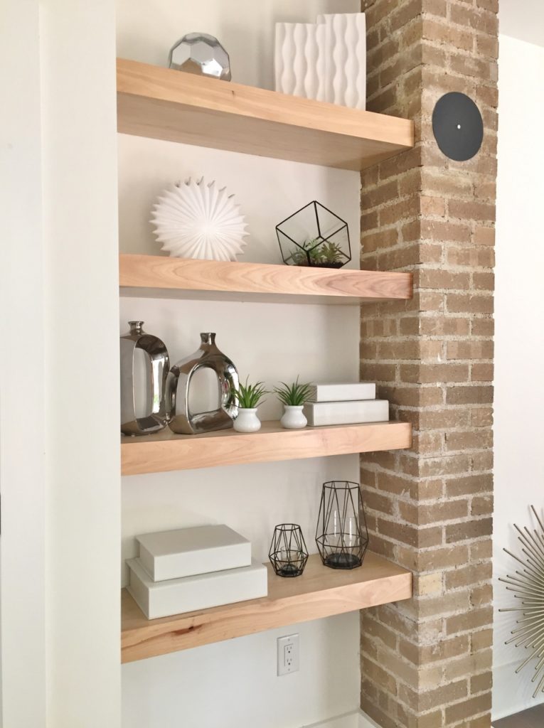
- Natural walls: Homeowners are adding character and contrast by leaving an accent wall of exposed brick or natural wood in bedrooms and living spaces, like this one by Making Modern Home. For homes that don’t have these elements in the existing construction, there are faux versions out there that can be installed with minimal fuss.
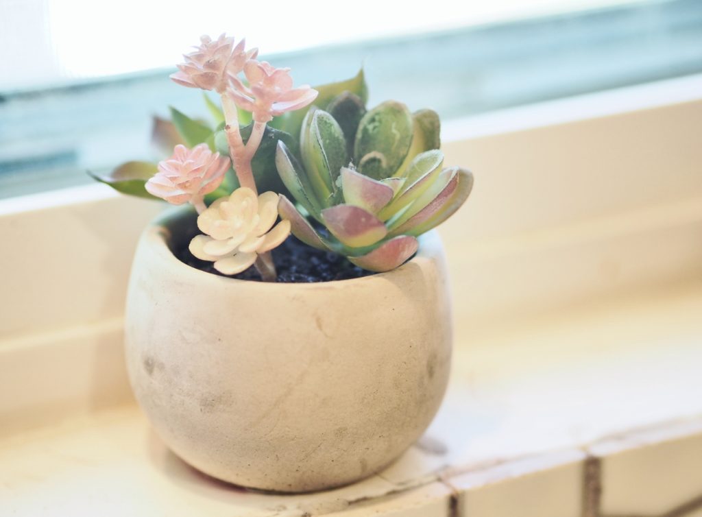
- Cacti & succulents: These water-wise plants are having a major design moment. They’re everywhere from coffee tables to countertops. You can pick up inexpensive ones at the grocery store and the big box home stores like Lowe’s or Home Depot.
- Open kitchen shelving: Homeowners are opting to replace closed cabinets with open shelving. Just beware! You have to be committed to keeping your shelves tidy to pull this one off. This is the kitchen from the 2017 Texas Monthly show home in Cinnamon Shore down in Port Aransas.

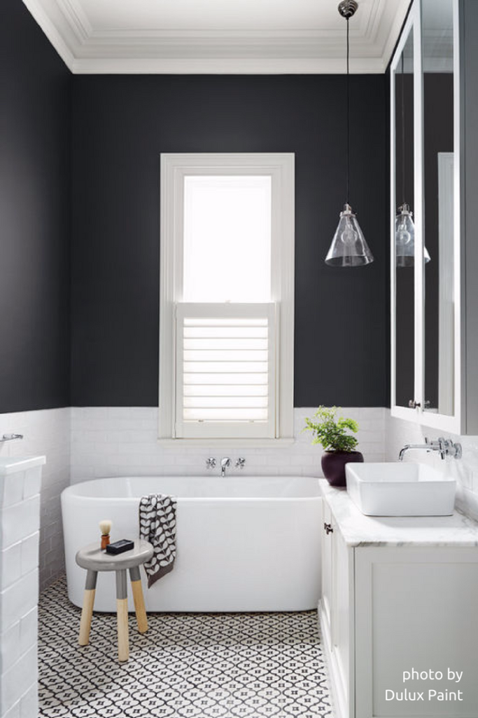
- Dark Colors: Saturated colors, particularly those in the graphite family, are really hot right now. Darker colors add depth and a moody vibe to a room. Just be prepared for some serious work when you want to go back to something lighter. Dark colors can be a pain to cover up.
So that’s my take on it, but I want to know what you think. Of these 8 Central Austin home interior trends, do you have a favorite? Are you seeing any hot trends we missed? If so, send me a picture and I’ll update my list!
The post What’s hot in Central Austin home interiors appeared first on A Life More Beautiful.
]]>The post Peak inside my May 2017 art journal appeared first on A Life More Beautiful.
]]>As a result, I didn’t do my May 2017 art journal pages on a daily basis. Boo.
Go bold
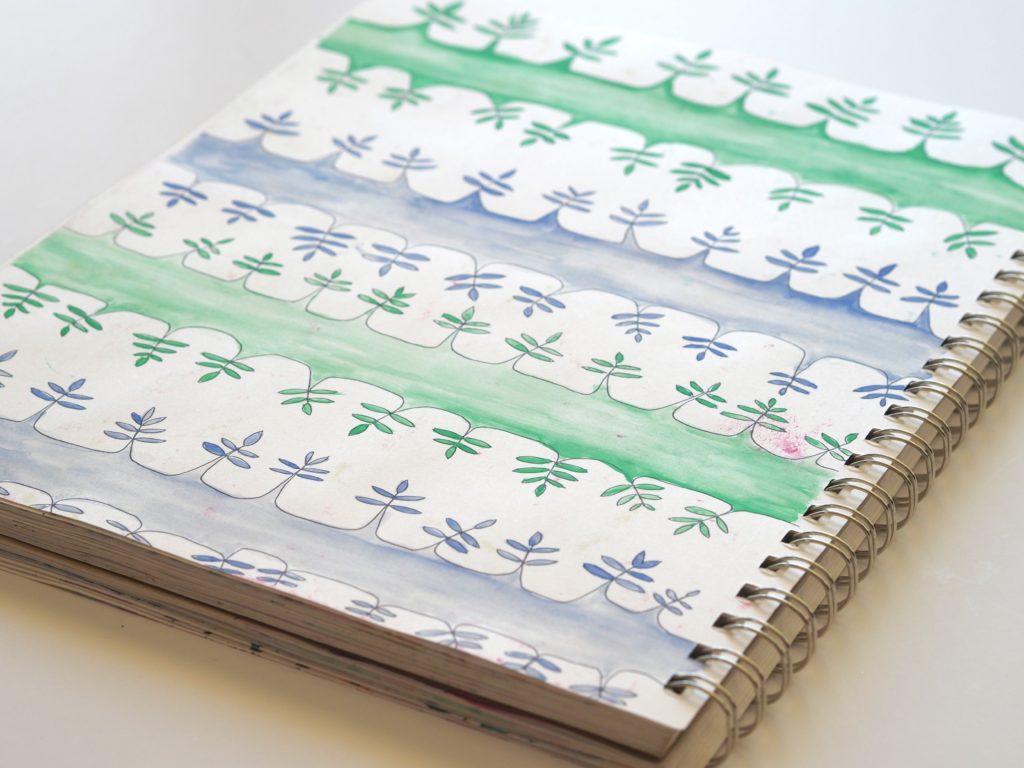
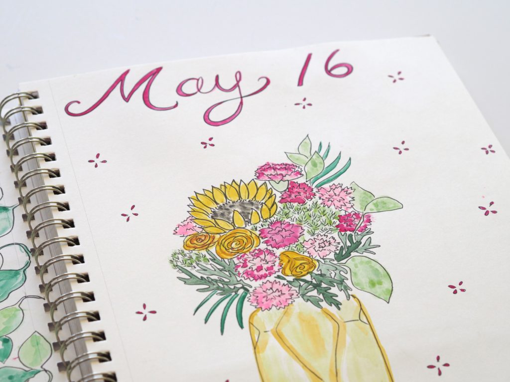
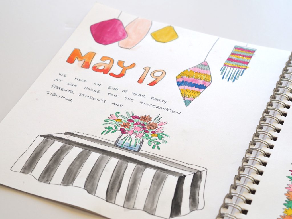
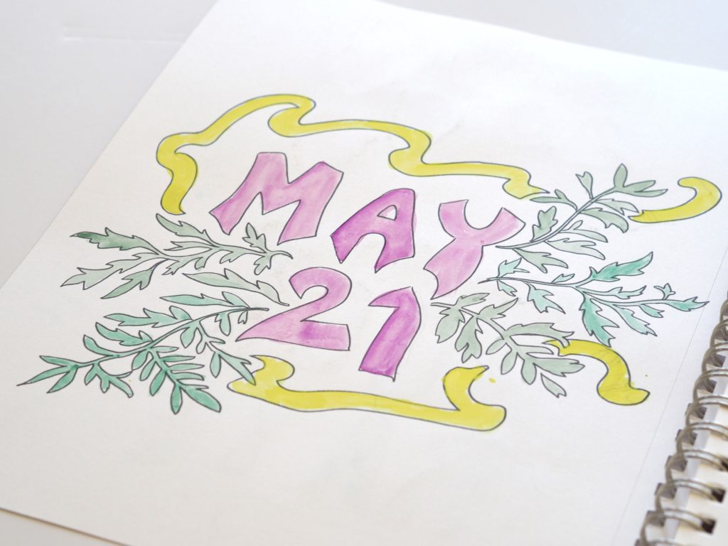
But I squeezed pages in when I could using lots of saturated and juicy colors. It started with Cinco de Mayo, and the boldness just kept going from there. In fact, my art journal served as the inspiration for the bright and bold end-of-the-year class party we hosted. on the party in another post!
While I didn’t do my pages every single day, I am still enjoying them. It’s funny how I will start to work on them, and the next time I look at the clock hours have passed. Time just seems to stop, and the next thing I know it’s 1 a.m. There have been several mornings when I’ve blamed the bags under my eyes on my late night doodling.
It’s a family affair
My kids have also seen my pages and shown an interest in what I’m doing. When my son has been willing we’ve traded art journals, where I draw a picture in his and he draws a picture in mine. Or sometimes we start a picture for each other and then swap so the other person can finish it. It’s been a sweet and creative way to connect with him. My daughter prefers to sit in my lap while I draw, making it impossible to create anything of substance. But the snuggles are worth it…
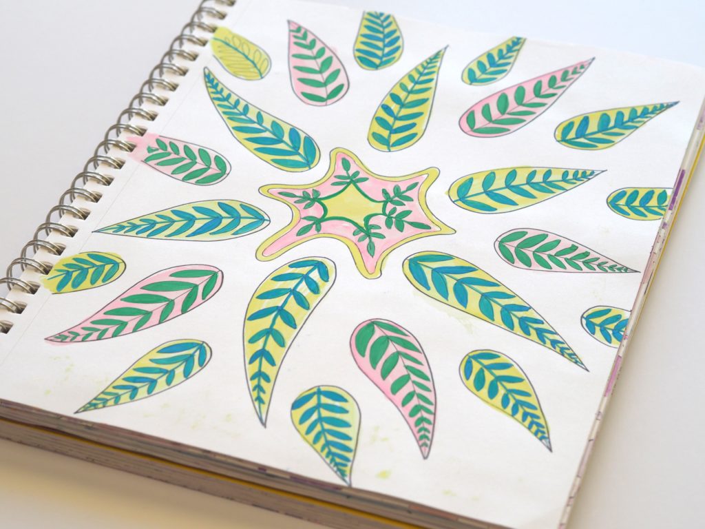
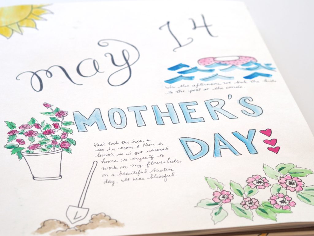
Here’s a peak at some of the pages from my May 2017 art journal:


You can see more art journal entries from other months on our pen and paper page.
The post Peak inside my May 2017 art journal appeared first on A Life More Beautiful.
]]>The post Peak inside my April 2017 art journal appeared first on A Life More Beautiful.
]]>I found that I could only write that I took my children to lessons or worked on the blog or had movie night so many times. After that it got really redundant…
Don’t get me wrong. I still add the journaling when there’s something of interest to include. But otherwise its flowers, and hearts, and just simple doodling.
Either way, I still find it a rewarding way to connect to my creativity. I will always love the experience of putting pen on paper.
I do, however, need to go buy some different journals. I’ve tried mixed media paper and bristol paper, but they just don’t take the watercolor the way I’d like. That’s alright. I love an excuse to go to the art store, don’t you?
Here’s a peak at some of those doodles.
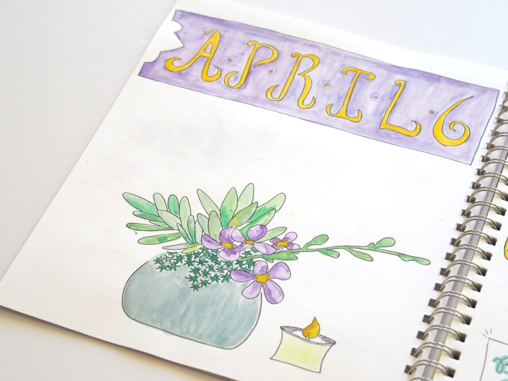
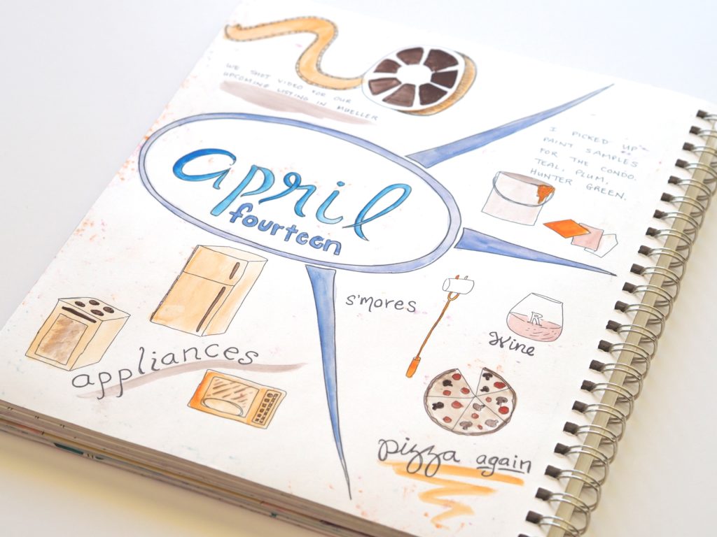


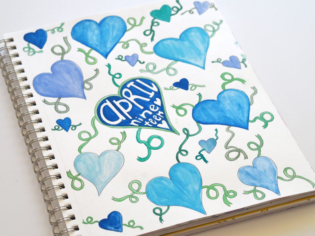
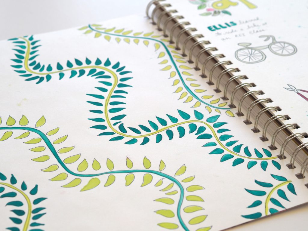
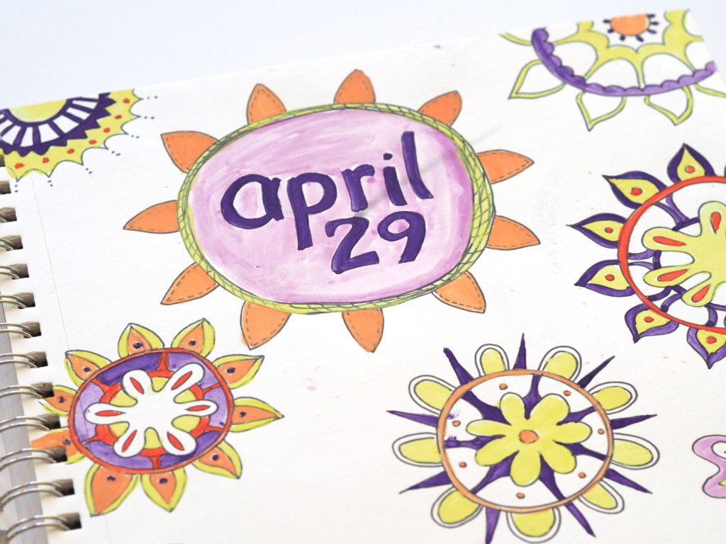
You can see the evolution of my art journal entries at pen and paper.
The post Peak inside my April 2017 art journal appeared first on A Life More Beautiful.
]]>The post A peek inside my March 2017 art journal appeared first on A Life More Beautiful.
]]>Yep. That was embarrassing.
Art for my eyes only?
Since then I’ve been more self-conscious about my art and rarely show people what I create. Other than doodling during meetings, my art served as a private outlet for my eyes only. If you can imagine, posting my daily art journal online for the world to see is a scary thing for me.
The bold, messy art of my children inspires me
But I am inspired by my children. They create art with abandon. Big, messy bold art. Color combinations I would never consider that turn out fantastic. Voluminous amounts of art that cannot be contained in tidy folders. They lack inhibition, and it shows in the freedom on which they approach creativity.
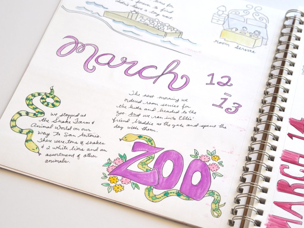
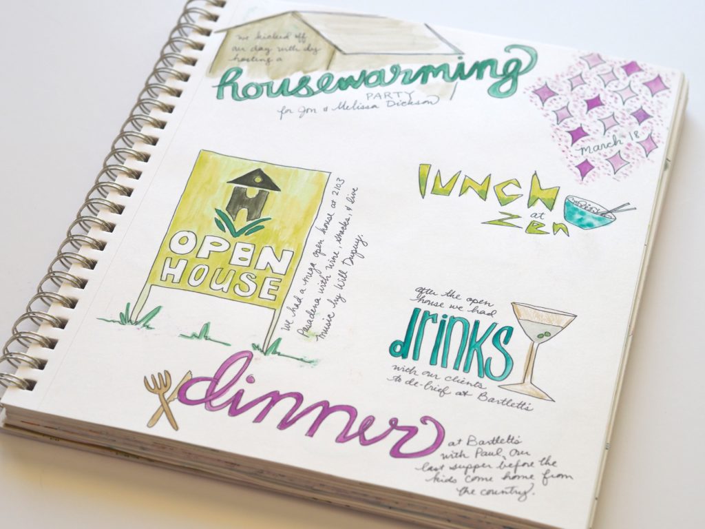
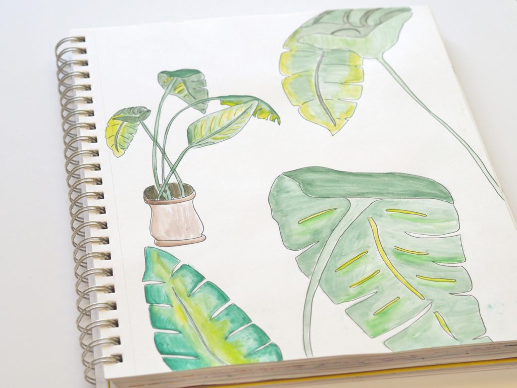
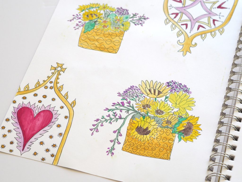
Take a peak inside my March 2017 art journal
So here I am. Putting pages from my March 2017 art journal out there.
I’m coming to realize that it’s not about approval. And it’s not about it being beautiful. It’s about the journey. And the journey is wonderful.
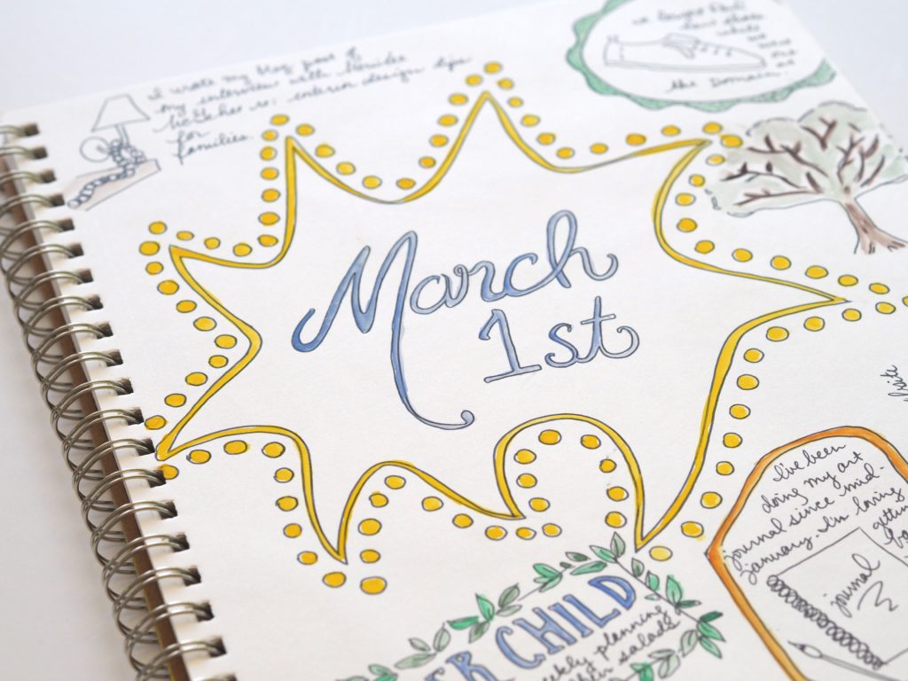
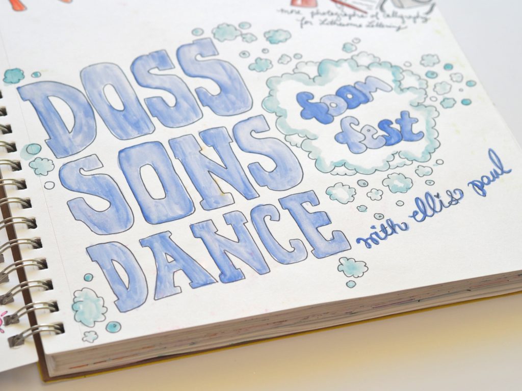
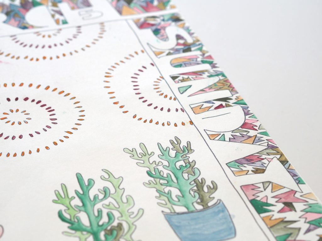

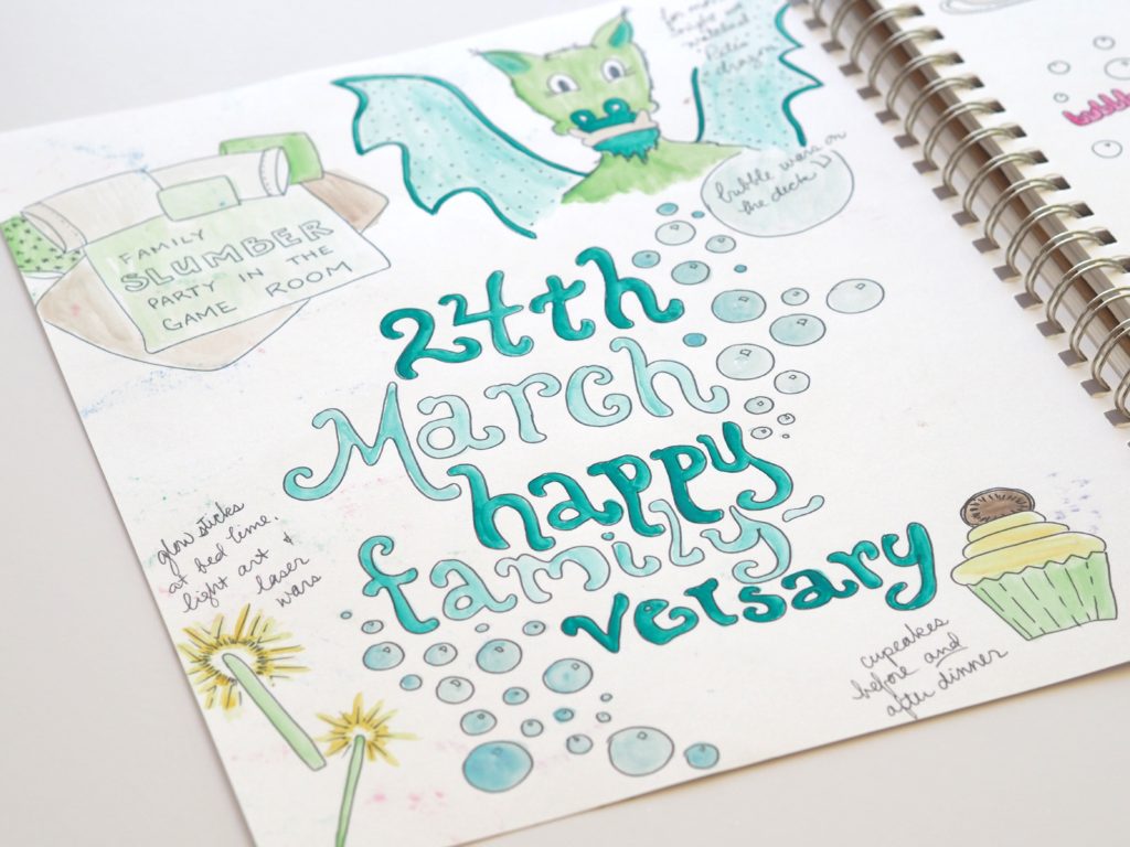
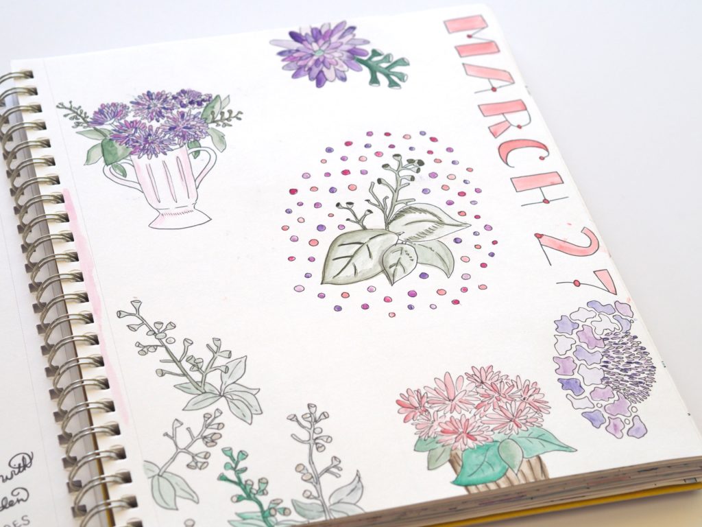
The post A peek inside my March 2017 art journal appeared first on A Life More Beautiful.
]]>The post Modern calligraphy with Mint & Maple Designs appeared first on A Life More Beautiful.
]]>
As part of my post-law journey, I made a commitment to try new things and explore a variety of creative outlets. Truth be told, sometimes I’m better at keeping that commitment than others. But this was a good month! I tried modern calligraphy.
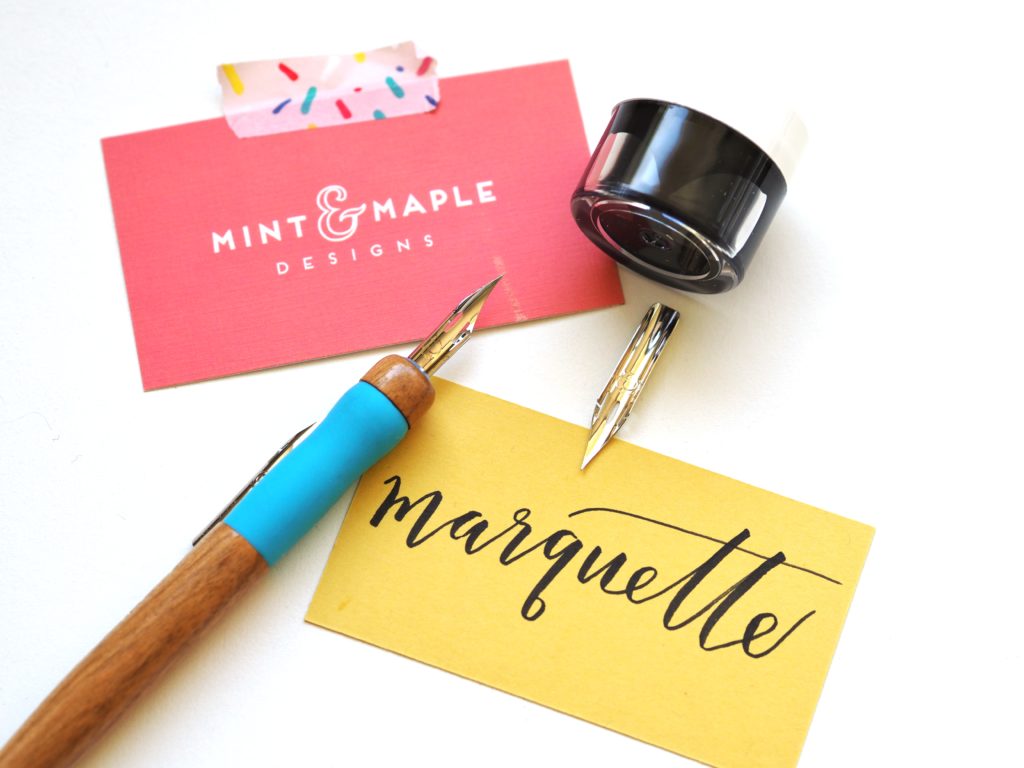
If you’ve been on Instagram or Pinterest lately, calligraphy is totally having a moment, particularly the loose, bouncy, modern calligraphy. I love lettering, doodling, and making decorative envelopes, so I thought I’d give calligraphy a try. I’ve taken several classes from Natalie Coulter at Mint and Maple Designs, so when I got an email from her advertising a Modern Calligraphy class, I knew I couldn’t go wrong.
Making it simple
For starters, Natalie does a great job of making it approachable. She described her own journey and mishaps in learning her craft, which immediately put me at ease. Plus she’s a pro at explaining things in an easy-to-understand way. I love how she started by explaining the tools we’d be using (no wondering what a nib or vent hole are) so everyone was on the same page regardless of skill level. Plus, she provided a handy outline, including a helpful supply list and shopping resources so everyone knows what and where to buy additional supplies later on. I also really like that her resources aren’t all fancy art stores; she includes accessible resources too like Amazon or Dick Blick.
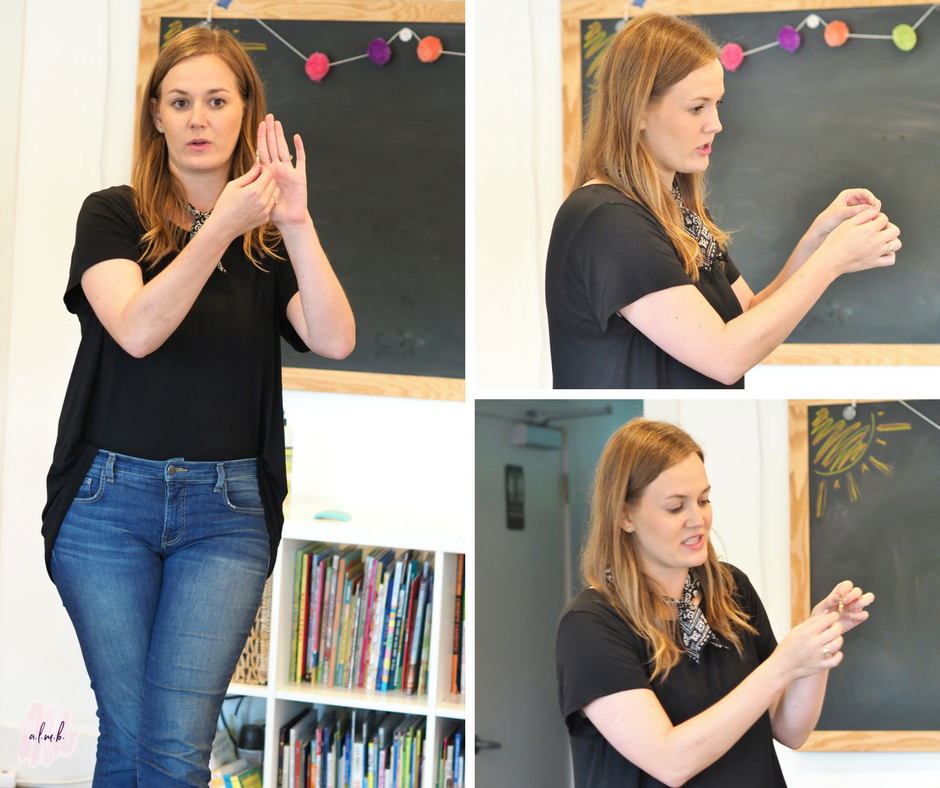
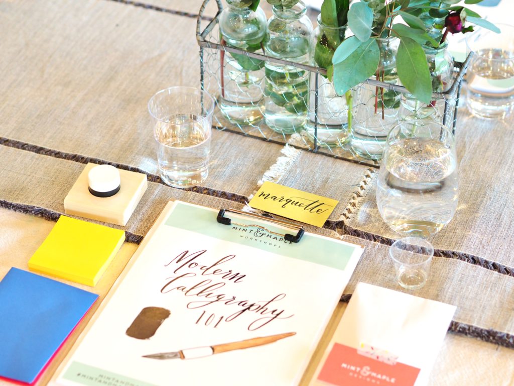
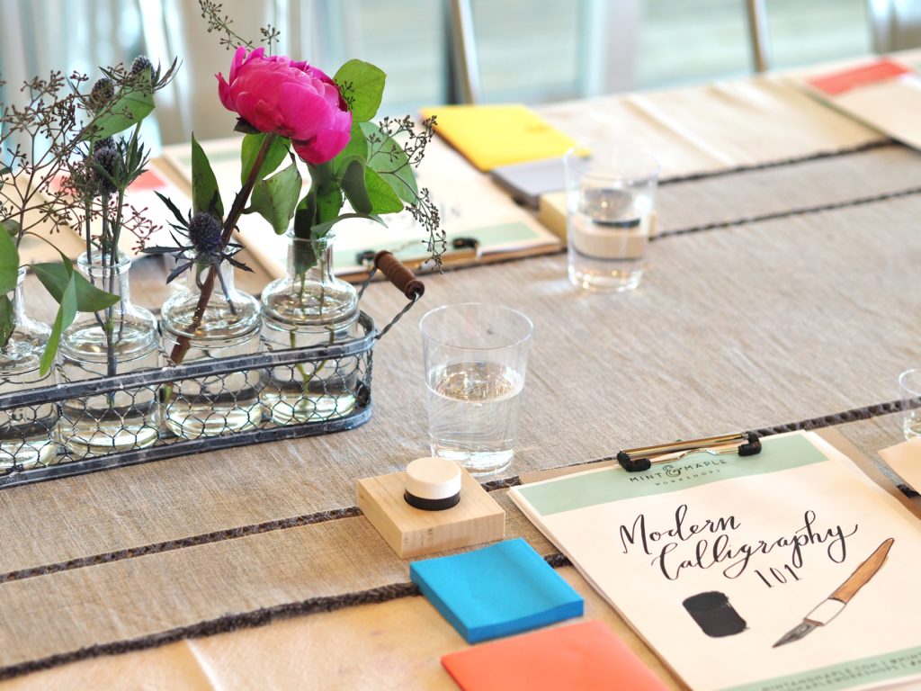
Unlike classes I’ve taken at UT or Laguna Gloria, Natalie provided all of the supplies so I didn’t have to hunt things down before class. Soooo grateful for that time saver. But that’s really under-selling it. When I arrived I found my name at an individual work station with beautifully packaged supply kits — that I got to keep! It was like Christmas!
Practicing modern calligraphy makes perfect (sort of)
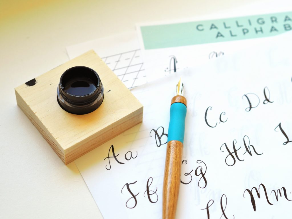
After learning about the basics of the calligraphy tools we’d be using, Natalie explained how to make the various strokes and gave us plenty of time to practice. Those nibs are tricky, so I was glad to have the practice time. Just when I thought I had it down, I’d press too hard and end up with a big pool of ink on my paper. Ugh. It definitely takes a light hand and focus on what you’re doing.

The class sizes are limited, so Natalie can interact with everyone and provide one-on-one instruction and demonstrations when needed. Hallelujah for that. I didn’t have to ask my embarrassing questions in front of everyone.
Once we were comfortable with our practice strokes, we moved on to tracing the sample alphabet Natalie provided. From there we created our own calligraphy. I can make loops and swirls all day, but actually making words was a whole different ball game. My practice sheet turned out okay. What you don’t see are the ink blots and smudges where I pressed too hard or didn’t let the ink dry before stacking pages on top. I think it’s safe to say none of you will be getting beautiful calligraphy holiday cards from me this year…
A beautiful setting
Not only does Natalie and her team offer great content, they are also pros at designing a beautiful setting to get those creative juices flowing. And if the inspiring setting didn’t help, the wine did!
The class was at Patricia’s Table, a light and airy space that’s perfect for these kind of intimate art classes. They greeted us with mini cupcakes topped with fresh raspberries, sprinkle-covered cream puffs, and fruit and veggies. To top it all off, they did an excellent job of making sure no one’s wine glass was empty for long. That’s my kind of hostess. Ha!


Simple farm-fresh arrangements of peonies and eucalyptus added a touch of color and softness to the tables which sparkled with wine glasses, water glasses, and art supplies. It was like being at a fancy dinner party with an entree of calligraphy.
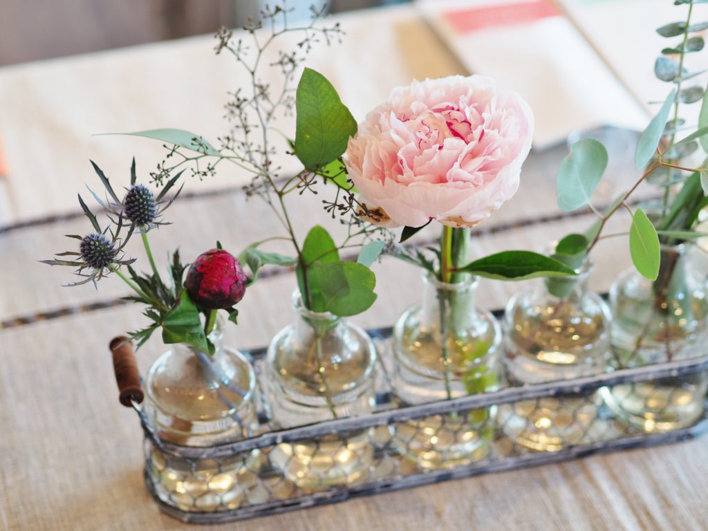
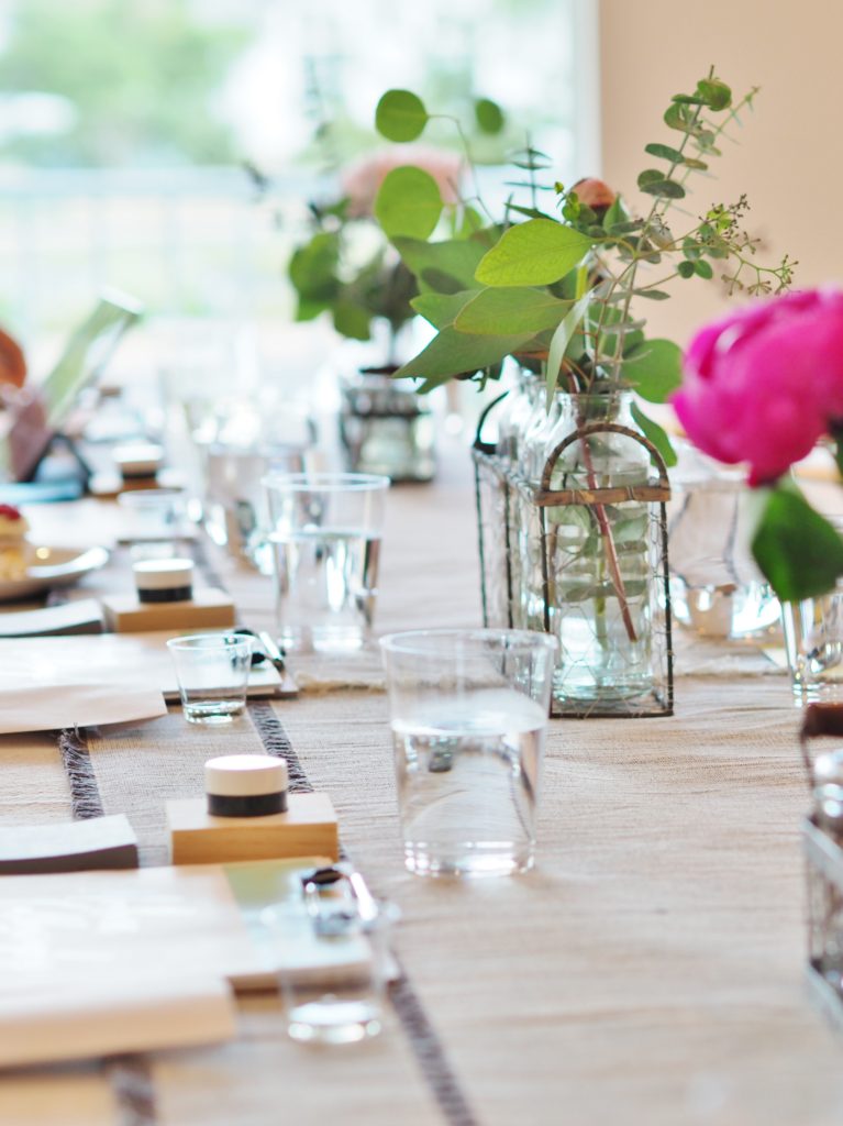
No detail was overlooked. The setting, the supplies, the name card all made it truly special.
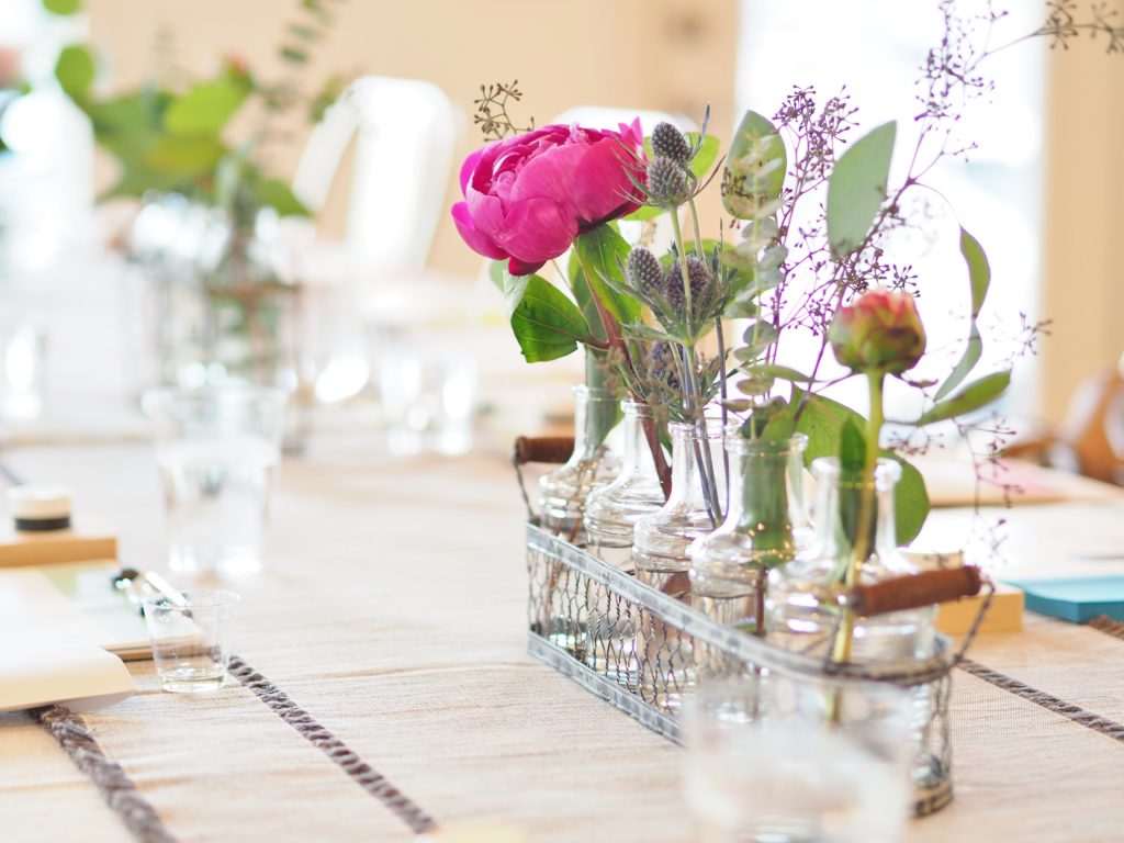
It was over before I knew it
The class was two hours long, but before I knew it our time was over. While I didn’t master the art of modern calligraphy, now I know enough to keep experimenting without being intimidated. Next, I’m going to see if I can incorporate it into my daily art journal in some way. Stay tuned! And if you ever want to go to one of Natalie’s classes, you can sign up here. Who knows, maybe I’ll see you there!
If you like what you read, you can check out more of my creative journeys on pen and paper.
The post Modern calligraphy with Mint & Maple Designs appeared first on A Life More Beautiful.
]]>The post Rockin’ the boat party appeared first on A Life More Beautiful.
]]>

At first I didn’t think a boat party would be much different than a normal event, but as I got into the actual planning there were several variables that made it a little challenging. First off, everything had to be splash and wind proof since we were on the water. Good thing too, because it ended up raining for part of the event! Second, the Riviera Marina where we rented the party barge had particular rules about what you could and couldn’t do on the boat. Like no glass… And third, the marina was 30 minutes from our house so I had to check and double check to be sure I had absolutely everything I needed since we were too far away to make any last minute trips to grab anything.
It took a little creative planning, but we pulled it off. And we definitely ended up rockin’ the boat. Below are photos and the details.
Getting nauti
With the “rockin’ the boat” theme in place, it was time to get to work. Sometimes I’m challenged to come up with punny sayings and such for a party, but there are so many fun boat and nautical sayings that I had a hard time narrowing it down. After some ‘serious’ research and a lot of laughs, I focused on a few primary sayings for the boat party:
- Rockin’ the boat
- Feeling nauti
- I’m on a boat
- Let’s get ship faced
- Livin’ large on the barge
I used these sayings on photo booth props, napkins, and plastic cups. After all, if we couldn’t have glass on the boat, we had to have a keg, right? And keg beer meant fun cups with boat themes! Yes! I whipped up some designs on Canva, and sent them off to Totally Promotional to get printed. They did a great job of turning them around quickly at a reasonable price. I was really pleased with how they turned out. And I’m thinking we’ll be having another boat party next year because I ordered WAY too many of these!


I also incorporated our nautical theme in the photo props. I had designed an elaborate photo backdrop but NOTHING would stick to the walls of the party barge, not even my trusty gaffers tape. So we improvised with some simple banner flags and lightweight anchor cut outs. It turned out okay because the boat was narrow and there wasn’t a lot of space to show off a large background anyway.



And of course if you’re on a boat, you have to have a captain, or in our case, several captain hats. And some sailors too, with saucy sayings like “shameless,” “wrecking ball,” and “sassy pants.” One thing led to another, so I also had playful boat party photo props like life preservers, boas, ship wheels, and anchors. I may have gotten a little carried away… But hey, is that really surprising?





Festive food & drinks
In keeping with our high class trash concept, we had some pretty bad-for-you munchies that I would never ever let my kids eat. I couldn’t exactly let the kids see all the junk food we were buying, so instead Paul and I spent our date night shopping at the liquor store and grocery store. That’s romance right there…
So we headed to the grocery store where we did our best to completely clear out the junk food aisle. Yep, we were doing you other folks a favor by removing all of that artificial food from the shelves. For real. I’m talking chips of every kind and flavor. Oreos full of trans fats. Caramel and cheese popcorn. Cupcakes. Sticky sweet watermelon. Ooey gooey chocolate chip cookies. I’m salivating just typing the words… And to make sure we had something with a little more substance, we also paired Chik-Fil-A nuggets with some gourmet Fischer & Wieser sauces to balance all the sweet and savory treats.

But the best food of all wasn’t even something we brought. Our clients Carrie and Steve joined us on the lake and treated us by bringing the best homemade brownies ever. So. Freakin’. Good. These two own Kurant Events catering, and those brownies make me want to have another event just so I can have Carrie and Steve cater it. Seriously. I will be forever jonesing for those brownies. But I digress…
Given that it was an adults-only party, the drinks were paramount. We had water, sodas, canned champagne by Sofia Coppola and rose, and the keg of Dos Equis. But for the more adventurous we had liquor on hand to create your own cocktail. True to our Texas roots, we focused on Texas-brands, including 512 Tequila, TX Whiskey, and Tito’s Vodka. We were just doing our part to indoctrinate our clients from foreign lands (okay, California, Illinois, and New York) in the ways of the South.
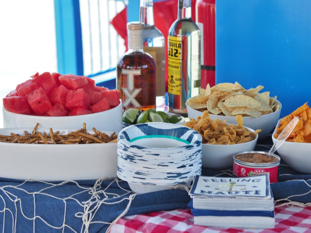
We only had about 45 minutes to get everything in ship-shape before our guests arrived, and that included making numerous trips down the big hill from the parking lot to the dock. My husband served as pack mule while I quickly set the table and decorations out. Checkered table cloths, denim, and fish net lent a nautical air to the food table.
Boat party time
After hurriedly pulling everything together, we were able to kick back and relax with our guests as we cruised around Lake Travis before tying off on one of the islands. We enjoyed the water slide and welcomed the chance to cool off in the water. An unexpected rain storm didn’t dampen the mood. We just took advantage of the short break to fuel up on more food and drinks, and then we hit the water again.
It’s not often that we get to spend a carefree afternoon with other adults out on the lake. It was a refreshing break for us, and we had a blast spending some relaxed time with our friends and clients. This boat party may become a regular thing. And I have just the idea for next year’s party!



The post Rockin’ the boat party appeared first on A Life More Beautiful.
]]>The post Flipping houses in Central Austin appeared first on A Life More Beautiful.
]]>
Once upon a time before I had children, I remodeled and flipped houses with my husband. I always enjoyed the puzzle of it, and even more so the process of transforming a distressed property into a beautiful space. I would immerse myself in those projects for hours at a time, surrounded by piles of paint chips. It was my happy place.
Once the kids came along the focus of my free time shifted to them. And with less free time — and the new money pit known as daycare — we had to put flipping houses on pause. It was a long pause, and I missed it. So when I left the practice of law in January 2016, it wasn’t much of a surprise that flipping houses was at the top of my list of creative projects. I had time, I had the energy, and I was ready!
Patience pays off when flipping houses
Eager to start flipping houses, I bugged my husband Paul about it regularly. After all, he is the Austin house finder extraordinaire! But the circumstances weren’t right. The hot Austin real estate market meant there were limited ‘deals’ to be found. And with our shift to one income it wasn’t a good time to make a risky investment. We needed to be able to feed the children after all…
And so I waited. Not patiently, no, that’s not my style. I’m a ball of frustrated energy when I don’t get something I want. But a year and a half later, Paul started talking to me about condo deals he was finding. Ah ha! This was a sign he thought we could bear the risk. Yeah! While I preferred a house over a condo, at this point I was willing to take anything I could get.
What to look for when flipping houses
We began to look at properties here and there. As a general rule we want properties that are (1) undervalued or overlooked (2) don’t show well, (3) in appreciating neighborhoods (4) where we can get a decent return on our investment. And because we don’t like to put lipstick on a pig, we want to be sure it’s a project where we can really add value and make the property more attractive to potential buyers. (Learn more about our process for choosing a flip house). None of the properties we looked at met all of the criteria.
One night Paul sent me some pics of a pretty awful looking 2 bedroom, 2 bathroom condo. And my heart started to pound. It’s just the kind of thing we look for when doing a flip.
The unit was owned by the same person for 20+ years without any updating. Can you say D-A-T-E-D? Dark draperies blocked one of the most outstanding features of the property – large windows and abundant natural light. One room was so full of stuff that you couldn’t even walk into it. The structure was sound, so most of the changes would be purely cosmetic. And the seller’s real estate agent did a poor job of marketing[1] the home, with just a handful of iphone photos that were dark and blurry. Awesome! The property looked awful online, so that made it likely that we wouldn’t end up in a bidding war. Plus, it is in the sought-after and appreciating Highland Park West neighborhood of Austin. We both agreed right then to make an offer.
Well, as you might’ve guessed, we got the deal. But the best part was that we got it for less than the asking price even though it had been on the market for less than a week. Kudos to my husband for another great real estate negotiation! And so our latest house flipping journey began.
Location, location, location
Aside from the price and condition of the property, the condo’s location was one of the major selling points. Ideally located in the heart of Central Austin near the intersection of 2222 and Mopac, it is only ten minutes away from downtown, the Arboretum, and the Domain. You can literally walk to meet your friends for dinner at Chez Zee, treat yourself to yogurt at Berry Austin, pop into Peony next door for Chinese take-out, or pick up some pastries at Russell’s Bakery. It’s , grab a coffee at Starbucks, shop for groceries at Randall’s, or stretch your legs at Perry Park.
And while this home is close to it all, it feels like an urban hideaway. Tucked back from the road in a secluded community of only 51 units, the home is nestled on 4.245 acres dotted with heritage oak trees. Each building faces a central grove of majestic oak trees centered around a junior-sized Olympic swimming pool. I spent many hours working by the pool and listening to the birds during the remodel. It’s really a beautiful and peaceful setting. I especially love that the windows in the home overlook the treetops so that you feel like you are in your own private treehouse. But I digress.

Be prepared to start work when the sale closes
With the house under contract, the real work began. Inspections, meeting with contractors, sketching plans. And lots and lots of late nights on the computer picking out finishes and creating the design boards. That’s my favorite part. <wink>
When flipping houses we want to be ready to hit the ground running once we close on the property. After all, the property is costing us money every day we own it. Fortunately we were able to line it all up so that demo began the day after our closing, and from there we rocked and rolled.
We had a great crew led by John Edmond, and by May 25th we were ready to go on the market. The only problem was the timing. With it being Memorial Day weekend we couldn’t get our professional photographs and video done, and we had a family trip scheduled the week after that. So contrary to our own advice, we held the property a little longer and pushed our launch to June 8th. Now that the project is complete and I’m getting a little more sleep, I am excited to show you the finished product.
The finished flip: kitchen
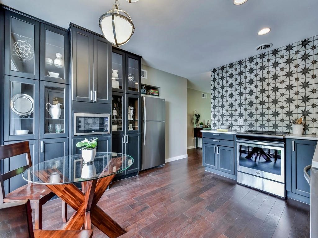
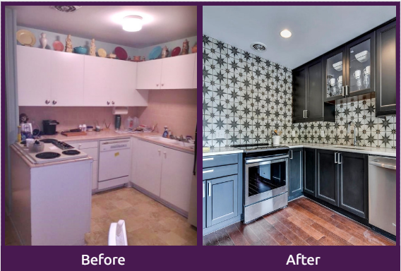
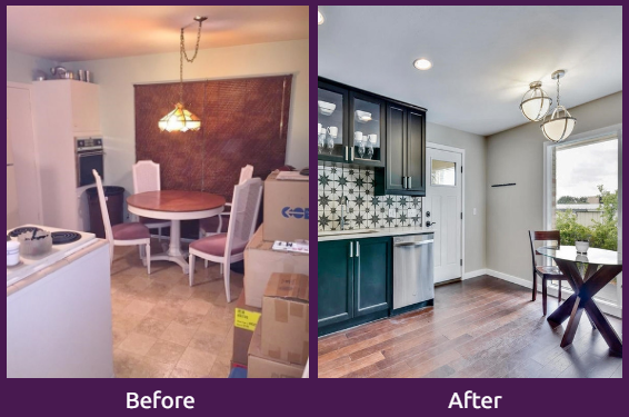
The front door of the home opens into the kitchen, so it was important to make this a show-stopping space. The original kitchen floor plan was a tiny U-shape with the stove top jutting out. You had to brush by it to get to the living space. I had visions that someone would walk by and put their hand on a hot cooktop or knock off a boiling pot. To make matters worse the range was behind the kitchen door. And the aesthetics, well, I’ll let you describe those yourself when you see the before photos.
In an effort to enlarge the space and make it more functional, we removed the cabinets that were jutting into the room and co-opted the opposite wall to create a display cabinet and pantry. Not only did this make the room larger, it also significantly increased the storage space in the kitchen.
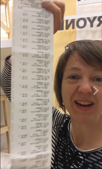
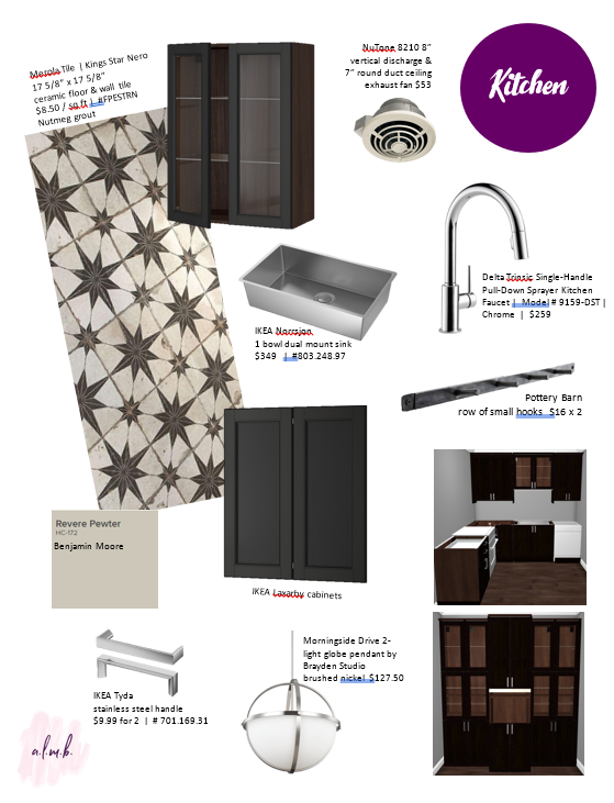
Cabinets are expensive, so I decided to overcome my fear of IKEA’s kitchen planning center. I spent four hours at IKEA designing the cabinets on one of their computers. While it was exhausting, I will definitely be able to do it again. I came out with a receipt taller than me and an order for a full set of Laxarby espresso cabinets. Woo hoo! The price was so right that I went ahead and bought IKEA cabinets for the guest bathroom too.
In most flips I typically try to appeal to the masses with basic and universally appealing design. Since this was my first project in ages, Paul encouraged me to do something different and really express myself. I’m so grateful he had confidence in me and let me take some risks. That meant instead of white subway tile I could do something fun and unexpected.
I scoured my Pinterest boards for inspiration (click to check out my boards), and then I started shopping. On previous flips I spent a lot of time going to stores and collecting samples. Remember those were the days before kids… This time I did most of it online. And because of our short turn time, I didn’t have the chance to order samples, which meant I was really hoping things would match!
I was pleasantly surprised to find that Home Depot had a huge selection beyond what they carry in stores, and a lot of it was fun, funky, and affordable. With the exception of the blue marine tile in the master bath, I sourced all of the tile from there. Plus, Home Depot accepts returns of overage tile so I wouldn’t be stuck with a garage full of unused tile boxes. However, that part proved to be more difficult than I had hoped — the wait-in-line-and-guide-the-clerk-through-it-one-item-at-a-time-over-the-course-of-an-hour kind of difficult. Do-able, but difficult.
I ended up picking this unconventional Kings Star Nero tile by Merola for the kitchen. To make more impact I took the pattern all the way up to the ceiling. To offset the dark cabinets and patterned wall, I enlisted the help of AAA Countertops to install a white engineered stone counter by Viatera. The white counter adds crispness and contrast. I capped off the room with chrome plumbing fixtures (that’s a Delta trinsic faucet) and classic half-globe pendants by Brayden Studio for a little shine. Viola! Kitchen complete!
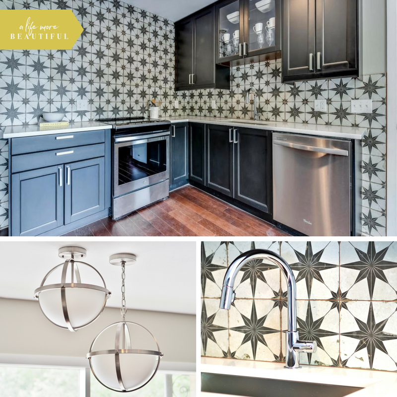
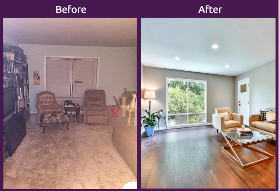
Now the space seems like it’s always been this way, but a look at the before and after pictures really show how far this kitchen has come.
The finished flip: living room
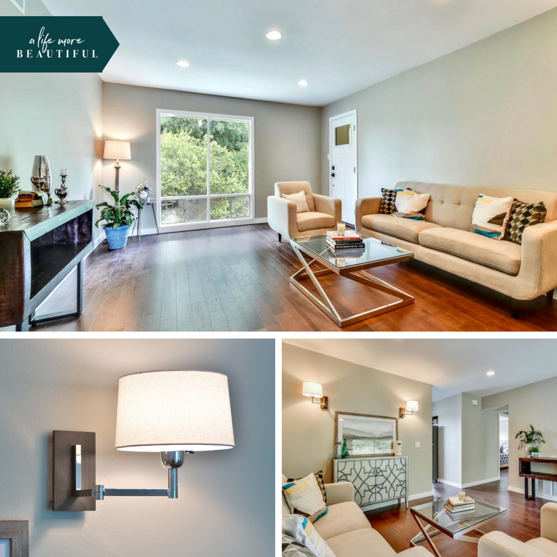
The adjoining living room didn’t need much work. An unfortunately-placed coat closet chopped up a nice rectangular space, so we removed it. To give the room a little personality, we added two decorative sconces by Robert Allen. With the help of Total Pro Flooring we installed new engineered hardwood floors in large planks to unify the entire space. What once was a dark and dreary cave is now an light, open and flexible living space. A fresh coat of paint also helped brighten the dingy walls.
The finished flip: guest bath
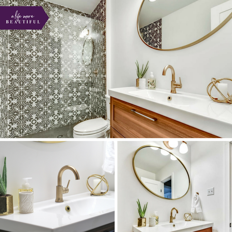
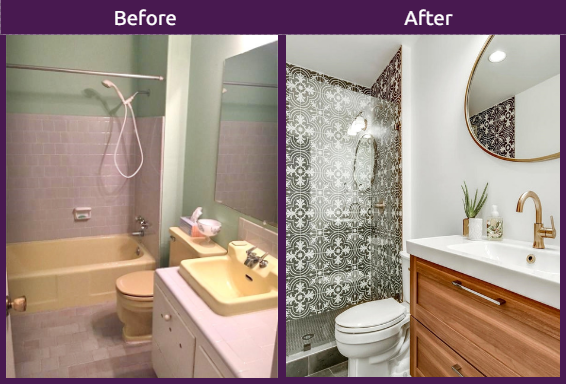
Since the guest bathroom is visible from the living room, I banished the original grey and yellow tile to the dumpster. I replaced the tub with a walk-in shower and surrounded it with Merola Twenties Classic black and white patterned tile for some pop. The glass shower front lets you see the entire shower wall at a glance. The wall does double duty. Not only does it glam up the shower, it also serves as a gorgeous accent wall that you can see from the living room.
I ordered all three types of bathroom tile from Home Depot online without seeing any samples. Fortunately, this is one of those times where luck was on my side. I was relieved that the large-scale charcoal hexagon floor tile and the smaller hexagon shower tile all matched perfectly with the patterned tile even though they were different brands. Whew.
Now, I’m not a big fan of the popular brass fixtures you find in all the magazines these days, but since my target buyer is a young professional I figured I needed to give it a shot and do something on-trend. I was pleasantly surprised with the outcome. The IKEA wood cabinetry and the champagne bronze fixtures warm up the space; see for yourself.
The finished flip: guest room
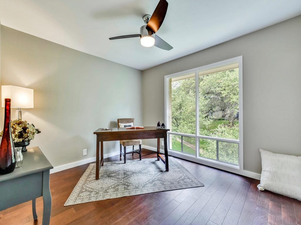
Like the living room, the guest bedroom didn’t need much renovating. The light and airy space really speaks for itself. It got a new modern ceiling fan by Quorum International and new closet doors. And of course we freshened it up with new paint.
The finished flip: master suite
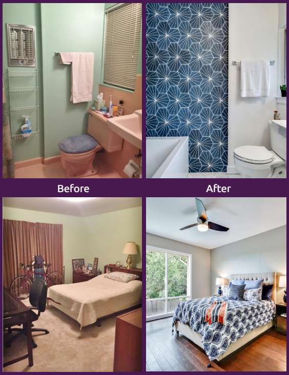
The same went for the master bedroom. Clean, simple, bright, and spacious. Done.
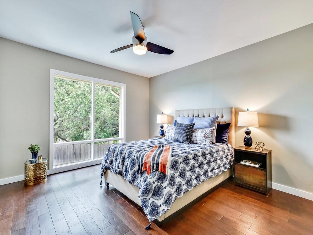
But tucked inside the master bedroom was another surprise.
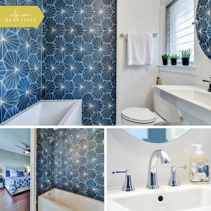
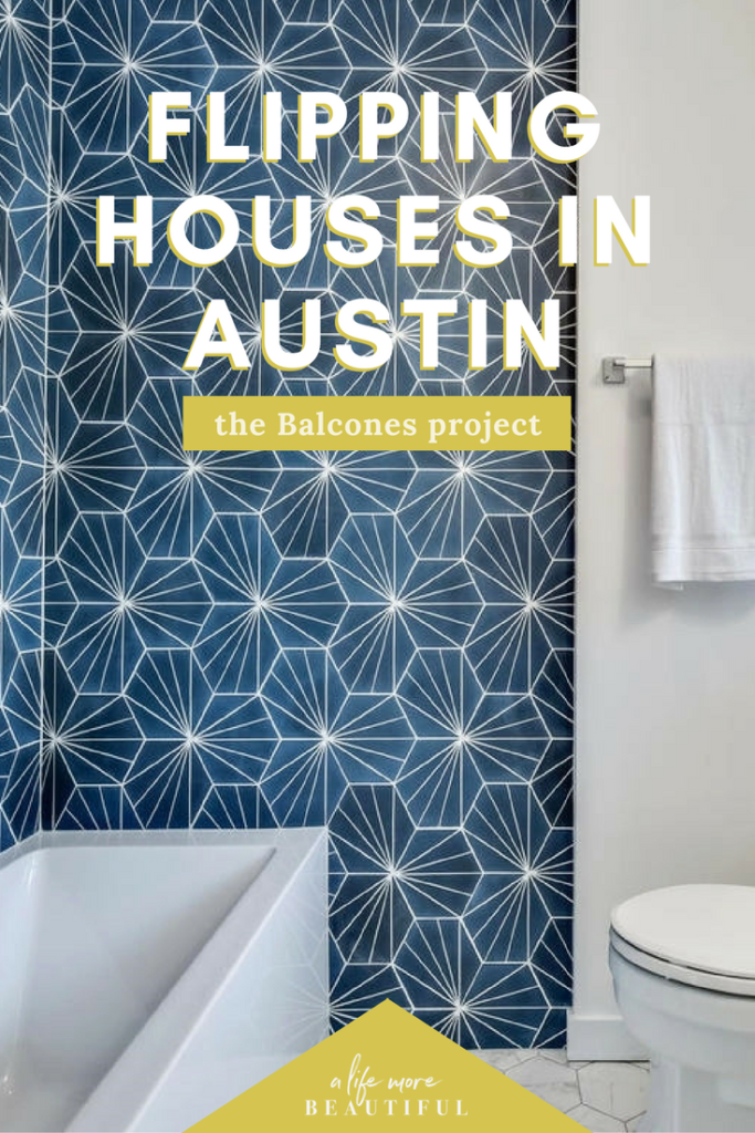
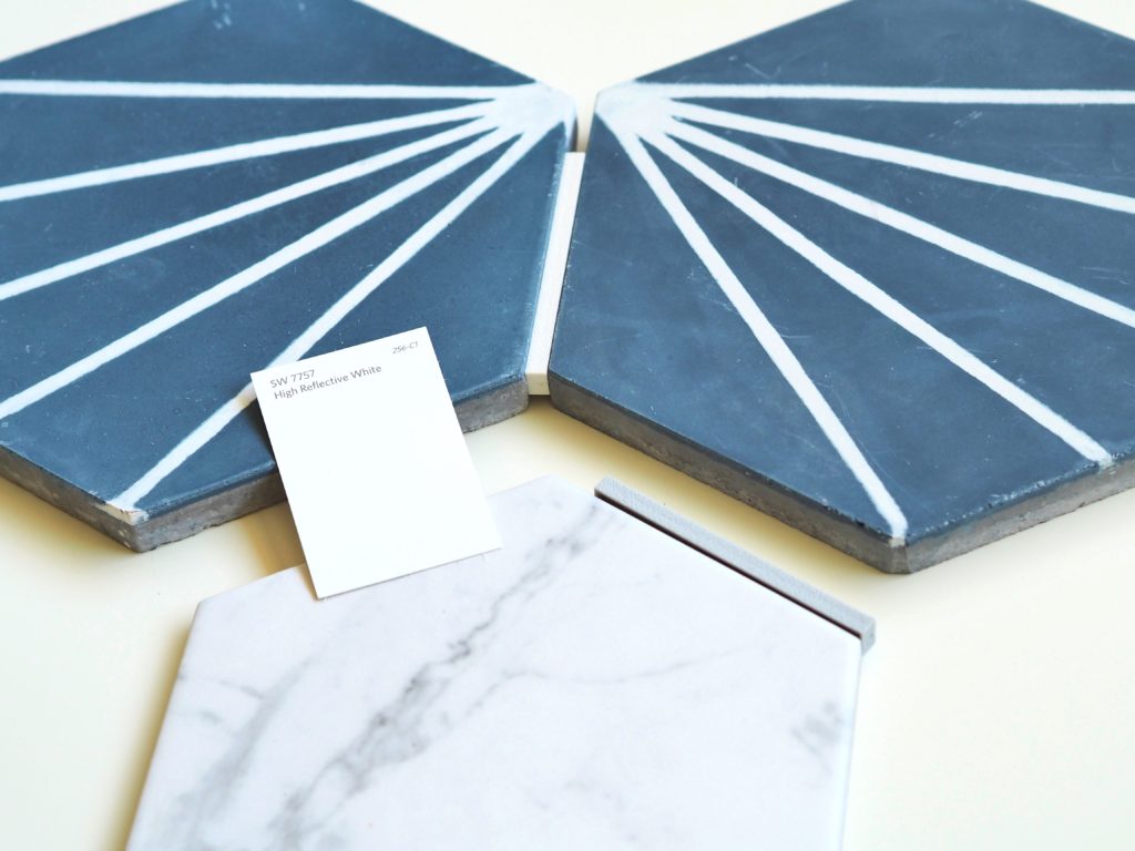
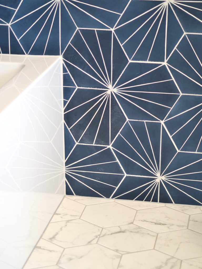
This is my favorite room in the entire project. At $16.99 / square foot, the electra marine blue tile by Mission Stone & Tile was a splurge, but it was sooooo worth it. I’ve always opted for a neutral bath space, but that blue tile that was calling my name. I had it shipped here from Tennessee, and I literally squealed out loud when I saw it installed. The tile guy did such an amazing job aligning all the lines that you really can’t even see the corner seam. He doesn’t know it yet, but I’ve nicknamed him the tile wizard!
The blue tile packs a big punch, so I tempered its modern energy with classic hexagon carrara marble on the floors. They are the perfect marriage of classic and contemporary. The master bathroom is on the small-side, so I chose a pedestal sink to create more open space. As in the kitchen, chrome fixtures shine.
The finished flip: exterior
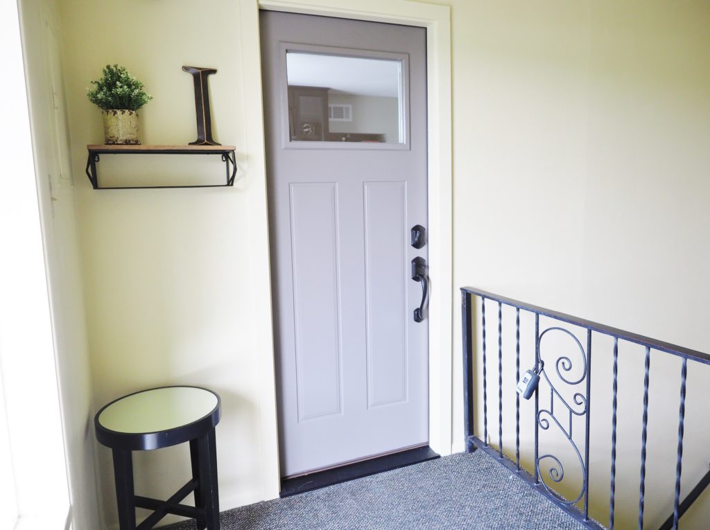
Since the exterior is the first thing a buyer will see, I did as much as I could to create curb appeal. Nothing is going to change the fact that the building was built in the 1960s. Even so, a freshly painted door and new exterior light fixture, manicured shrubs and the addition of drought-resistant lantana in the flower bed did wonders for the previously dreary exterior. For the entry into the unit itself, a new door, hardware, and the addition of an exterior light added personality. We also put up shelving to make the entrance welcoming.
Staging helps homes sell
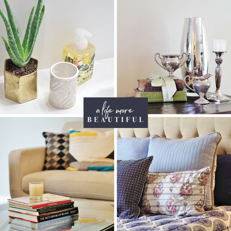
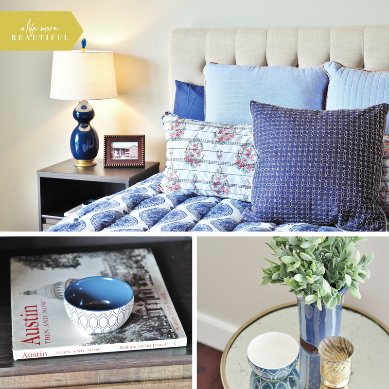
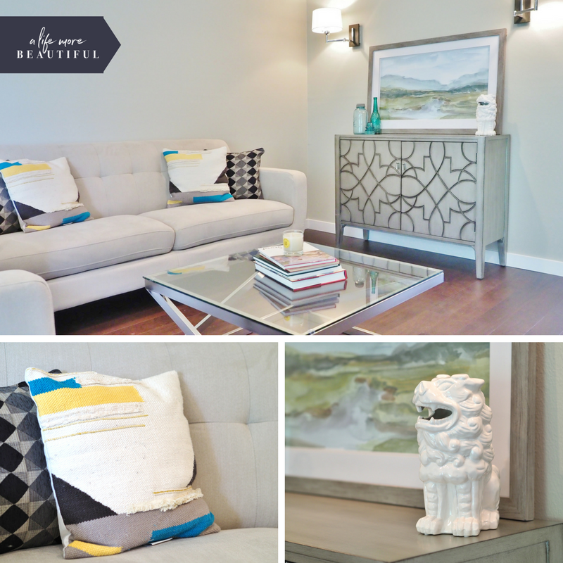
While an empty house often sells just fine, studies show that staged homes sell faster and for more money. Staging helps potential buyers envision how space can be used, how they might live there, and so on. I’ve considered becoming a certified stager, so since this was our own project I did the staging myself. I rented the large pieces of furniture, borrowed some things from my own home, and purchased a few other items. Oddly, I found all of the bedding components at different stores, but I’m loving how it turned out. I may end up putting it in rotation at my own home. Ha!
While I enjoy designing with existing decor, it was refreshing to tackle a project from scratch. Nothing beats a clean slate. Here is a sample of some of the staging work at the condo.
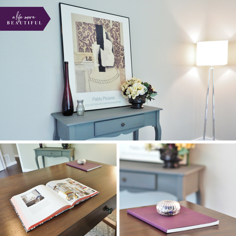
And now we wait
And that’s it! Now we hope for a buyer to come along and love the place as much as we do. Paul and I are in a tug-of-war about selling or leasing the property. If we don’t get an attractive offer in the coming weeks we’ll add this to our portfolio of rental properties. But….that means we won’t have the funds for another flip. This project reinforced how much I enjoy flipping houses, so I’m pushing to sell. I’d be grateful if you’d help spread the word to any interested buyers!
If you want to see more, check out the property tour.
[1] Folks, if you are going to sell your home, find a Realtor that will invest the time and money it takes to market your home properly. I’m talking about 40+ professional photographs, a stager, video marketing, and more. That’s standard at Homesville, and I get mad when I see other agents do a poor job for their clients. You deserve better!
Warm regards,
Marquette
© 2017 | A Life More Beautiful
The post Flipping houses in Central Austin appeared first on A Life More Beautiful.
]]>