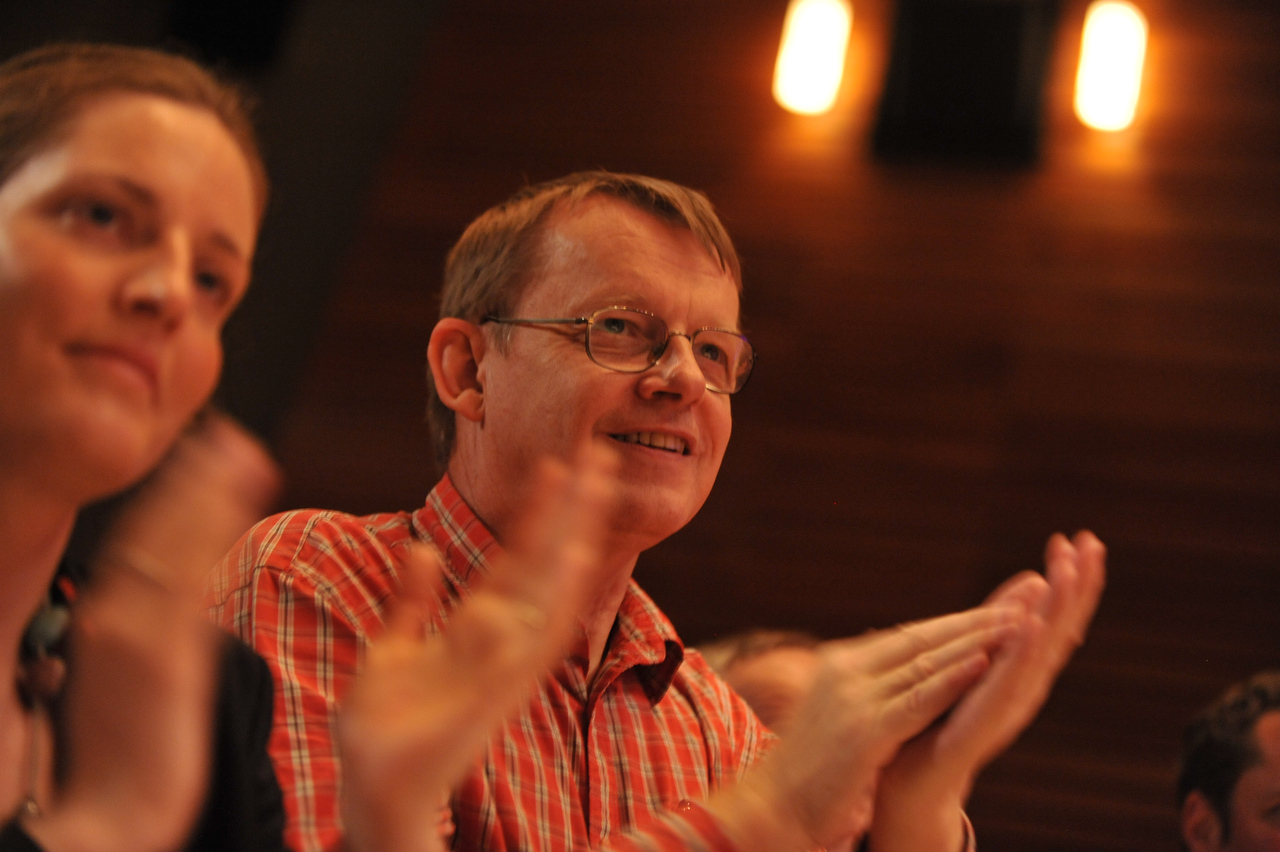
Hans Rosling. Credit: TED / James Duncan Davidson
I was there when Hans Rosling first shook the room at TED, and transformed tiresome medical statistics into an action-packed, live performance about real people’s lives on the line.
He’s since been namechecked by Bill Gates. And he outlasted Fidel Castro – twice. Not merely mortally. In an interview on the TED Blog, Hans recounts an all-night argument with the Cuban dictator that upended the country’s healthcare system.
At our second encounter, shortly after the launch of TED Talks, Hans pulled up a chair and sat down by my side to ask about the instant replay I’d inserted into his presentation. He listened to my answer attentively, then shared his greatest secret as a speaker, a secret he had refined over years of teaching with a sportscaster’s exuberance: “I must strike a delicate balance,” he explained, “Too much data, and I become boring. But too much humor, and I am a clown.” He drew diagrams.
His ideas spilled forth with lucidity, seemingly effortlessly, because he loved what he did, and he worked with the people he loved. He couldn’t wait to share his latest revelations with everybody at every opportunity: He evaded bribery in some of the more corrupt corners of the world by showing off printouts of his data, page by page, until local interlocutors would release him, either out of inspiration or sheer exhaustion — but never confusion.
Years after we first met, Hans showed up at my door one night with a toothbrush and a laptop full of data visualizations, announcing himself as my roommate, staying up all hours to work out the particulars of his latest presentation. And I told him that my favorite part of any of his TED Talks, the bit that gives me chills to this day, was something that could easily go unnoticed, from that very first speech comparing the developed world to the developing world, when, about four minutes in, he leans in to take us on our first journey through time, and he says, “Let’s see,” to an unsuspecting audience, “WE START THE WORLD.”
— Jason Wishnow
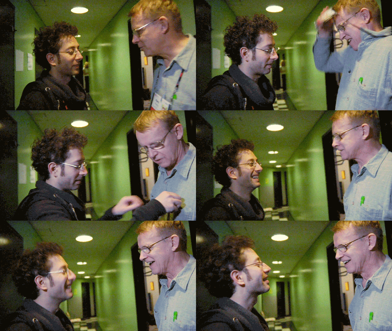
TED’s founding director of film + video, Jason Wishnow, gives Hans Rosling some presentation tips backstage at TED in Long Beach. Image courtesy M ss ng P eces and Jason Wishnow
]]>
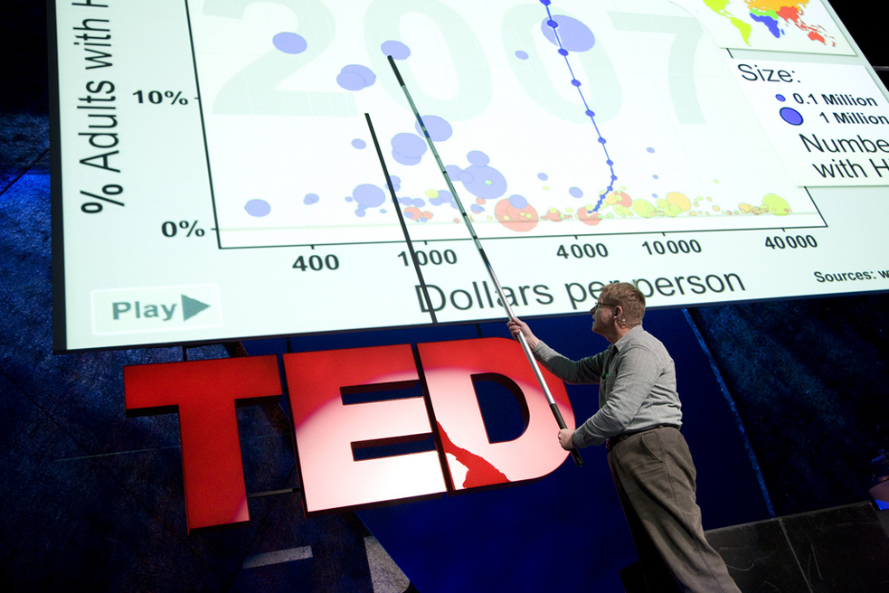
Bounding up on stage with the energy of 1,000 suns and his special extra-long pointer, Swedish professor Hans Rosling became a data rock star, dedicated to giving his audience a truer picture of the world. Photo: Asa Mathat
Is the world getting worse every day in every way, as some news media would have you believe? No. In fact, the most reliable data shows that in meaningful ways — such as child mortality rate, literacy rate, human lifespan — the world is actually, slowly and measurably, getting better.
Hans Rosling dedicated the latter part of his distinguished career to making sure the world knew that. And in his 10 TED Talks — the most TED Talks by a single person ever posted — he hammered the point home again and again. As he told us once: “You see, it is very easy to be an evidence-based professor lecturing about global theory, because many people get stuck in wrong ideas.”
Using custom software (or sometimes, just using a few rocks), he and his team ingested data from sources like the World Bank (fun story: their data was once locked away until Hans’ efforts helped open it to the world) and turned it into bright, compelling movable graphs that showed the complex story of global progress over time, while tweaking everyone’s expectations and challenging us to think and to learn.
We’re devastated to announce that Hans passed away this morning, surrounded by family. As his children announced on their shared website, Gapminder: “Across the world, millions of people use our tools and share our vision of a fact-based worldview that everyone can understand. We know that many will be saddened by this message. Hans is no longer alive, but he will always be with us and his dream of a fact-based worldview, we will never let die!”
]]>“I firmly believe that nonprofit organizations should magnify their impact by collaborating wherever their aims align,” says Andy, one of TED’s Wikipedians-in-Residence.
Andy works as a consultant, advising organizations about Wikipedia, Wikiquote and numerous other Wiki-projects run by the Wikimedia Foundation, including a program known as the GLAM-Wiki Initiative. GLAM stands for “Galleries, Libraries, Archives and Museums,” and it pairs experienced Wikipedia editors with nonprofit cultural institutions — like TED, which fits under the “archive” category of GLAM’s acronym.
What’s in the archive that TED is sharing with the Wiki editors? A collection of metadata around our 2,000+ TED Talks — headlines and descriptions, tags, speaker names and more — which will become part of the Wikidata bank, and can be used to add all kinds of information and detail to Wiki pages.
So TED has hired Andy and his fellow veteran Wikipedia volunteer, Jane, to work part time for six months to help connect TED’s data with Wikipedia. Their goal: to motivate their fellow volunteers to add new articles about speakers and topics that TED covers, and to add new links into existing articles where TED’s data would add knowledge. As well, they’re hoping to inspire people to translate pages. Think of Andy and Jane as the face of TED in the Wikipedia community, liaisons who understand the nuances and sensitivities that come with being a part of such a dedicated and hardworking collective.
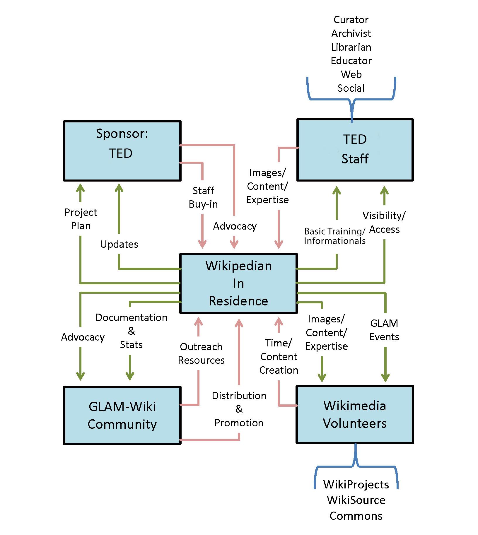
This complex-seeming workflow for linking TED’s metadata to Wikipedia, encouraged and assisted by TED’s Wikipedians-in-Residence, is how Wikipedia works — many hands, many lines of communication and many ways to contribute. Based on original diagram by Lori Byrd Phillips; edits by Sacha Vega for TED.
To break down the diagram: TED donates metadata (images, content) to the Wikipedians-in-Residence who then upload this information to Wikidata, which allows fellow Wikimedia volunteers to easily access these details and update or create articles. In return for the data, Andy and Jane share their expertise with the TED staff through informationals and basic Wikimedia training. Occasionally, the Wikipedians-in-Residence may hold a GLAM event. These events can range from competitions to hackathon-style tasks to further encourage participation with the project.
Andy and Jane are working for and getting paid by TED, which is made immediately clear to the Wikimedia community. “Though they have different approaches, TED and the Wikimedia community both want to make knowledge available, multilingually,” Andy says via email. “I want to help both organizations to do that in partnership, and to help each community to understand the other.”
“The advantage of working in Wikidata is that everyone can work there in their own language,” Jane says. “This enables easy access to information across all language Wikipedias. Central discussions are still in English, but when we link to things, they show up in the user’s own language.”
Why can’t TED just edit Wikipedia on its own? Well, the Wikipedia community and the Wikimedia Foundation have set up policies to limit organizations from editing their own pages — no matter the intention, good or bad. Giving a business unrestricted access to its Wikipedia page could result in a constantly evolving advertisement, possibly transforming much of the site into a black hole of never-ending marketing copy.
The Wikimedia ethos is about maintaining a collaborative and transparent digital climate. And Wikipedia as a whole is its own galaxy. Collaborating with people who are intimately familiar with its layout and peculiarities, while bringing perspectives from numerous cultures, languages and fields of expertise, allows for an organic cross-pollination of information.
Over time, as speaker pages are created and articles updated, TED’s Wikipedians-in-Residence will be able to identify gaps in TED’s past and present coverage, and reflect back to TED what they see. Meanwhile, they can generate calls to action to the Wikipedia community – via project pages, discussion boards and on their personal profiles – to fill in the lightly covered areas, no matter the topic.
Which suits these volunteers fine. “My favorite part of being a Wikipedian is learning more about what interests me,” Jane says.
There are a lot of kindred spirits among the TED and Wikimedia communities, people committed to the spreading and sharing of knowledge. This collaboration is all about sending a probe into the farthest corners of Wikimedia — finding those who are interested in helping to further TED’s mission of ideas worth spreading.
]]>This week, Apple turned the iPhone into a medical research tool with the launch of ResearchKit. This open-source framework, described in the video above, lets a medical researcher set up a project to gather anonymous patient data on diseases like asthma, breast cancer and diabetes. Using their own smartphones, patients who join a project can monitor their symptoms on a regular basis — while contributing their data to researchers working to cure their condition. ResearchKit makes it possible to generate large, wide-ranging datasets about the day-to-day of disease.
ResearchKit launched with a set of five apps, including the Parkinson’s mPower app, developed by Sage Bionetworks. This app builds on the work of applied mathematician and TED Fellow Max Little. At TEDGlobal 2012, Little (watch his talk: A test for Parkinson’s with a phone call) made headline news when he launched the Parkinson’s Voice Initiative, a data-gathering project that aimed to develop a quick and non-invasive way to detect the disease with a phone call. Since then, Little, along with collaborators in the US, has been creating Android-based apps for monitoring Parkinson’s symptoms and gathering data for research. These apps have been used to record symptoms from thousands of participants in studies in the UK and US, leading to hundreds of gigabytes of data about Parkinson’s — which may open up entirely new scientific understanding about the disease.
We asked Little to tell us how his technologies got ported to ResearchKit, and how this could take his work to the next level.
How did you get involved with developing a Parkinson’s app for ResearchKit?
Apple was really impressed with the research work I’ve been doing over the last three years on apps for monitoring symptoms of Parkinson’s. We’d been using voice recording over mobile phones since 2012, of course. We’d also developed touch-screen tapping tests and walking and balance tests using the accelerometer in the smartphones. We’d been able to show in small pilot studies that we can predict symptom severity and very accurately detect who has Parkinson’s using these apps.
We were looking to run studies on larger populations to see if it would work on a larger scale — essentially what we were doing with the PVI project, but using smartphones. My collaborators and I developed apps on Android, but Sage Bionetworks wanted to replicate it on iPhone. So Sage built the mPower app on top of Apple’s ResearchKit API, embodying many of the tests that we’ve been developing over the years.
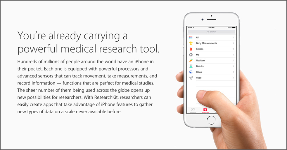
Apple’s ResearchKit turns the health data collection capabilities of the iPhone into a medical research tool. One of the first apps on the platform takes TED Fellow Max Little’s work to the next level.
What exactly does mPower do?
mPower is an entirely remote recruitment and objective sensor data collection app, tailored specifically for Parkinson’s research. It’s designed to capture objective data about the disease using daily tests such as voice, walking, balance and manual dexterity, all using the basic functionality of the iPhone.
What difference do you think it will make to your research to have these tests running on iPhones? And what does this mean for the future of medical research in general?
Since the launch of mPower earlier this week, they’ve been able to recruit nearly 8,000 participants — so it looks like the data collection is going fantastically well!
mPower has tremendous potential for speeding up discovery of medical and biological knowledge about Parkinson’s. Having symptom tests like this on iPhone opens up the whole, non-Android half of the world’s smartphone users. Apple’s enormous reach — around 700 million users — poses an extraordinary opportunity for researchers to gather objective symptom progression data from a sizable fraction of all Parkinson’s patients all over the world. It’s not often that researchers can set up studies that have essentially zero cost, yet are able to recruit subjects in the thousands in a matter of hours.
For example, we don’t yet know what causes Parkinson’s, but we do know it can’t be entirely genetic, behavioral or environmental. So it’s not enough to study the biological/genetic side alone. We really have to gather detailed knowledge about behaviour and the environment of each patient. With objective testing using smartphones, we can more fully complete the scientific picture.
]]>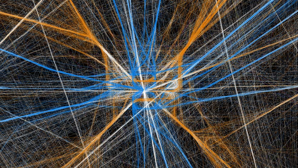
This image looks like a random assortment of blue, yellow and white string. But the lines actually visualize ascending and descending flights into and out of an airport, showing the air traffic control patterns that emerge over time. Courtesy of: Aaron Koblin
We live in a sea of data — and visualizations can help us understand the movement of individual waves. Great data visualizations can gather up enormous volumes of information, revealing the (sometimes sublimely beautiful) patterns underneath.
Next week at TED2015, Manuel Lima (founder of Visual Complexity) will explore how one particular data representation — the branching tree — has evolved over the past 900 years. Yes, data viz has been around for nearly a millennium.
And, of course, data visualizations are a big part of TED Talks, whether they map neuron activity inside our brains or trace crowdsourced drawings of Johnny Cash. Below, 8 of our favorites.
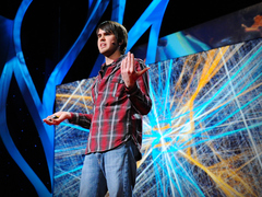
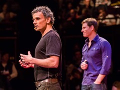 Eric Berlow and Sean Gourley: Mapping ideas worth spreading
Eric Berlow and Sean Gourley: Mapping ideas worth spreading
Eric Berlow and Sean Gourley: Mapping ideas worth spreadingThe event: TED2013 What they’re illustrating: Ecologist Eric Berlow and data scientist Sean Gourley met at TED and discovered that their talks — on the data and ecology of war — were connected. They decided to map a wide variety of interlocking ideas, using TEDx talks as their data set. Most eye-popping moment: At 2:57, talks (represented as nodes) spin and cluster into a multicolored 3D visual map of the TEDx universe. |
 Nathalie Miebach: Art made of storms
Nathalie Miebach: Art made of storms
Nathalie Miebach: Art made of stormsThe event: TEDGlobal 2011 What she’s illustrating: Using strings and beads, Nathalie Miebach translates weather data into woven sculptures — and then uses the sculptures as a basis for musical scores. Most eye-popping moment: Check out the detailed close-ups starting at 3:32, but don’t miss the brief string quartet rendition of her score in the opening shot. |
 Aaron Koblin: Visualizing ourselves ... with crowd-sourced data
Aaron Koblin: Visualizing ourselves … with crowd-sourced data
Aaron Koblin: Visualizing ourselves ... with crowd-sourced data
Aaron Koblin: Visualizing ourselves … with crowd-sourced dataThe event: TED2011 What he’s illustrating: Artist Aaron Koblin starts simply enough, with elegant, illuminated maps showing U.S. flight path patterns. But his crowdsourced illustration projects quickly lead us into strange and uncharted visual territory. Most eye-popping moment: At 13:08, Koblin plays a clip from his music video for a posthumous Johnny Cash track, using thousands of web-sourced, frame-by-frame Flash drawings to build a hypnotic and moving portrait of the country legend. |
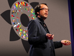 David McCandless: The beauty of data visualization
David McCandless: The beauty of data visualization
David McCandless: The beauty of data visualizationThe event: TEDGlobal 2010 What he’s illustrating: The glut of information in our world clouds our understanding of current events. Data expert David McCandless shows how infographics help us make sense out of statistics. Most eye-popping moment: At 2:07, McCandless provides a sobering and simple graphic to illustrate the catastrophic impact of the 2008 financial crisis. |
 Carter Emmart: A 3D atlas of the universe
Carter Emmart: A 3D atlas of the universe
Carter Emmart: A 3D atlas of the universeThe event: TED2010 What he’s illustrating: Oh, the entire known universe, circa 2010 Most eye-popping moment: We pan up from the peaks of the Himalayas to the edge of the cosmos in less than 7:00. You’re really going to want to see the whole thing. |
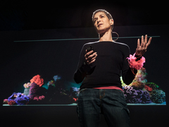 Margaret Wertheim: The beautiful math of coral
Margaret Wertheim: The beautiful math of coral
Margaret Wertheim: The beautiful math of coralThe event: TED2009 What she’s illustrating: Using knitting techniques derived from mathematical algorithms found in natural forms, Margaret Wertheim and her collaborators crocheted a jaw-droppingly accurate re-creation of a coral reef. Most eye-popping moment: From 1:19-1:55, we get a slideshow picturing Wertheim’s “corals” in breathtaking detail, revealing both their mathematical structure and their eerie realism. Don’t be surprised when you reach for your snorkel. |
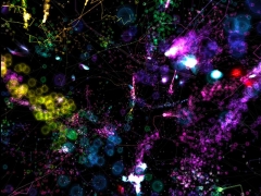 JoAnn Kuchera-Morin: Stunning data visualization in the AlloSphere
JoAnn Kuchera-Morin: Stunning data visualization in the AlloSphere
JoAnn Kuchera-Morin: Stunning data visualization in the AlloSphereThe event: TED2009 What she’s illustrating: Using two giant, suspended hemispheres as a projection surface, the AlloSpere allows scientists and artists to get inside their data visualizations — literally. JoAnn Kuchera-Morin takes us on a tour. Most eye-popping moment: Although the fly-through of a graphically reconstructed human brain will have you ducking for cover, the electron spin model at 4:11 rivals anything from the finale of Kubrick’s 2001 for sheer kaleidoscopic impact. |
 Chris Jordan: Turning powerful stats into art
Chris Jordan: Turning powerful stats into art
Chris Jordan: Turning powerful stats into artThe event: TED2008 What he’s illustrating: Chris Jordan documents the excesses of modern culture with seemingly innocuous, decorative art that takes a dark turn as we examine its components more closely. Most eye-popping moment: Six minutes in, we see a breast, constructed from a minutely detailed mandala of 32,000 Barbie dolls — one for each of the breast augmentation surgeries performed every month in the U.S. in 2008. |
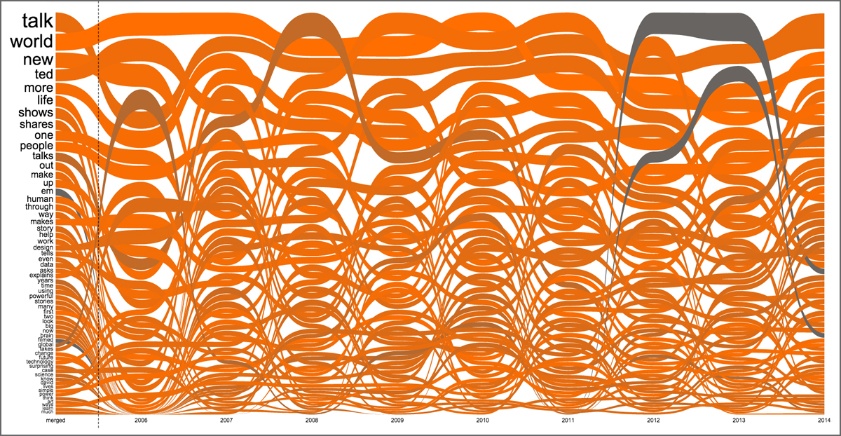
This interactive graph shows the most popular words in TED Talk descriptions over time. Click on the image to explore the visualization. Created by: Santiago Ortiz
At first glance, the image above may look like an artistic tangle of worms. But it is actually a visualization of the words that appear most often in TED Talk descriptions. Each line corresponds to a word, and its snaking movement shows how its frequency of use has changed over time. Mouse over the word “work” and you can see that the line plateaus in 2007 and 2008, then stairsteps down from there. Meanwhile, the line for the word “brain” serpents its way to an all-time high this year.
This is one of the latest works from Santiago Ortiz, an information visualizer who lives in a small town in Argentina. On the website Moebio.com, he posts what he calls “experimental experiences with data” that run the gamut from Twitter conversations represented as stars in a galaxy to a brightly colored stream of the major players in The Iliad.“One of my specialties is networks of people who are connected by texts, by speech, by messages,” he says. “It’s a mixture of network analysis and text analysis. I studied mathematics — but before that, I studied music. I was always interested in using mathematics in creative ways.”
Ortiz has been visualizing TED Talks since 2007, when he was working for the Spanish data agency Bestiario and created “The TED Video Sphere.” This sphere organized all the talks available at the time into a globe, with a spiderweb of lines noting connections between talks. Click on a talk and it spins to the center of your screen, like a merry-go-round of ideas. Mouse over the lines, and you see information on how talks are related. You can view this sphere from the inside or from the inside — and you can zoom in to see the details or stay zoomed out to see the whole system.
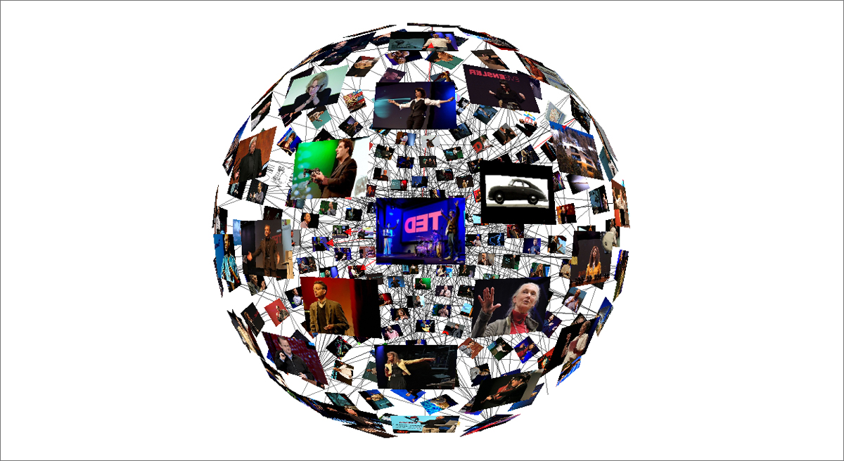
Take the “TED Video Sphere” for a spin—literally— by clicking on the image. Created by: Santiago Ortiz, copyright Bestiario 2009
“At the beginning, I used to watch basically every TED Talk, but that became impossible,” he says. “So I thought about an explorative serendipity interface. I thought it would be interesting as a way to discover new talks.”
When it came time to choose a shape, the answer was obvious to him. “[A sphere] is a good metaphor,” he says. “A sphere is a good geometrical archetype for a community in which everyone is in the center, in a way. Connections are the core of this community.”
To create the sphere, Ortiz built a crawler to go to all pages of TED.com and gather data. As such, the sphere hasn’t been updated with talks published since it was created. “It’s a photograph of that moment,” he says.
Ortiz used a different method to create his newest visualization, which he calls “TED Word Flows.” He coded it using a spreadsheet we update daily with each new talk, so that it’ll always stay current.
“For this one, I took all the short summaries of talks and made an analysis,” explains Ortiz. “You can roll over a word and see how the word has been mentioned different amounts of times throughout the years.”
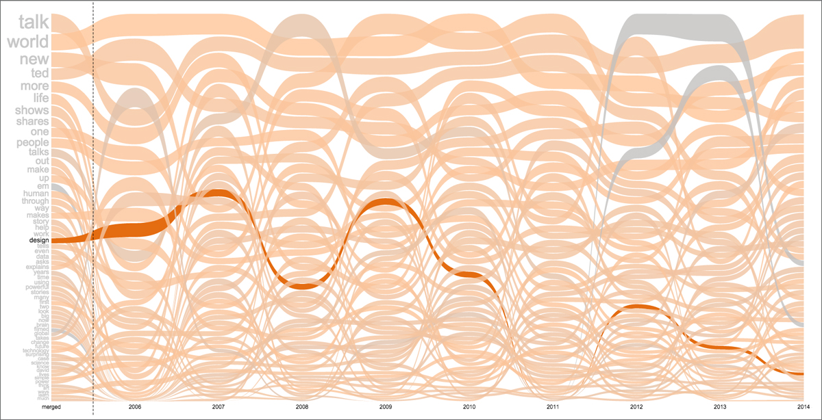
This is what happens when you mouse over a word in this data experience. Created by: Santiago Ortiz
When he finished the initial coding for this project, Ortiz was surprised to see the lines that emerged. “You create very simple rules that connect the data with the graphical expression,” he says. “Sometimes you expect something linear and what you get is something exponential; sometimes you expect something exponential and it’s linear.” While he’d thought he’d see wild variations in every line — and to see new words pop into the graph each year — he saw remarkable consistency over time.
Of course, there are exceptions. And for the words in the flow that showed change over time, Ortiz had fun thinking about what might have happened. “The [words] can be a mirror, or the anti-mirror of reality,” he says. He points out the line for the word ‘global,’ which peaks in 2006 and then more or less disappears. “Maybe in the first year of TED.com, a lot of people used the word ‘global’ because that was the intention. But then TED went global and because it was so evident that it was global, the word just lost meaning. The drop of the word represents almost the opposite of reality.”
Before Word Flows, Ortiz visualized the most common words in TED Talk descriptions in a cloud form. “It’s beautiful as a three-dimensional object, but it’s not the best visualization because you have to navigate a lot to actually read it,” he says. “You get lost in the words.”
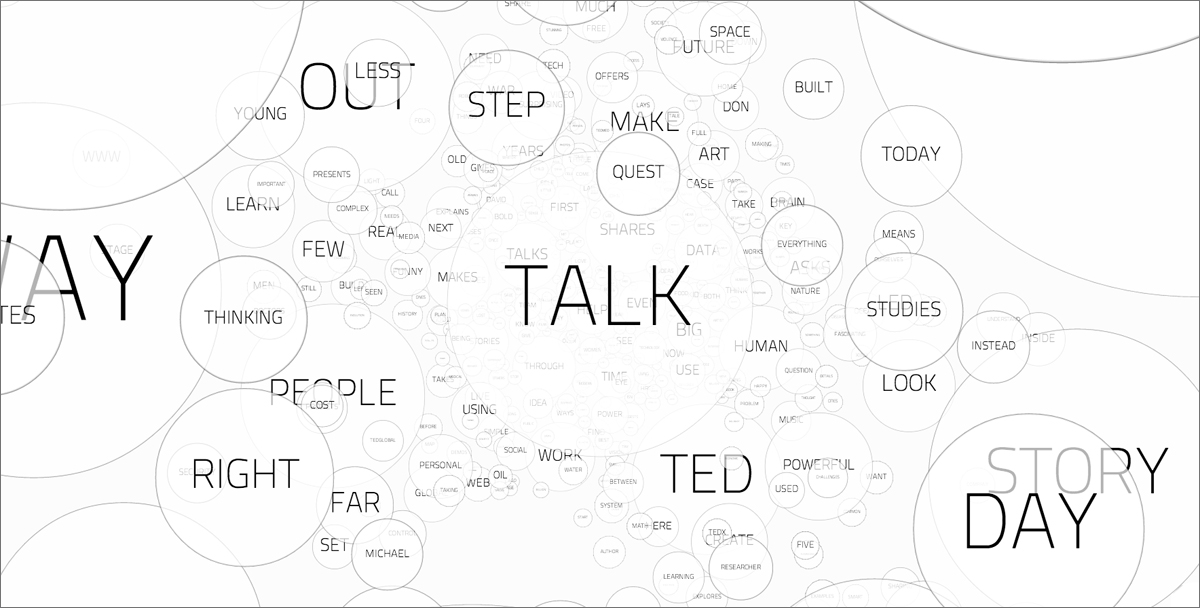
Take a journey through the most popular words in TED Talk descriptions. Created by: Santiago Ortiz
Ortiz says that he is far from done creating visualizations from TED Talk data. He says that he is already at work on a new piece—one quite vast in scale. The idea is to somehow show the talk descriptions as a heat map, noting hot words that connect to other talk descriptions. He envisions a new way to navigate through the TED library. “You will see the connected texts arrive and can click and then go and see the video,” he says. “With some collaboration, I could actually embed the videos in the visualization and make a big interface with all of the talks.”
Stay tuned. We’ll share new experiences from Ortiz on the TED Blog.
Fanfare shares art, music, video remixes and more created by TED fans around our content. Have something you’d like to share? Write kate@ted.com and tell her about it.
]]>.
Artist Julie Freeman creates kinetic sculptures, compositions and animations from nature-generated data. Think: the motion of fish swimming, or the quiver of moths’ wings. This week, Freeman revealed a new piece of work from the TED Fellows stage. Called “We Need Us,” it’s an online, data-driven artwork that explores the nature of metadata. It’s now live on The Space, a new website for digital art funded by the BBC and Arts Council England.
We asked Freeman to tell us about what we can learn from experiencing data, rather than simply gleaning information from it.
You are known to make art using data from natural sources. Where is the data for “We Need Us” drawn from, and how is it different?
This metadata comes from a citizen science website called the Zooniverse, which allows people to classify large data sets from all the over the world. Volunteers from all walks of life come together to do this in a very altruistic manner, helping scientists complete extremely labor-intensive tasks, freeing them up for other research and analysis.
Essentially, I use data as an art material. I take the metadata looking at Zooniverse user activity, and how they’re interacting with the site. I manipulate and process the data, and then that’s used to control the animations and sound compositions, which are made of field recordings.
What did you record?
All sorts of stuff – underwater sounds, recordings of the environment, of birds, insects, buildings, machines. Anything.
How is this different from straight-ahead data visualization?
Traditional data visualization is about how we understand data and the information it contains. What I’m doing is a lateral way of looking at data. How can we experience it? How can we feel it, and what does it mean to think about the life of data — how it lives, and what the dynamics within it are?
What is the structure of this piece?
The work is made up of 10 different scenes, if you like, and each scene relates to a project on the Zooniverse website. There’s one called Snapshot: Serengeti, for example, where volunteers look at photographs taken by motion-triggered cameras in the Serengeti, to help classify the animals appearing in the photograph — say a bison or antelope. But I’m not so much interested in the animals as taking the data of the people classifying the data. What do they click on? When do they click on it? Where are they from? Using that data, I animate an abstract illustration drawn from references to the Serengeti. The sounds are things like flies buzzing, grasses in the wind, bison making weird noises.
Robert Simpson of the Zooniverse is a TED Fellow. What was the impetus for collaborating with him?
Robert and I met at TED2014 in Vancouver, and when he told me about Zooniverse, I thought, “I’ve got a great idea!” At the time, The Space — which is a new online platform for data-based artwork — had approached me as a curator. I said, “Actually, I’m an artist that works with digital technologies and would like to make a work with Zooniverse data.” They loved it, so they, along with the Open Data Institute, commissioned the piece.
And as a scientist, what does Robert think about what you’re doing?
He thinks it’s brilliant. Interestingly, a group of scientists are working with exactly the same data that powers my artwork, but they are looking at how communities come together to collaborate, to solve problems. But I’m using the data for art, and they’re using it for proper social science reasons. It’s nice to know that this pot of data is being used by different people for different outcomes. Basically both projects are about the humanity in technology, exposing the altruism of how people use the web, and what we can learn from that.
To view “We Need Us,” visit TheSpace.org/WeNeedUs. To learn more about Robert Simpson and the Zooniverse, read our post: You found a planet!: Robert Simpson crowdsources scientific research
]]>
Jean-Baptiste Michel’s “I wish I could be exactly what you’re looking for” (2014). The words that appear in it are tweets that start with “I wish.” Photo: Courtesy of Jean-Baptiste Michel
Jean-Baptiste Michel has sold a small sculpture to the Whitney Museum of American Art. A major museum acquiring a piece—that’s a big moment for any artist. But this sculpture is the very first piece of art Michel ever created.
 Jean-Baptiste Michel + Erez Lieberman Aiden: What we learned from 5 million books
Michel is the data researcher who showed what you can learn using Google’s Ngram Viewer at TEDxBoston in 2011, and who calculated the mathematics of history at TED2012. He credits one thing with inspiring him to take his love of data and turn it into art: joining the TED Fellows program.
Jean-Baptiste Michel + Erez Lieberman Aiden: What we learned from 5 million books
Michel is the data researcher who showed what you can learn using Google’s Ngram Viewer at TEDxBoston in 2011, and who calculated the mathematics of history at TED2012. He credits one thing with inspiring him to take his love of data and turn it into art: joining the TED Fellows program.
“I’m not an artist. I never thought that I could do anything in that area,” says Michel, in the Brooklyn office space he shares with several other TED Fellows. “I really consider this a very direct consequence of my being a TED Fellow because I was not exposed to this kind of world before—I was in dry academia. The ability to just bring to life the other aspects of our creativity is something [I learned from] seeing what the Fellows were doing, and understanding their very down-to-earth, no-fuss approach to doing things. Just trying stuff and seeing if it works.”
The 10×15 sculpture acquired by the Whitney at first looks like a shiny square of hot pink lacquer. In the corner is a small screen, which flashes with sentences like, “I WISH I could record my dreams and watch them later” and “I WISH you could delete feelings.” These sentences are real-life tweets, starting with the words “I wish,” posted by people around the world. Michel says there are several thousand of these tweets every minute—a Raspberry Pi behind the display selects a small group every 30 seconds, and changes which ones are shown every five. Michel named the piece “I wish I could be exactly what you’re looking for,” after one of his favorite tweets it has displayed.
The idea behind the piece is to take a set of big data—all the tweets containing these words—and to create an intimate connection with its smallest pieces. “I was not expecting that [the tweets] would be so meaningful. It’s actual emotions, people’s inner desires on display,” says Michel. “What I was used to looking at before was the breadth—it’s big data, so you measure volumes, and what you see is patterns … What I was interested in here was the contrary—going back to that individual thing that this pattern came from. I wanted to show the original intent, the original thought itself.”
Michel got the idea for how to achieve this goal after seeing others in his office playing with Arduino and Raspberry Pi.
 Massimo Banzi: How Arduino is open-sourcing imagination
But creating a beautiful object—one embedded with electronics—was very new to him. Many people in his office space lent a hand to help him clarify the idea, order the right materials and figure out how to use tools. TED Fellow James Patten was especially helpful on all these fronts.
Massimo Banzi: How Arduino is open-sourcing imagination
But creating a beautiful object—one embedded with electronics—was very new to him. Many people in his office space lent a hand to help him clarify the idea, order the right materials and figure out how to use tools. TED Fellow James Patten was especially helpful on all these fronts.
Excited by what he saw developing, Michel created several other pieces in line with the first: “I want to be your idea of perfect” (which displays on a long, thin screen akin to a stock ticker) and “I need to go away for a while” (set into a block of wood). Just last week, Michel made his newest piece, called “It’s time to try defying gravity,” which he built inside a vintage flip clock. As Michel walks by his desk, the piece displays the words, “IT’S TIME for another tattoo.”
Michel, who recently published the book Uncharted and is focusing on a new venture Quantified Labs, typically only displays his art at home and in his office. It was another TED connection that led to the Whitney purchasing “I wish I could be exactly what you’re looking for.” One day, Marc Azoulay—studio director for TED Prize winner JR—came by Michel’s apartment, and gravitated toward the piece. He suggested that Michel display it as part of his exhibit exploring the interplay between public and private at the SPRING/BREAK Art Show in New York. It was there that a curator at the Whitney saw the sculpture and brought it to the museum’s buying committee.
Last week, Michel visited the Whitney to make sure all parts of the piece were working properly. “This continues to baffle me day in and day out,” he says. “This is the first piece that I made—I’m just still very surprised. It’s extremely lucky.”
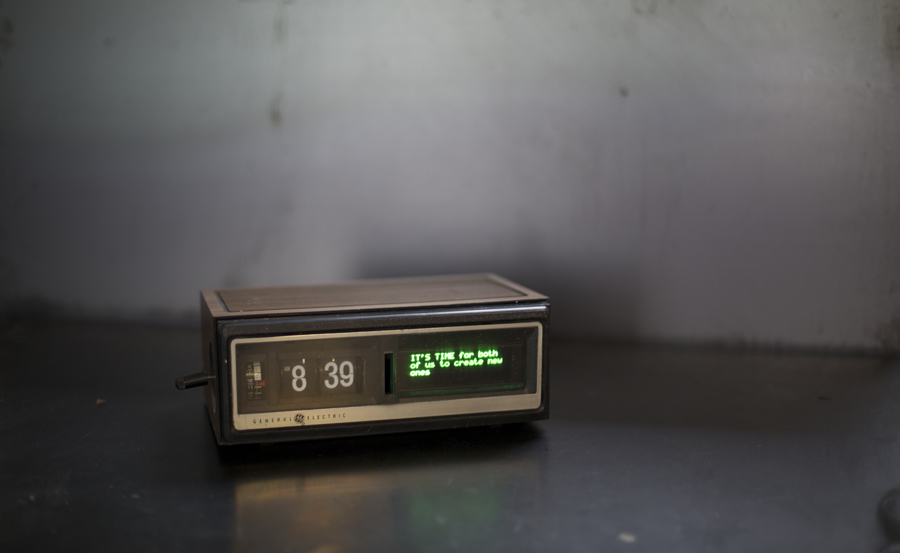
Jean-Baptiste Michel’s latest work, “It’s time to try defying gravity” (2014), which he built into a vintage clock. Photo: Courtesy of Jean-Baptiste Michel
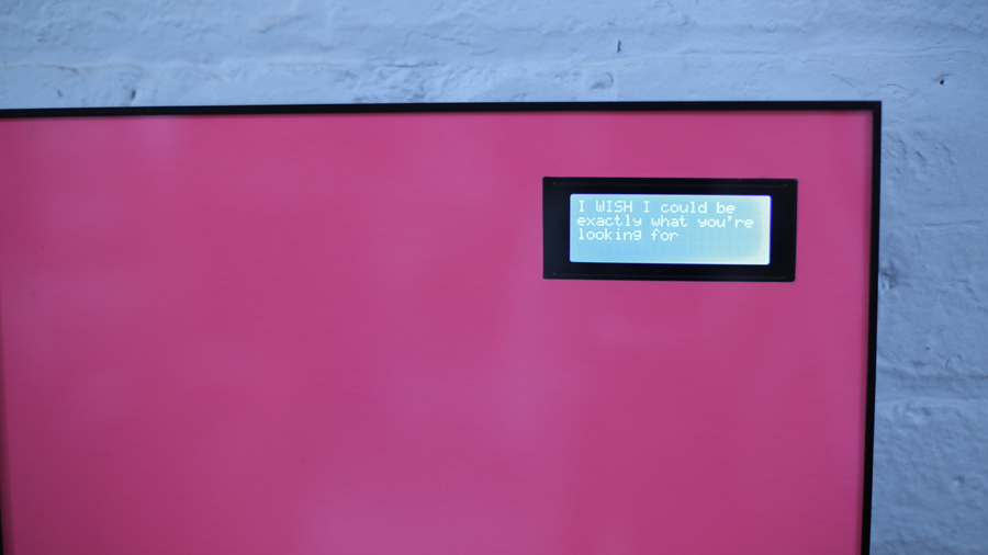
A closer look at “I wish I could be exactly what you’re looking for” (2014). Photo: Courtesy of Jean-Baptiste Michel

Another in the series, called “I need to go away for a while” (2014). Photo: Courtesy of Jean-Baptiste Michel
What’s this galaxy-like cluster of dots and lines? It’s the TED Fellows Collaboration Network MAPP, a rich and interactive web that shows the patterns of cross-disciplinary collaboration among TED Fellows over the past four years. This rainbow visualization was created using MAPPR, a cloud-based network mapping tool that Eric Berlow demoed during TED2014. It allows anyone to make shareable, interactive network visualizations.
The TED Fellows program began as a way to support and amplify the work of thinkers and innovators through the conference. But then something unexpected happened – the professionally diverse community, which includes scientists, makers, activists, artists, technologists and more, became its own living, breathing organism. Fellows began reaching out to each other for all manner of cross-disciplinary collaborations. A few examples include:
- Filmmaker and sitar player Andrew Mendelson working with open-hardware guru Catarina Mota to incorporate programmable Arduino-powered tuners on his Carbon Fiber Sitar project.
- Satirist and designer Safwat Saleem working with applied mathematician Max Little to help make all the visuals for his TEDMED talk on his revolutionary work to blend math and data science for the advancement of medicine.
- Microbial ecologist Jessica Green collaborating with photojournalist John Adam Huggins and filmmaker Anita Doron to create a sci-fi graphic novel about the human microbiome set in Paris.
-
Tissue engineer Nina Tandon writing a TED Book with architect and futurist Mitch Joachim called Super Cells: Building with Biology.
-
Social media entrepreneur Suleiman Bakhit collaborating with strategist Adrian Hong during the Libyan revolution in 2011, to help open the door for the evacuation of tens of thousands of injured civilians and provide them with urgent medical care in Jordan. This collaboration had to be kept secret to avoid retaliation from the Libyan regime; it was mentioned publicly for the first time on the TED Fellows stage in Vancouver this year.
-
Bakhit also happens to be working with neuroscientist and poet Ivana Gadjanski to turn one of her poems into a comic book.
A whopping 84% of the Fellows documented in the collaboration network had at least one cross-disciplinary collaboration. And MAPPR itself is a creative collaboration among three Fellows: ecologist and network scientist Eric Berlow, artist/designer David Gurman and computer scientist Kaustuv DeBiswas, who together launched Vibrant Data, a data storytelling boutique in San Francisco’s Chinatown. They’re now focused on building MAPPR to enable the understanding of complex networks. Custom projects include mapping the collaboration network of faculty at the University of California, Berkeley, and visualizing the ecology of human creativity.
We asked Berlow to tell us more. Below, an edited transcript of our conversation.
What is MAPPR? What does it do?
It’s a cloud-based tool that lets anyone publish interactive visual stories about how things are connected. These network stories can be about anything — from the network structure of collaborations as with the TED Fellows, to identifying patterns of funding among donors and grant recipients, to unraveling the complexity of conflict. In one of our recent projects, we have mapped the conflict in Syria (see below), in collaboration with Vibrant Data’s conflict analyst, Scott Field. The Syrian civil war is widely regarded as the defining political crisis for the future of the Middle East. One of the main reasons it will be so hard to resolve is that is not a “stand-alone” conflict, but involves a complex intertwining of the vital strategic interests of all major powers that make up the regional security system. The Vibrant Data team aggregated expert analysis of the conflict to visualize that tangle of interests and identify its emergent structure. We hope that visualizing the structure of this conflict—and others—might help suggest pathways to resolving them sooner.
How does MAPPR work and who can use it?
MAPPR allows you to upload custom datasets of relationships and publish them as online custom network visualization stories. Each node and link in the network can be its own multimedia microsite. For example, in the TED Fellows collaboration network, each node can contain people’s bios, images, videos and so on, and each link can display multimedia information about that specific collaboration.
Network visualization isn’t new, but it has remained relatively inaccessible to non-experts. Anyone can use MAPPR. It’s designed to make network science accessible to anyone interested in visualizing and sharing a story — or Network MAPP — about how things are connected. MAPPR is currently in private beta, and people can sign up at Mappr.io. We’ll notify them when it’s ready, likely at the end of April 2014.
During your talk at TED2014, you seemed bowled over by the results of the Fellows collaborations survey. Why do you think TED Fellows collaborations are so prolific and unusual?
We live in a world where we generally match like with like. Just look at any online suggestion engine! While this approach is great if you’re shopping for red shoes, if broadly applied, it has the potential to kill the creative innovation that comes from serendipitous encounter and unexpected remixes. The Fellows program does a remarkable job of selecting individuals who are not only incredibly diverse and interdisciplinary, but also have in common that they are extraordinarily open to new ideas and working together.
]]>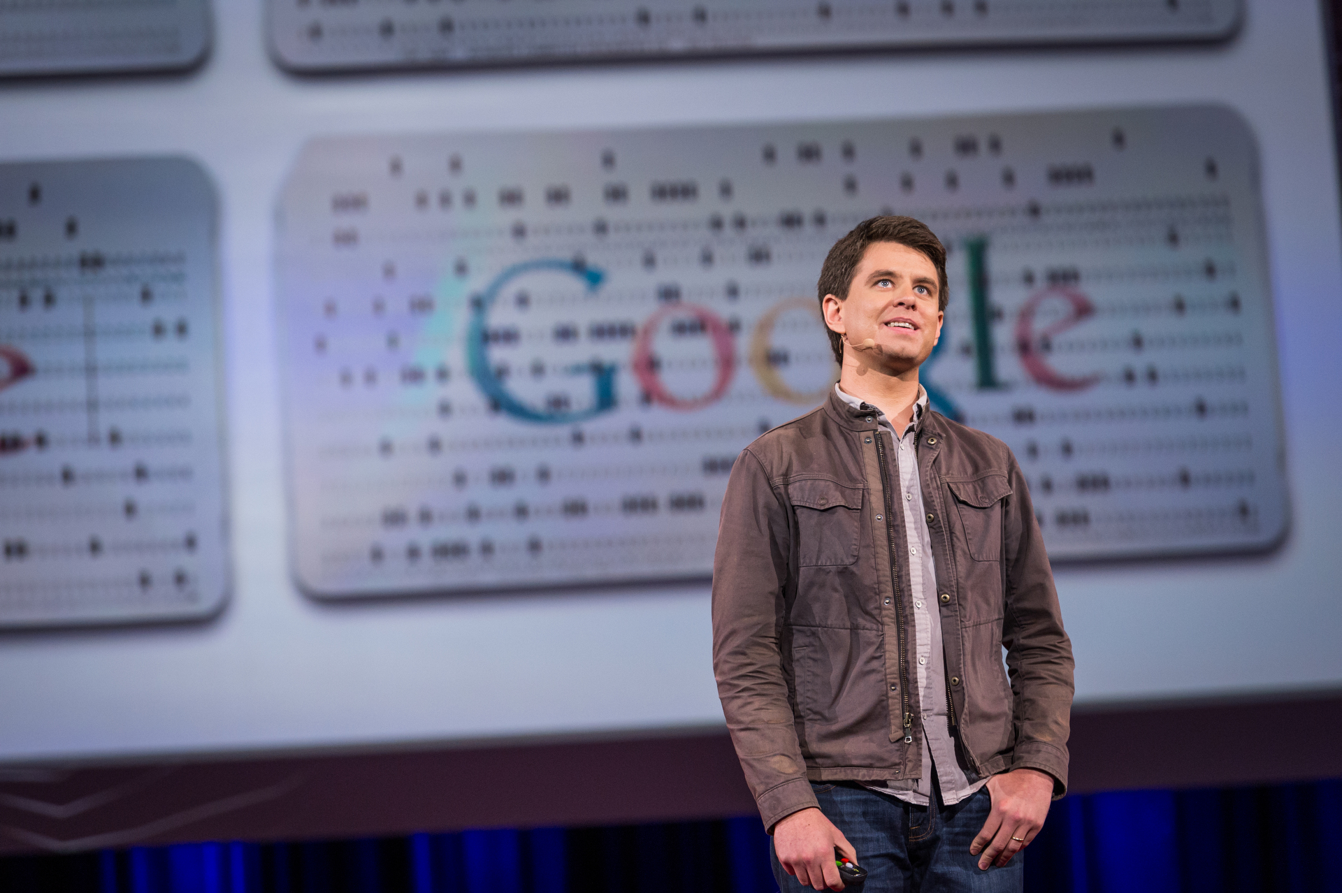
Randall Munroe. Photo: James Duncan Davidson
Cartoonist (and former NASA roboticist) Randall Munroe illustrates the questions that keep you (or at least him) up at night. Whether that’s “What would happen if you tried to hit a baseball pitched at 90% the speed of light?” or “How much of the Earth’s currently-existing water has ever been turned into a soft drink at some point in its history?” he’s got you covered.
On the TED2014 stage, the mind behind the webcomic xkcd — which might be the only comic with a haiku made of code, the sub-title “drawn during an endless NASA lecture,” the directive “What Would Escher Do?”, or (finally!) the extra-credit question for the Turing test — explains the one question from a reader that really stumped him.
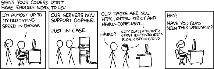
“If all digital data were stored on punch cards, how big would Google’s data warehouse be?” reader James Zetlen asked Munroe in an email message. A question Munroe couldn’t just Google, he set off on an information scavenger hunt. “I started with money,” he says, “Google has to reveal how much they spend” — and with this information, he could narrow down the answer by putting caps on things like the number of data centers Google could afford to build, and how much of the world’s hard drive market they take up.
Next, he moved to electricity. Google has released numbers on its average power use, he found, so with that, paired with information on Google’s spending, things got easier. “When you know how much they spent, and also know how much power it takes, you can use the ratio of those numbers to figure out for data centers where you don’t have that information,” he says.
He likes the mystery of working with limited information, of building a model to solve for what you don’t know with what you do. “It’s nothing more than solving a Sudoku puzzle,” he says. But it’s exciting. And satisfying. “I love calculating these kinds of things,” he says, “not because I love math for its own sake; I love that it lets you take some things you know, and by moving some symbols around, you find out something you didn’t know that’s surprising.”
Did he ever answer Zetlen’s question? Well, sort of. On xkcd, he writes: “Let’s assume Google has a storage capacity of 15 exabytes, or 15,000,000,000,000,000,000 bytes. A punch card can hold about 80 characters, and a box of cards holds 2000 cards … 15 exabytes of punch cards would be enough to cover my home region, New England, to a depth of about 4.5 kilometers. That’s three times deeper than the ice sheets that covered the region during the last advance of the glaciers.”
The mystery didn’t end there, though. He never expected to get an answer from Google, but one day, he did. They contacted him saying, “Someone here has an envelope for you.”
“It was punch cards,” he says. The cards contained codes that revealed codes that revealed equations that revealed more equations, which finally led to … “No comment.”
“I have a lot of stupid questions,” Munroe says, “and I love that math gives me the power to answer them sometimes.” So next time you have a question that you don’t know how to calculate, send it to him. We think he’ll find a way.
(And we’re still waiting for an answer about the emoticons.)
Munroe’s first book, What If?: Serious Scientific Answers to Absurd Hypothetical Questions, will be released in September.
]]>
Color infrared imagery of a gold mine in western Turkey taken by SkySat-1 on December 25, 2013. All photographs courtesy of SkyBox Imaging.
By Jessie Scanlon
In January 2011, Fred Villagomez, the head mechanical technician at a Mountain View-based satellite imaging startup, drove east, looping down and around the San Francisco Bay toward Fremont. His destination: an auto plant called NUMMI, a failed joint venture between General Motors and Toyota, whose assets were about to be auctioned off. Villagomez spent two days walking around the plant, making bids on milling machines, lathes, hand tools. “We got almost all of the equipment we needed to build a lean satellite manufacturing facility — at fire-sale prices,” recalls Skybox Imaging co-founder and chief product officer Dan Berkenstock. If buying up an auto assembly line to build satellites sounds unorthodox, that’s because it is. But unorthodox is typical at Skybox.
In the world of innovation, borrowing ideas or re-using a technology invented for a different purpose is as old as the sun. There’s the escalator, conceived as a Coney Island amusement ride. Reinforced concrete, invented by a Parisian gardener who wanted stronger flowerpots. Bill Gates borrowed the structure of BASIC, Steve Jobs borrowed the desktop metaphor. But few companies have borrowed as creatively as Skybox, which is combining technologies from a half-dozen consumer products to upend the insular business of satellite imagery.
Skybox was conceived in 2008, when Berkenstock, trained as an aerospace engineer, was working as a data scientist — trying to catch potential smugglers of nuclear technologies. Looking for accurate information about industrial facilities on the other side of the globe, he studied satellite images, only to find that those available to him were months or even years old.
Roughly 1,000 satellites ride Earth’s orbit. Less than one percent of those gather high-resolution images for the commercial market, and many government agencies can essentially commandeer a satellite’s time. In other words, there just aren’t enough imaging satellites to capture the Earth in a timely way. Berkenstock found that while a satellite passes over some places on the globe almost quarterly, most of the planet is photographed but once a year. Why weren’t more satellites collecting high-resolution images? Because building and launching a satellite the traditional way costs more than $1 billion.

“We see ourselves a pioneers of a new frontier,” says SkyBox’s Dan Berkenstock. “Beyond economic data, we are unlocking the human story, moment by moment.” Here, a view of Nice airport in the south of France, photographed on December 7, 2013.
Berkenstock and his three Skybox co-founders set out to build a radically cheaper imaging satellite. They took inspiration from the CubeSat, a DIY satellite conceived in 1999 by some aerospace engineering professors at Stanford. The CubeSat could be built with components from RadioShack and piggyback its way into space on a rocket already taking other payloads, for a total cost of around $60,000. Since then, many research teams have launched these mini-satellites into space.
The Skybox team aimed to find the sweet spot between CubeSats, which were too small and crude to collect valuable images, and the prohibitively expensive NASA-grade imaging satellites. So they borrowed the DIY approach but upgraded from RadioShack, finding high-grade components and clever workarounds wherever they could. “Across power, navigation, and communications, we found ways to modify things you could buy at Home Depot or a sporting goods store so that they would work in space,” Berkenstock says.
Consider the essential task of an imaging satellite: taking pictures. “Traditional satellites work like a line scanner, capturing images row by row,” says Berkenstock. Complex onboard systems then assemble those thousands of rows into images and send them back to Earth. In contrast, the Skybox satellite uses a two-dimensional video sensor created for night-vision goggles and some electronics borrowed from high-end digital cameras to capture video. Skybox software, adapted from MRI and ultrasound machines, reads the data from the sensors and compresses it in real-time before it is sent Earthward using essentially the same technologies as DirecTV.
The video data is parsed and reassembled into useful high-resolution images on the ground, allowing Skybox to build much simpler (and therefore smaller and cheaper) satellites.
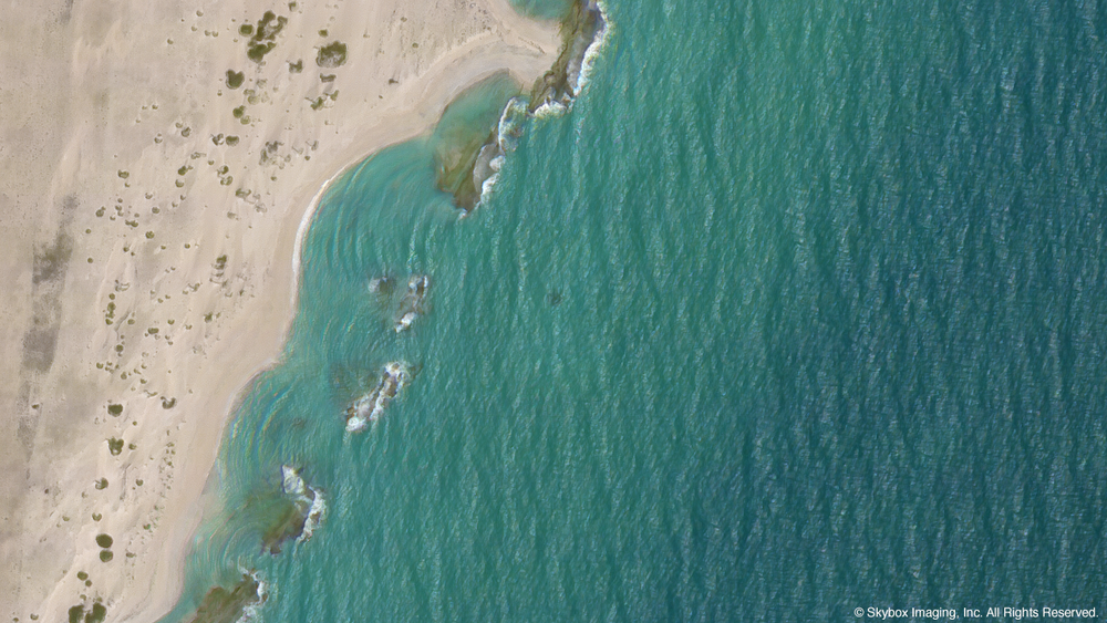
The coastline of Somalia, photographed by SkySat-1 on December 7, 2013.
But arguably, it’s what Skybox does next with the images that sets them apart: It overlays those high-enough-resolution images onto other types of data to allow for quick analysis and comparison. It fell to the company’s big-data team — made up mostly of former Yahoo! engineers, using open-source database software developed by Google — to build the tool that parses images in this way. By starting with software developed for web searching, rather than data-crunching software traditionally used in aerospace, the Skybox engineers developed a platform that can extract information from an image — say, the number of cars in a parking lot or the number of rows in a cornfield — and crunch it along with data from an entirely different source — say, historic government records.
The company has taken more from the auto industry than NUMMI’s idled assembly line. Modern cars use a standard networking technology, a system of wires and software protocols that allows all of the sensors and mini-computers in a modern car to communicate efficiently. (For instance, when a minivan driver activates the power sliding doors, the relevant mini-computer first ensures that the car isn’t moving; then sends an OK to the power circuit that runs the door’s motor and monitors the circuit for voltage spikes, which happen if an object blocks the door’s path; and so on. See a more detailed account of how this works in this Popular Mechanics piece.)
Like a modern car, a satellite has numerous subsystems that need to be able to communicate efficiently. One Skybox engineer had already adapted the Detroit-standard technology once, as part of a team competing in DARPA’s Grand Challenge, the Defense Department-sponsored competition to develop self-driving cars. This time, he adapted the system to help the myriad technologies inside its satellite work together — from those managing power and gathering images to those controlling altitude and wireless communications.
The first Skybox satellite is now in orbit and streaming images back to Earth. The second will launch sometime this year, with the long-term goal of having 24 satellites in orbit by 2017.
Of course, Skybox hasn’t built its celestial network yet, and at least two other startups are also rushing to build a business around satellite imagery. One, Urthecast, has the rights to images collected by a powerful telescope attached to the International Space Station. The other, Planet Labs, plans to launch a network of ultra-low-cost (though also less powerful) “doves,” akin to CubeSats. (Planet Labs co-founder Will Marshall will speak at TED2014 in March.)
Yet when Berkenstock says, “we don’t see ourselves as having competitors,” it’s almost believable, because no company now in the commercial satellite-imaging market does the kind of analysis it hopes to offer, comparing high-resolution satellite images to other relevant data. It’s the kind of real-time information that would be useful to companies in trucking, shipping or logistics; someone interested in projected crop yields and corn futures; organizations or governments tracking environmental disasters and more. Ultimately, the most significant Skybox adaptation might not be that it is using consumer technologies to rethink satellite imaging, but that it will use satellite imaging to make the world’s data more transparent. “We see ourselves a pioneers of a new frontier,” says Berkenstock. “Beyond economic data, we are unlocking the human story, moment by moment.”
“Questions Worth Asking” is a new TED editorial series; this week we ask the question, “Can I borrow that?” to dig into themes of cross-disciplinary innovation and idea-sharing. See also Seth Godin’s op ed, “Why I want you to steal my ideas.”
 Dan Berkenstock: The world is one big dataset. Now, how to photograph it ...
]]>
Dan Berkenstock: The world is one big dataset. Now, how to photograph it ...
]]>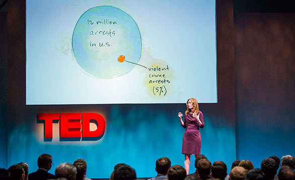
Anne Milgram reveals what happened when New Jersey moneyballed its criminal justice system. Photo: Marla Aufmuth
When Anne Milgram became the Attorney General of New Jersey in 2007, she was stunned to find out just how little data was available on who was being arrested, who was being charged, who was serving time in jails and prisons, and who was being released.
 Anne Milgram: Why smart statistics are the key to fighting crime
“It turns out that most big criminal justice agencies like my own didn’t track the things that matter,” she says in today’s talk, filmed at TED@BCG. “We didn’t share data, or use analytics, to make better decisions and reduce crime.”
Anne Milgram: Why smart statistics are the key to fighting crime
“It turns out that most big criminal justice agencies like my own didn’t track the things that matter,” she says in today’s talk, filmed at TED@BCG. “We didn’t share data, or use analytics, to make better decisions and reduce crime.”
Milgram’s idea for how to change this: “I wanted to moneyball criminal justice.”
Moneyball, of course, is the name of a 2011 movie starring Brad Pitt and the book it’s based on, written by Michael Lewis in 2003. The term refers to a practice adopted by the Oakland A’s general manager Billy Beane and assistant general manager Paul DePodesta in 2002 — the organization began basing decisions not on star power or scouts’ instincts, but on statistical analysis of measurable factors like on-base and slugging percentages. This worked exceptionally well for the A’s. On a tiny budget, Oakland made it to the playoffs in 2002 and 2003, and — since then — nine other major league teams have hired Sabermetrics analysts to crunch these types of numbers.
Milgram is working hard to bring smart statistics to criminal justice. To hear the results she’s seen so far, watch this talk. And below, take a look at a few surprising sectors that are getting the moneyball treatment as well.
Moneyballing music. Last year, Forbes magazine profiled the firm Next Big Sound, a company using statistical analysis to predict how musicians will perform in the market. The idea is that — rather than relying on the instincts of A&R reps — past performance on Pandora, Spotify, Facebook, etc can be used to predict future potential. The article reads, “For example, the company has found that musicians who gain 20,000 to 50,000 Facebook fans in one month are four times more likely to eventually reach 1 million. With data like that, Next Big Sound promises to predict album sales within 20% accuracy for 85% of artists, giving labels a clearer idea of return on investment.”
Moneyballing human resources. In November, The Atlantic took a look at the practice of “people analytics” and how it’s affecting employers. (Billy Beane had something to do with this idea — in 2012, he gave a presentation at the TLNT Transform Conference called “The Moneyball Approach to Talent Management.”) The article describes how Bloomberg reportedly logs its employees’ keystrokes and the casino, Harrah’s, tracks employee smiles. It also describes where this trend could be going — for example, how a video game called Wasabi Waiter could be used by employers to judge potential employees’ ability to take action, solve problems and follow through on projects. The article looks at the ways these types of practices are disconcerting, but also how they could level an inherently unequal playing field. After all, the article points out that gender, race, age and even height biases have been demonstrated again and again in our current hiring landscape.
Moneyballing healthcare. Many have wondered: what about a moneyball approach to medicine? (See this call out via Common Health, this piece in Wharton Magazine or this op-ed on The Huffington Post from the President of the New York State Health Foundation.) In his TED Talk, “What doctors can learn from each other,” Stefan Larsson proposed an idea that feels like something of an answer to this question. In the talk, Larsson gives a taste of what can happen when doctors and hospitals measure their outcomes and share this data with each other: they are able to see which techniques are proving the most effective for patients and make adjustments. (Watch the talk for a simple way surgeons can make hip surgery more effective.) He imagines a continuous learning process for doctors — that could transform the healthcare industry to give better outcomes while also reducing cost.
Moneyballing government. This summer, John Bridgeland (the director of the White House Domestic Policy Council under President George W. Bush) and Peter Orszag (the director of the Office of Management and Budget in Barack Obama’s first term) teamed up to pen a provocative piece for The Atlantic called, “Can government play moneyball?” In it, the two write, “Based on our rough calculations, less than $1 out of every $100 of government spending is backed by even the most basic evidence that the money is being spent wisely.” The two explain how, for example, there are 339 federally-funded programs for at-risk youth, the grand majority of which haven’t been evaluated for effectiveness. And while many of these programs might show great results, some that have been evaluated show troubling results. (For example, Scared Straight has been shown to increase criminal behavior.) Yet, some of these ineffective programs continue because a powerful politician champions them. While Bridgeland and Orszag show why Washington is so averse to making data-based appropriation decisions, the two also see the ship beginning to turn around. They applaud the Obama administration for a 2014 budget with an “unprecendented focus on evidence and results.” The pair also gave a nod to the nonprofit Results for America, which advocates that for every $99 spent on a program, $1 be spent on evaluating it. The pair even suggest a “Moneyball Index” to encourage politicians not to support programs that don’t show results.
In any industry, figuring out what to measure, how to measure it and how to apply the information gleaned from those measurements is a challenge. Which of the applications of statistical analysis has you the most excited? And which has you the most terrified?
]]>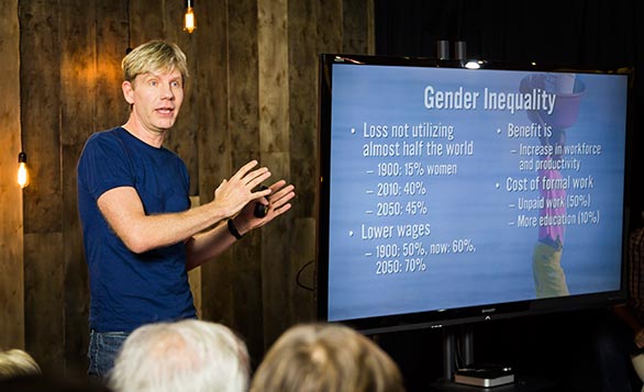
Photo: Dian Lofton.
Danish political scientist Bjørn Lomborg focuses on using economic methods and data to prioritize the world’s problems. In 2005, he gave a TED Talk, Global priorities bigger than climate change, in which he challenged the audience to decide how they might spend $50 billion to solve the pressing issues of our time. Now he’s back, with a new book, How Much Have Global Problems Cost the World?, in which he applies a similar “scorecard” methodology to try to quantify how much various problems have cost the world in terms of GDP since 1900 (projected through to 2050). His conclusion: The world is getting better and the naysayers should rein in the doomsday talk.
Recently, we invited Lomborg to speak at a salon in the TED office in New York. The result was a challenging talk that sparked a lively discussion among our team. And not least for this viewer, a certain amount of number blindness and econo-confusion. You’ll find the talk below (and can weigh in on a conversation with your opinions), while I called Lomborg to get a little help understanding his thinking and methods. See the Q&A, an edited version of our conversation, below the talk.
[youtube=http://www.youtube.com/watch?v=uU-LTKOJY9M&w=560&h=315]
Why did you pick GDP as a metric? How is that valid when you’re measuring more qualitative things that won’t really factor in GDP?
We wanted to compare problems across areas. Economists usually do that by translating everything into money. Not because we’re money-obsessed, but simply to get a common denominator. So, when a person is illiterate, that person is less productive – that person has forgone a higher income of a specific dollar amount, one in 1900, another in 2013.
Likewise, when gender inequality barred women from working professionally in the year 1900, that caused a productivity loss (even when taking into account that somebody had to do the housework), and we put a dollar amount on that.
We add up all those losses from illiteracy and gender inequality and those become large dollar amounts (in the billions). But by themselves, the dollar amounts make little intuitive sense. You need to be able to compare them with the resources that were available at the time.
This is why we use GDP. It is by no means a perfect indicator, but it is a good representation of the amount of available resources. The problem expressed as a percentage of GDP shows you how much the problem cost compared to the total resources available to fix it.
Take illiteracy in 1900. We estimate about 70% of all people were illiterate. Had they not been, they would have much more productive. Econometric estimates indicate that without illiteracy, total global income would have been about $240 billion higher in today’s money. Is that a lot of money? It is hard to know, but given that the total global income (GDP) in 1900 was about $2 trillion, I think it is a lot easier to understand if you say that illiteracy cost the world about 12% of its GDP in 1900. Or, had there been no illiteracy, the world would have been 12% richer than it actually was.
I confess, as a non-economist, I did get a little lost in some of the numbers, and maybe diving into some of them will help me to understand your point more. Let’s take human health, which is the first example you give in the talk. You say, “in 1900, the average person produced $1,200 per year, and if you died, that was money the world didn’t get.” Okay, I’m with you so far. You continue, “So take all of those years we’ve died early, say at age 32; multiply it by all the people who died compared to the total world production in 1900; and the answer is 32%.” And now, you lost me.
Basically, what we’re asking is: What’s the loss that you incur by not having good health, by not living as long as you could? As a baseline for a long life, we chose 86 years, because we have good reason to believe that we actually can live to be 86 years on average. In fact, that is what the Japanese are expected to live to be in 2050.
So if you died in 1900 at 32, you’re losing 54 years on average. With an estimated value of $1,200 for each year of life, that is 54 x $1,200 for each person dying.
But wait. There are many reasons that life expectancy was lower in 1900, and many reasons that it’s potentially higher in 2050. How can you take a figure from 2050 and apply it to 1900? And how can you attribute a dollar amount to that?
Absolutely, there were lots of reasons for the lower life expectancy in 1900. But what we’re asking is: what was the cost of bad health? The cost is you die early. The question is how much too early? So, we’re simply estimating how much too soon you die for each year, and valuating each year by the production loss of an average person year.
Okay, I think I understand the earlier figures for literacy and education more than I do those for human health. I guess it seems like there are just so many different contributing factors that go into health. How does this all work when some things are easy to judge and others really aren’t?
I would actually challenge you on that. A lot of things go into illiteracy as well. We couldn’t just have snapped everyone in 1900 out of illiteracy. There are many factors: both your parents’ education, your nutrition, the availability of schoolbooks and teachers, and not to mention that most of us were farmers, so we’d have to go tend the fields instead of school.
What we simply ask is how much better off we would be if everyone had literacy. And likewise, we simply ask how much better off would we be if we all lived to be 86 years old instead of 32.
But isn’t it strange to apply one number from one era to another era altogether and then judge the first era unfavorably for not living up to the standards of later on, even though it didn’t have any of the other advantages of being later? My head hurts!
Ha. Well, I see your problem. But look at it this way. If I showed you statistics that document the average person in 1900 made $1,261 in present-day dollars, and today the average person makes $7,785, this comparison feels entirely correct. We’re more than 6 times richer today than a hundred years ago.
Yet, we’re also comparing very different eras and technologies – they didn’t have the ability to make $7,785 per person back then. One could argue that it is unfair to compare them to such an unrealistic standard. Yet it is also incredibly informative.
It is in this same way that we’re simply comparing the problems of the world in 1900 to later periods.
You’re clear in the talk that double- and triple-counting is problematic. But then you do it anyway. At the end of the talk, you say, “Over the past 113 years, it has gone down to about 40%, and by 2050 will be 27%.” Um, what are you referring to?
If we take all the 10 problems that we looked at and just add them up, then in 1900 we forwent 101% of GDP. We could have been twice as rich in 1900 as we were. And now, we could be 40% richer, and in 2050, we could be 27% richer than we are.
But as it is, you cannot just add them up, because there is likely an excessive amount of double- and triple-counting. The deaths that are ascribed to air pollution would also show up as lack of health and possibly even in malnutrition. It turns out that there is no realistic way to rid the dataset from these doubles and triples.
But it is still likely that the rate of double- and triple-counting is about constant, and that’s why I show the graph. The correct graph would probably look just like the one I showed you, but it would have different and lower numbers. And the main point of the talk, of course, is to show that the general direction is downwards, meaning that we have fixed many, many more problems than we have seen more arise.
So it doesn’t matter so much exactly what the numbers are, but the trend line would look the same.
Precisely.
We should probably touch on global warming, which according to your data is actually a small benefit right now. What about the idea that a lot of the expense of global warming just hasn’t shown up yet?
Oh, yes, global warming will definitely be a problem in the future.
The bottom line is that global warming was not a net problem in the 20th century, and it is not a net problem right now, but, as I say in the talk, it will be a problem in the future, and it’s going to be a net problem towards the end of this century. So definitely, the fact that global warming is a small benefit now does not mean that we shouldn’t do anything about global warming.
In your other work, you make the case that we should look at data and economics and avoid being swayed by emotional PR campaigns or activists showing us pictures of dying animals or melting icecaps. Is that philosophy underpinning your work here? What’s the takeaway for your fellow economists — and for the general public?
Fundamentally, my point is that we have limited resources and we need to spend our money in the best possible way.
That is only possible if we focus on the right things. This project is about bringing the numbers back in, and remembering that even if some things are really, really boring, they can be incredibly important.
I think the takeaway message is that the really big problems for humanity in 1900 were lack of good health, lack of clean air and lack of gender equality. What really mattered was to tackle those three problems, and – even though they’re still big problems and there’s still more to do – the data show that we’ve actually improved health, air and gender equality enormously.
Then I want people to have a sense of proportion. Biodiversity and global warming are smaller problems compared to some of the things that we’re talking about. This doesn’t mean that there are not smart solutions to be had in those areas, and people should pursue those. But my question is whether our conversation is relative to what really matters to humanity?
The final takeaway is that the optimists are mostly right. The world is moving in the right direction. The reason why I think that’s important is that knowing this makes it possible for us to make rational decisions in the rest of the policy sphere. When we think the world is going to hell in a handbasket, we tend to panic, like we’re swept up in a torrent of water threatening to take us over the waterfall’s edge. But if we realize we’re actually moving in the right direction, there’s a better chance we can actually start having a rational conversation about where should we focus next–and figure out where we can get the biggest bang for our buck.
]]>For the past week, Amy Webb has been inspiring people to calculate their own algorithm for love. Her laugh-out-loud TED Talk, about reverse engineering her online dating profile and, essentially, data-ing her way into her perfect relationship has gotten a lot of attention, including on The Frisky and Pop Sugar. As Webb’s talk continues to take off online, here is what to watch next if her talk intrigued you and left you wanting more.
 Helen Fisher: The brain in love
Helen Fisher: The brain on love Love: it makes the world go ‘round, and has been found in 170 societies. But why? In this talk, Helen Fisher shares how she and her team put new couples, longterm couples and those who’ve just been dumped in MRIs, and what they’ve learned about our need for love based on this brain activity. |
 Kevin Slavin: How algorithms shape our world
Kevin Slavin: How algorithms shape our world Algorithms are, basically, the mathematic programs computers use to make decisions. They guide our Netflix recommendations, book prices, the stock market, architecture optimization, and so much more. And yet, algorithms interfere and lock into each other in loops, creating bizarre behaviors. Slavin asks: Could entrenching these systems in our lives, even in the earth, have implications we don’t yet realize? |
 Esther Perel: The secret to desire in a long-term relationship
Esther Perel: The secret to desire in a long-term relationship Deeper intimacy leads to better sex, or so the story goes. But Esther Perel wonders if this is actually true. In her TED Talk, given in our office just like Webb’s, Perel looks at the problem of sustaining desire in a long-term relationship and how it relates to two needs often at odds: our need for security and our need for adventure. So what is the answer to this riddle? Well, you’ll have to watch. |
|
David McCandless: The beauty of data visualization
David McCandless: the beauty of data visualization The name of Amy Webb’s book is Data, A Love Story. So we bet she would adore David McCandless’ talk about his work as a “data detective.” McCandless gives new understanding to statistics and other assorted data by rendering it visible in charts and graphs — which also happen to be beautiful works of art. Bonus: get to know much more on the thriving field of data visualization with these talks from data artists. |
 Jenna McCarthy: What you don't know about marriage
Jenna McCarthy: What you don’t know about marriage Marriage. Why would anyone permanently tie themselves to another human being who likely snores, won’t do their dishes, and will gain an estimated 50 pounds over the course of their lifetime? In this humorous talk, writer Jenna McCarthy looks at the data surrounding marriage and realizes … wait, maybe that’s not so bad after all. I mean, the health benefits alone… |
Bonus: Christian Rubber’s TED-Ed lesson “The math of online dating,” in which he shares how exactly OKCupid, of which he is a founder, predicts whether a pair should go out on a date.
And to add a bonus on that bonus: here are 7 things we learned from Christian Rudder about online dating. An example: that the length of the message doesn’t matter.
]]> When yet another romantic relationship came “burning down in a spectacular fashion,” Amy Webb sought the advice of her friends and family, including her grandmother. “She said, ‘Stop being so picky. True love will find you when you least expect it,’” Webb recalls in her TED Talk.
This advice struck Webb, who works with data for a living, as preposterous. She had calculated that, in the entire city of Philadelphia, only 35 men had all the qualities she was look for and was still single. “I can take my grandmother’s advice and sort of ‘least expect’ my way into maybe bumping into the one [of them] — or I can try online dating,” she says.
Online dating is, in fact, the second most popular way couples meet in today’s technologically-mediated world. But when Webb began the journey, she found it much more fraught than she’d anticipated. “I like the idea of online dating because it’s predicated on algorithms,” she says. “These algorithms had a sea full of men that wanted to take me out on lots of dates—what turned out to be truly awful dates.”
At this point, Webb decided to get really systematic, and to find out how to make online dating work for her. She made a list of 72 items that she was looking for in a man, then ranked them by priority. She created a fake male profile so she could decode popular women’s strategies and then reverse-engineer her own profile. When she applied her rigorous ratings system to her plethora of possible matches, she wound up with just a single person who met all her criteria.
They went on what turned out to be a good date. In fact, a very good one. To see just how good, watch the talk.
Ahhhh, online love. Read on for some more delightful (and wonderfully nerdy) online dating stories we found, well, online.
- “Geeklover,” who posts her tale on The-Gaggle.com, joined the dating site Geek2Geek (yup: a dating site for geeks) by force. In other words, her friends created a profile for her as a joke. But after she clicked around the site a bit, she thought that maybe it wasn’t such a bad place for her, a self-described history nerd, to find love. She spiffed up her profile and went on a good date with a major video game enthusiast. But it took a chance encounter between them in real life — on the New York subway to be exact — for both of them to realize that they actually had real potential.
. - An adorable OKCupid Success Story: the first time Andrea and Michael IMed through the site, they talked for 12 hours. Despite the fact that they lived 1330 miles apart, they began talking daily, for months, before finally meeting. Less than a year later, they got engaged and are currently planning their wedding. Andrea’s best advice to anyone else hoping for love on the site: “Answer as many questions as you can … our match % was 97!”
. - Willard Foxton’s date tried to “sexily nibble” him over dessert. Instead, she bit him; he bled and became ill. “So yeah, an infected human-bite wound. Beat that for a dating story,” he writes in The Independent. But Foxton persevered, and in fact decided to blog about his dates, committing to 28 in total, with 14 from mainstream sites and 14 from more specific ones “such as BikerDating, Sea Captain dating or Godmother (which matches royals with commoners).” Spoiler alert: as with the stories above, it also worked.
. - Earlier this year, after it was discovered that Notre Dame linebacker Mant T’eo’s deceased online girlfriend had never existed, CNN asked readers to share their stories of online dating hoaxes. Barbara Hassan began online dating through Match.com in 2010 and started corresponding with an “architect/construction manager who built and designed a building in Nigeria for orphans.” She, of course, realized this wasn’t true when he asked her to pay for a $2700 plane ticket to the United States. A year later, she felt bold enough to try online dating again — this time with great success. How did she bond with her now husband? They both shared their tales of being scammed by online paramours.
. - When Gemma discovered her partner was cheating on her with women he met using the website Plenty of Fish, Gemma ended the relationship — and joined POF herself. Here, she gives the nuts and bolts of her unusual success story.
All this said, not everyone is thrilled with the sweet nerds they meet online. Take, for example, writer Alyssa Bereznak who wrote the Gizmodo essay, “My Brief OKCupid Affair with a World Champion Magic: The Gathering Player.” After two dates, she broke things off with him, concluding, “Maybe I’m shallow for not being able to see past Jon’s world title. I’ll own that. But there’s a larger point here: that judging people on shallow stuff is human nature; one person’s Magic is another person’s fingernail biting.”
What has your experience been with online dating? Do you prefer to leave love up to serendipity, or do you relish the opportunity for data to guide you on the way?
This post originally ran in October of 2013. It was updated for Valentine’s Day 2015.
]]>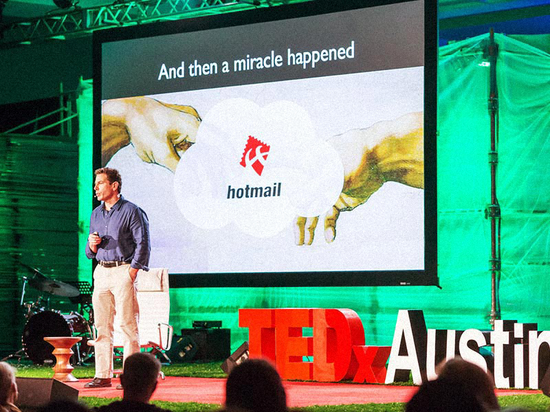
Joel Selanikio describes Magpi, a global health data collection system inspired by Hotmail, at TEDxAustion. Photo: Jerry Hayes
It may be the age of big data, but it’s still very hard to know how many children were born in Bolivia or Botswana last year, or to know something as simple as which clinics in the developing world have medicine and which don’t. Until recently, there was only one way to find answers to questions like these — to send a group of workers out into the field and have them do door-to-door surveys, filling out paper forms as they went. This would produce mountains of paper that took years to input into a computer for analysis. Often, projects would run out of money before inputting could even happen.
 Joel Selanikio: The big-data revolution in health care
In 1995, Joel Selanikio — then a young employee at the Centers for Disease Control, now the CEO of DataDyne — had the idea to start conducting surveys via a Palm Pilot and shave a huge amount of time off the process of collecting data. But even as he became well-known for this service, he realized there was a problem.
Joel Selanikio: The big-data revolution in health care
In 1995, Joel Selanikio — then a young employee at the Centers for Disease Control, now the CEO of DataDyne — had the idea to start conducting surveys via a Palm Pilot and shave a huge amount of time off the process of collecting data. But even as he became well-known for this service, he realized there was a problem.
“The main obstacle was me. I had developed a process whereby I was the center of the universe of this technology,” he says, pointing out that his rate was not cheap and that any proposed project had to fit into his schedule. “I had been trained that the way you distribute technology within international development is always consultant based. It’s always guys who look pretty much like me … flying to countries with people with darker skin.”
As Selanikio describes in today’s talk, filmed at TEDxAustin, he wanted to open up this service. He took inspiration from, of all places, Hotmail. He set out to build a cloud-based service that required no programming knowledge to use. The solution is known as Magpi, an online survey creator that allows users to write their own surveys and upload data instantly, creating maps and other anaylsis tools in real time. The training video for the service is just 15 minutes long.
In the first years of Palm Pilot data collection, Selanikio estimates that he trained a thousand people to use the system. In first few years of Magpi, more than 14,000 found the site and adapted it to their needs. To hear how Magpi has been used by the International Rescue Committee to allow midwives in Sierra Leone text message the numbers of births and deaths in their village once a week (this real-time count is a huge improvement from surveying every 10 years, as has traditionally been done) and by Physicians for Human Rights to document evidence to bring rapists in the Democratic Republic of the Congo to justice, watch this talk.
Selanikio’s talk contains echoes of two TED playlists. First, it reminds us of the list “Making Sense of Too Much Data,” which brings together TED speakers with ideas on how to use the large sets of data that computers allow us to collect. From Hans Rosling on how stats can reshape worldviews, to Erez Lieberman Aiden and Jean-Baptiste Michel on Google’s scanning of 5 million books, to David McCandless and Aaron Koblin, who make art that renders data understandable, these talks make 0s and 1s highly inspiring. Watch »
Insel’s talk also reminds us of the playlist “The Future of Medicine,” filled with talks on incredible achievements in healthcare. Anthony Atala explains how to print a human kidney, Max Little shares how a 30-second phone call can deliver a Parkinson’s diagnosis, and Daniel Kraft looks at how healthcare will become more and more app-based. Watch »
]]> At TED2011, Deb Roy shared his talk, “The birth of a word,” describing when he and his wife, Rupal Patel, brought home their baby boy for the first time. The pair sought to shoot a different kind of home video: in every room of their house, a camera recorded eight to ten hours of footage a day.
 Deb Roy: The birth of a word
After three years, Roy had roughly 90,000 hours of video and 140,000 hours of audio. But this wasn’t for sentimental purposes. Instead, they wished to study how a child learns language. The footage became a massive data set for Roy and his research team at MIT. Using unique data visualizations, they were able to track the many subtleties of a child’s learning process that they wouldn’t have been able to do in a lab.
Deb Roy: The birth of a word
After three years, Roy had roughly 90,000 hours of video and 140,000 hours of audio. But this wasn’t for sentimental purposes. Instead, they wished to study how a child learns language. The footage became a massive data set for Roy and his research team at MIT. Using unique data visualizations, they were able to track the many subtleties of a child’s learning process that they wouldn’t have been able to do in a lab.
His team wondered: could this kind of analysis be applied to television or, say, Twitter to discover communication trends?
These are the kinds of questions that today’s TED Weekends on the Huffington Post explores. Here, three of the great essays that are available now for your reading pleasure.
Three trajectories came together in 2005 and took me to new frontiers of cognitive science (and subsequently, it turns out, the media industry).
- The first trajectory: I began to see an unexpected connection between my research in robotics at MIT and theories of how children learn to talk, leading to studies of child language that I did with my wife and collaborator Rupal Patel over the past decade.
- Second: The era of Big Data was dawning, and the far-fetched idea of video-recording everything that happens in a home had become a practical reality.
- Third, Rupal and I learned that we were expecting our first child in July 2005.
This confluence of events sparked an unusual study of child language featured in the first half of my TEDTalk. Read the full essay »
Gayatri Devi: How Do I Improve My Memory? Forget More!
Do you know what is essential for a good memory? The ability to forget. To completely and thoroughly forget. Forgetting, like breathing or sleeping, is physiologically normal. This is at odds with our modern compulsion to record and remember everything and is a perfect recipe for anxiety.
Deb Roy, a cognitive science professor at MIT studying language, recorded 8-10 hours daily of the first three years of his son’s home life. He compiled a quarter million hours of audio and video, creating a 200,000 gigabyte “ultimate memory machine.” (Most computers store about one gigabyte.) Consider how much information each of us is exposed to in 24 hours, on streets, subways, screens and in sleep. Imagine recording and remembering all this. Thankfully, we were never meant to.
Fact: We are evolutionarily programmed to forget. Our brains evolved over millennia with built-in forgetfulness. Our brain is engineered to remember tastes, smells, voices, touch and visions, not names. Our brain is engineered to solve problems (How do we keep track of cattle? Mathematics; How do I communicate? Language), not remember disjointed facts. A fact not linked to a sense, an emotion, or a concept is quickly forgotten. Read the full essay »
Ben Hecht: Big Data Gets Personal in U.S. Cities
Much has already been said about how big data is dramatically changing the way that organizations make decisions. Today, more data is being created from more places than ever before. Blogs, Facebook, YouTube videos, retailer loyalty cards, mobile phones, and sensors on buildings are producing tons of data daily. Private sector companies, in their real-time data warehouses, are storing, analyzing, and harnessing it to help them to better understand their customers, dynamically alter pricing based on real-time demand, and even change their business models. And, more and more, government is putting the wealth of data that it generates to work to increase efficiency, save dollars, and create more proactive policy. But, as Deb Roy shows in his TED Talk, the true promise is where the numbers and patterns from this data connect and become personal — enabling us to understand and to respond to humanity and the world in ways previously unimaginable. This type of analysis has infinite potential for improving the human condition on an ongoing basis; and strengthening people’s commitment to our democracy. Already, in U.S. cities, we are seeing many promising signs of the transformative personal application of Big Data:
Mass Personalizing of Government Data and Services: The movement towards open government data in the U.S. has already had huge implications for the relationship between citizen and government. Read the full essay »
]]>
Artist Julie Freeman uses data as a source material to make biologically inspired artworks — giving musicality to the movement of fish and expressing city lights in the quiver of moths’ wings. Now she’s finding ways to translate data so that we may gain new perspectives on what it’s trying to tell us.
What do you do?
I make artwork that allows me to be curious about nature in different ways, and to share that curiosity. The driving force behind my work is, generally, What is it about natural systems that are so compelling? How can we understand more about them to get a fresh perspective? And how can we understand phenomena that exist beyond our own sensory perception? That’s where the technology comes in. It allows us to get to grips with hidden elements of biological systems, and can allow us to see or experience things in new ways. In my practice, I use technology as a kind of communication bridge between the natural world and ourselves.
Technology is often seen as something that is at odds with nature, something that tries to control, change, or supercede. My view is that we can use technology to try and understand the natural world better, getting a deeper knowledge of biological systems will allow us to acknowledge and empathise with nature, to garner peace with our environment.
What’s the value of art that translates data?
In addition to exploring how natural systems can be translated, I’m also preoccupied by how much our lives rely on data in the form of data-driven decisions — from the ones that we make personally (think social networks) to those made by our employers, suppliers and governments. It feels important that artists should be working with data not only to reflect what’s happening in the world, but also to help create a level of understanding that in some way reduces fear. The more information is generated, the more our need to understand it grows. We need to be literate to comprehend the interpretations of data that we are being exposed to. And we need to find a way of talking to each other about data that is clear and understandable.
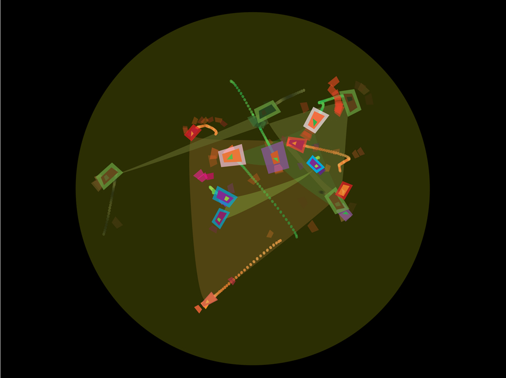
The Lake (2005): A site-specific installation in which 16 freshwater fish were tagged in their natural environment. The tracking data was used to create music and animation display by the lake side in a 80ft tall cylindrical structure — an experience composed by the fish.
For example, there’s a dynamic light sculpture by Fabio Lattanzi Antorini that flickers in response to the number of crimes against humanity being perpetrated. It pulls information from a series of different real-time news feeds, parses them into a sequence and then displays that as a rhythm of light. So although you don’t know any specifics, you do know is that crimes are happening and that it is being monitored. That’s possibly enough to have an awareness without being overwhelmed with detail. Of course it is important that the awareness then leads to change in some way.
It’s no news that there is exponential growth of information. People are trying to tell us their side of the story all the time. It’s overwhelming. We need to find some way of managing that process of absorbing information, and learning from it, without it becoming a pressure. A lot of data-driven artworks do that by condensing information and then giving you a simplified idea.
Digital Wave (1998): Participant faces are manipulated and streamed down a giant wave-shaped interactive digital sculpture measuring 45 x 6 x 10 ft.
What made you want to do The Lake project — one of your early works (shown above), where data gathered from the movement of fish in water was translated into animation and sound?
Again, I was curious: I wanted to understand more about the underwater environment and why is it that we’re so fascinated with fish. How does a fish behave in its natural environment? Can the movement and behaviors that fascinate us be translated into art? More personally, part of the reason I wanted to pursue this idea was because I come from a fishing family, and I have fish-like tendencies — I’m an active swimmer, a total water baby. And, being a geek, my artistic tools were technology. It started off as a prototype and then around eight years later became a full-fledged, fully supported project. I let my curiosity out by using technology to get to grips with how fish swim and what their relationship to each other is. I learned a lot from the project, and the data I collected is very unique — I’m still working on further analysis now.
Would you say that your primary interest growing up was biology and the natural world, and then technology just became your tool?
Yeah, I think so. Biology, always. When I was very small, I used to be petrified of animals, anything apparently — cats, rabbits, dogs. My parents got so fed up with my fear that they ended up buying a dog. I remember coming home one day and the dog was in the backyard. I freaked out, screeching “I can’t live here. I can’t live here anymore” — a total drama queen. I was only about six or seven. About an hour later, I was rolling around with the dog. From that point onwards, my whole view of animals shifted completely.
Thinking back on it, I just assumed that these critters were going to bite me or attack me. It was the unpredictability of animals that made me nervous. I guess that was the beginning of wanting to understand more. I’m still interested in critters of any shape and size, but also things at the nanoscale, and more and more, this idea of how biological systems get represented by data, and what if data *was* a biological system? How would we see it if it wasn’t digital? What would it be like if it was akin to something like a slime mold, or nematodes — a living entity?
Why didn’t your curiosity about biology translate into a biology career?
I studied biology through school. I had some issues when I was leaving school age where I ended up being told I couldn’t continue studying at the school, and I had go and do something else. I stumbled into graphic design at the local college, and I took art at the same time. That steered me into the design world, and then I studied design technology at university. Based in the mechanical engineering department it was then that I first started putting together computers and was introduced to the product design world.
It was only when I studied for my Masters in Digital Art, all the concepts I was coming up with linked back to something from the natural world. The idea of tracking fish (later The Lake), my animations about plankton — all my work had a biological element. I got really interested in artificial life systems and how we can mimic life through cellular automata. All the software art that I was developing then was all based on this idea of unpredictability and life systems within the machine. From there I started thinking, well if I’m building them in the machine, how can we start making the software and the hardware connect with the real life systems? It became a fusion of technology and biology in a very literal way.

Lepidopteral (2012): A multi-object kinetic artwork that responds to environmental data fluctuations from remote sensors.
Is data then the bridge for that?
Data is a byproduct of our curiosity. Nearly every scientist I know and many artists that work in technology all have this relationship with data where data is the substance that sits between initial curiosity and knowledge and understanding. It plays such an important role. How can data been seen as something that has an ephemeral behavior which changes depending on how you treat or perceive it?
I’ve read and heard people say, “Data is information.” Actually, I don’t think it always is. Data is much more akin to an artwork in some ways, because as a mass it has this potential ambiguity and subjectivity that exists before an analysis happens or before it gets processed in some way. And I think that bit is really quite intriguing.
Do you mean information isn’t information until we interpret the data that’s there?
It’s tricky. I was thinking about this: If all data is information, say, does that mean that everything we see is information? Does it mean that everything has got some kind of message behind it that it is trying to impart which we can then gain knowledge from? And I was trying to think, well if that is true, does it mean that art is information as well? And as soon as art becomes information then suddenly it seems less interesting to me, because I don’t know if it should be information. I think it should be experience. But then could you deconstruct experience into being a process of information gathering? I don’t know. I tied myself up in knots with that one.
Tea Flock (2011): Migrating rituals and emergent behavior of grouped objects are displayed in this kinetic work, using data from imaginary migratory tea-birds that fly to and from tea-growing countries and the UK.
What types of data you work with?
I’ve worked with all different types. I’ve worked with data that’s been generated by sensors — tracking data. I’ve worked with data that has been collected as sound files and spoken word — sonic data. I’ve worked with data that’s been processed by other people and then delivered either as streams of values or as video feeds. I’ve worked with light levels from different parts of the world. I’ve worked with geographic data about trajectories of bird migration from India and other countries. And I’ve worked with data collected from people. There isn’t any piece of my artwork that hasn’t used data in some way, in some format.
In terms of making art with different types of data, using data as a material, it’s really important to define it so that we know how it manifests within the work. The definitions range from how the data is delivered, where it’s coming from, the temporality of it and also things like: Does it relate to the living world? Is it natural data? Does it relate to the social and political world? Does it relate to a personal individual? Is it economic data? Is it geographic data? Is it generated, real-time or processed data? These are simple descriptions, but they’re important to understand that for data-driven art, the type of data within it can give you a different experience of the work.
How do you go from a sense of curiosity about something to coming up with designing an artwork and making it happen?
To give you one example, a few years back I started making moth capture devices to film moths in action. Sometimes, I’d string up a big white sheet in a woodland and put lights behind it, to attract moths. Every time, nearly every other kind of insect joined the party, and only just one or two moths if any! That made me wonder, if I was a moth, why would I be attracted to light? I wanted to capture, on video, the flickering moth movement.
I went swimming in a lake in Italy and saw what looked like flowers all over the lakeside. But when I looked closer, they were clumps of little lilac butterflies. And they were almost static, they were moving really gently. It was fascinating to watch. Every now and then they’d flit about from clump to clump. I thought, it’s interesting that when you think of a butterfly or a moth, you think of a very flickery, very high-speed flying movement, but actually spend a lot of their time still, just being quite peaceful. These experiences inspired me to make a piece of work, Lepidopteral — these small plastic moth-like creatures that flap in a very organic way in response to light levels in Berlin.
Why Berlin?
Berlin was just a reliable light feed that I found on the Pachube website. It appealed to me to have a remote light level driving the system, a data feed that’s nothing to do with where the work is — and is outside of my control. A lot of my works have this element where I set up a framework using different hardware and software, and then it takes a feed from something — from the environment, or from animals — which directly affects how the artwork performs, whether it’s a sculpture or animation or sound work. It’s not random, but uncontrollable. The work acts as a conduit between something in the environment and something in the gallery or in the studio. When everything gets switched on, I don’t know what’s going to happen, so I don’t know how the final artwork is going to be until it actually comes to life. I’ll spend months, often years, working on these projects, and that’s the moment that really gets me, because I can’t predict it. I also feel like I’ve built something that is communicating in a new way, that it’s not just out of my head, but it’s coming from somewhere else. That’s a great thing to be able to share with people.

Specious Dialogue (2007): A pair of concrete forms spew an emotional dialogue, they bicker, coo fragments of love, they shout, scream and whisper, they are lonely lovers or clinging siblings. Randomised data produces a conversation that is plausible but false.
What are you working on now?
At the moment, for my PhD I’m working on how we can experience different types of data sets from natural systems through physical objects. I’ll be looking at how those objects relay the essence of data and whether you can determine whether that data is biological, technological or economic, simply through a sense of movement. So it’s kind of like the body language of an artwork in a way. There’ll also be viewer-response feedback mechanisms. So for instance, if you saw a data-driven sculpture that was kind of slumped and it made you feel a bit unsure about why and so you sort of slumped a little bit, then that could be detected and then the object could kind of chirp up a bit, which you’d probably try and mirror, perhaps subconsciously. It’s all very early days.
Will you be making objects for that?
I’ll try! I’m excited because it’s a computer science PhD at Queen Mary, and they’re happy for me to make artworks that explore psychological response to data-driven artwork in a scientific arena, but also in an artistic space as well. We’ll make the artworks and then use them as a stimuli in an experiment and have them as an artwork in a gallery, and see if there’s any link between the two in the way that people perceive the work depending on what context it’s in. It’ll be interesting. It’s quite a challenge to establish whether, if you’re designing an artwork as part of a science experiment, is it still an artwork in itself. Where is the line between rigid design and artistic flow? I think a lot of artworks act the same way as a stimuli in a psychological experiment, even if the artist doesn’t realize that’s what they do.
Tell me about the Open Data Institute show you recently curated.
The Open Data Institute was set up by Sir Tim Berners-Lee and Prof Nigel Shadbolt, and their idea is to create a culture of open data. A key premise behind the institute is to teach people what they can do with open data, and how they can make their data open — all the way from political leadership level to schools and universities and small businesses.
Ellie Harrison’s piece Vending Machine, chosen by Julie Freeman for exhibition at the Open Data Institute, dispenses free crisps in response to recession data. Photo: Ellie Harrison
When I visited their new space in London, I said, “What you need is data-driven artworks.” I was worried that data is seen as dry information, that it’s seen as a very academic or commercial thing. I wanted to make data very tangible for their visitors. We curated and commissioned nine works, nearly all of them are physical pieces. There are a couple of dynamic sculptures. There’s a kinetic wall-based piece, and a painting. There’s a newspaper and an archival book. There is only one piece that is screen-based. It is important to have physical objects in the space, displaying data in a energetic and abstract way. I think the collection we put together surprised them.
What was the response?
The idea of data as a material in an artwork was quite new to those working in the space, so there was some apprehension. As they saw the artists setting work up and building it, they formed a bond with the works because they got to know the people behind them and to understand them quite deeply. Now, the artwork is what everyone talks about. There’s one in particular — by artist Ellie Harrison — an old 1970s vending machine that feeds off of economic data. If there is talk of economic crisis or if there’s a big budget announcement in the news, it dispenses crisps for people to take for free. Staff come in the morning to see if any “recession crisps” have been dispensed, getting a very rapid grasp of the night’s fiscal activity — 10 bags of crisps in the drawer generally means trouble brewing. It’s really interesting to watch that piece in action because it’s a perfect venue for it in a weird way — not many artworks work in a kitchen!
How has the TED fellowship had an effect on you?
Being a Fellow has broadened my ideas about how far I can push things and how important and serious my work is. In practical terms, any question you could have about nearly any subject, you can just email one of the Fellows and they generally know exactly what you need. In terms of resources and opportunities, that is invaluable.
Before I met a lot of the other TED Fellows, I didn’t quite understand where I fitted in — I’m such a kind of mix of things. Being with the TED Fellows, it’s just like: good grief, yeah. It’s completely fine and normal to be doing what I’m doing. Just having that shared knowledge of people all over the world doing the same kind of thing, and being part of that gang, is reassuring. It’s definitely something I carry with me in terms of facing any fears.
]]>
TED speaker Rick Smolan is asking students between the ages of 13 and 18 to become “Data Detectives” for a new project he’s unveiling today — and that he will talk about at TEDYouth this Saturday.
By answering a 20-question online survey, teenagers will help build a data set that will let then compare themselves to teens all over the world. Some sample questions from the survey: “Are you more like your mother or father?” “How do your parents discipline you for bad behavior?” “How do you get to school: by bus, public transportation, limo, donkey, or skateboard?” The survey is anonymous and takes about 10 minutes to complete.
Take the Data Detective survey here >>
You can watch a FREE livestream of TEDYouth on Saturday, Nov 17, 1-6pm EST. Just bookmark this page and check back at 1pm Eastern on Saturday: http://new.livestream.com/tedyouth
]]>
In his recent TEDTalk, “What doctors don’t know about the drugs they prescribe,” Ben Goldacre sounded a warning about the vast numbers of pharmaceutical studies that go unpublished. “Positive findings are about twice as likely to be published as negative findings,” said Goldacre, noting that this is a big problem because it means doctors are prescribing pharmaceuticals without full knowledge of their side effects and overall efficacy.
However, Goldacre is excited about a hint of change displayed in this article from the British Medical Journal. In the editorial, BMJ editor-in-chief Fiona Godlee tips her hat to pharmaceutical giant GlaxoSmithKline for opening its vaults and allowing access to its trial data. The system is not perfect — all requests must travel through a panel and be deemed “a reasonable scientific question” before data will be released — but it is a step forward. At the same time, Godlee pledges that, beginning in January 2013, the journal will only publish studies on drugs and medical devices when there is a commitment to make all data available upon request. Meanwhile, she writes that the publication is continuing its three-year battle to gain access to all the data existing for the drug Tamiflu.
This, of course, does not mean that the problem is solved. But it is a sign that a sea change may soon be under way in the area of medical data.
]]>