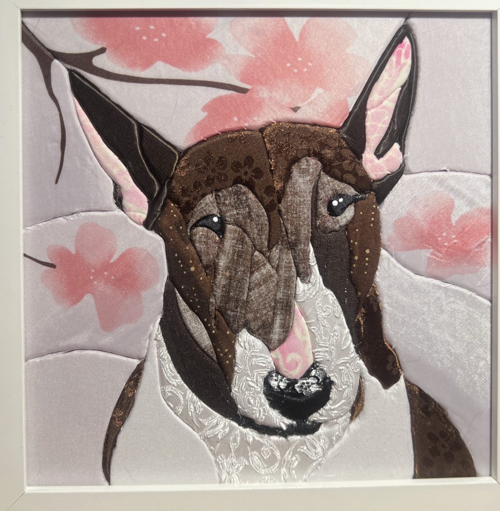
I knew I wanted to keep the cherry blossoms in to make her match Missy, so I used what I already had on hand for that. I went shopping specifically for the brown (I fell in love with the flower pattern, and reversed it on half her head to show a bit of a difference in colour/shine/texture) but couldn’t really find much brown with white shots through it like her fur. I bought the dark piece under her left eye and right cheek because it had a shot of silver running through, but it wasn’t really visible and not really what I was looking for. I threw it in anyway to add some depth and difference. While I was working with the brown and gold spotted pieces, I realized the backside was exactly the colour and texture I was looking for for her face, so I flipped it and used the back. I had the rest of the fabric on hand, so used some light pinks in her nose and ears, and again that white textured satin for the fur. I broke it up with blocks of white to give it some difference and interest for the eye.
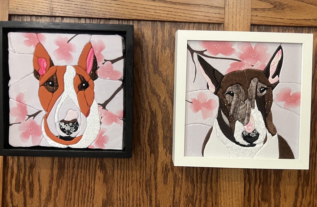
Here they are, together again. Maya was the 4th one I’ve done, and I think is my favourite. Looking at Missy on the left, I could have taken a bit more artistic license with her shoulder and added more like I did for Maya, and less blossoms, but we’re our worst critic. My friend got a little emotional when I gave it to her, and I don’t think she cares about my self-criticism at all lol.
]]>This is Marley, my mom’s dog. It’s probably the best picture I’ve ever taken of her, and I’ve technically already used it once in a painting, but a good reference is a good reference. Don’t mind her spit bubble.

As usual, I made a stencil by using my mom’s bf’s iPad (I seriously considered shelling out over 1k for my own of that size before I realized I’d probably really be only using it for this, because my iPad Air 2 still works fine for what I need it for thankyouverymuch and like, over 1K?? Plus over $100 for a pen? When I can just his use? Criminal), and then cut out each section. You have to be a bit generous with the shapes because it’s impossible to get this absolutely perfect as it’s by far from a realism portrait. Letting loose with art is a new concept for me lol.

I already had most of the fabric on hand, but went out to specifically get the black fabric with flowers, because I wanted it to be a bit different from the rest of her mottled colour. Part of the good thing about buying new fabric for this kind of craft is that there was a sale and it was half off and I paid less than $3 Canadian for a good swatch of more than what I needed for this. On the flip side, a whole bedsheet or comforter cover or shower curtain or whatever is like, $8 at Value Village. Cheaper, way more material, but way less selection. Anyway.

And here’s the finished piece! The background was from a sheet set my mom was gifted while visiting her family in Italy, but it didn’t end up fitting her bed. I don’t love how it turned out, but I wanted to incorporate it somehow so she at least still had a piece of it left. The frame is thrifted from the Habitat for Humanity Re-Store. You want to look for frames that are in-set from the front. Meaning, there’s no glass in front of the artwork, and the depth is at least 1″, or the depth of your piece.

It looks complicated, but it actually goes really quickly once you start putting pieces in. I started tracing on Friday, and finished the piece on Sunday, and probably could have had it done Saturday had I not booked myself a bunch of other things to do on the same day. lol.
]]>I had a bit of surgery a few years back and despite the ups and downs around that, I decided to make a painting for my surgeon to say thanks (as if the $$$$ I paid him wasn’t enough, lol). Spoiler alert: he loved it.
At the time, I was playing around with a new to me technique where you drip paint on the paper and use a squeegee to pull it down and make abstract shapes. You can also use a credit card to further manipulate the paint and get some interesting shapes in. This project deviated from that significantly lol.
I knew I wanted to do a portrait of his dog, Buddy, so I stalked his personal IG and found a great picture of him. The first step was to use my Cricut to cut out his name, and center it in the middle of the paper. The original image is of the him in the forest, so I tried to get tree looking sticks in the background with the squeegee paint, but I hated it and it just didn’t achieve the look I was going for. Not wanting to waste the paper, I flooded the squeegee with blue and white paint, and with a few strokes, got a great streaky sky looking background.
Then I went in with a dry brush and tried to mimic a green bush around his name, but it was too dark and just looked like a green blob. So I flooded the squeegee with green and white paint, and pulled it along the bottom. Then I pulled the lettering off to reveal the white paper beneath it. The paint was all still wet so it mixed nicely. I let it dry a bit, then went in with brown on a credit card, and scraped a line down on the left, and pulled that to the right before running the card up and down again. It’s an easy and fast way to create texture, and when a bunch of them are lined up, they look like trees.

Then I taped the reference image on the table, and taped the front of the frame (a record frame since he likes music as much as I do and the image was from IG so it’s square anyway), and traced the outline of the dog with black and white Posca paint markers. I picked them up for a similar project I did for my mom, and really like the control you can have with them. Originally, I was going to leave the dog see-through and only do an outline, but it was severely lacking something, so I painted his copper muzzlepouche. It made it look like he had this huge mustache, which like, fine, but when it’s portrait, it has to be bang on otherwise it just looks off. It did, so I added the beard and tried again. This time, it was very clear that the writing wasn’t centered to the dog, and the trees going through the left side of his head just looked weird. I wanted to bring him front and center more.

I played around on my phone and found that filling it in with 40% opacity helped make that distinction, so I headed to the art store to get grey paint and some transparency medium. It didn’t do what I wanted, and ended up with really streaky results, so I decided to just go full opaque with it.
I struggled with the lettering, which is normal for me. I couldn’t figure out how to match it to the glass properly, so I tried tracing with the paint marker on the outside of the glass, and painting with paint on the inside. This wasn’t great, and resulted in squiggly text with uneven thickness. Then I laid the glass on the paper and lined up the lettering from the outside, and pained the inside with the marker and then paint. It went okay, but it was still off a bit because it’s nearly impossible to line two stencils up like that. I think the next one I do, I’ll cut a mirror image of the name so that I can line it up exactly, then paint around it. You can still see a sliver of green underneath, but I think it looks okay.
The collar also had some issues. I used the paint marker to do the design, but I did it rough and quick, and some of the black came off when I painted the teal on top. I don’t think it’s a huge issue, and I didn’t care enough to go back and take up all the paint to fix it. I also thought about adding gold to the tags, even though they’re silver, but I figured I’d be fucking with it forever, so I put a stop to that and focused on the lettering, which I ended up fucking up anyway, but whatever. Sometimes you have to call it and just put the brush down.
Once I was done, I flipped it so the inside painted glass was up against the painted background, and framed it in the rest of the frame.
I was a bit sad to lose that tree behind his head on the left, but I think the image is better centered, and the tree doesn’t pull away from the face as much. And he’s really front and center now. Anyway, I’m a lot happier with it like this. I know it’s weird to give your surgeon gifts, but sometimes I see something, or I get an idea for something and I have to make the thing. If he doesn’t want it, I’d understand and wouldn’t be butthurt. I had a hairstylist once refuse a portrait I’d done of her cat (she didn’t see it but didn’t want it). No problem. I was going to re-use the canvas (because who wants to put a pic of someone else’s cat up?) but I ended up using it as a test for resin coating, and it’s up in the kitchen, under one I did of Tug.

The lady who posted the original IG reel I saw had created a tut on how to make a stencil and handle the eyes, which I struggled with on my Lala piece. Would have been nice had I seen that BEFORE I started the Lala one, but timing be what she be.
I cut the foam and sticky tape to size, but I need to find a better foam cutting method (without using a hot wire) because I can’t seem to get my edges straight (hah!) or smooth.
I started off using my mom’s BF’s iPad to trace the stencil. Using Guided Access, you can turn off touches to the screen to prevent the image from moving around. Frustratingly, I managed to trigger some magnifying loupe thing, and then couldn’t restart the iPad, but that’s neither here nor there, just something to think of if you want to use Guided Access.
Using a free iOS program similar to Procreate, I made loose shapes and didn’t overly worry about the details. Missy had a lot of interesting features, including her tiny little ears, and I wanted to make sure I captured the difference in colour and fur texture.
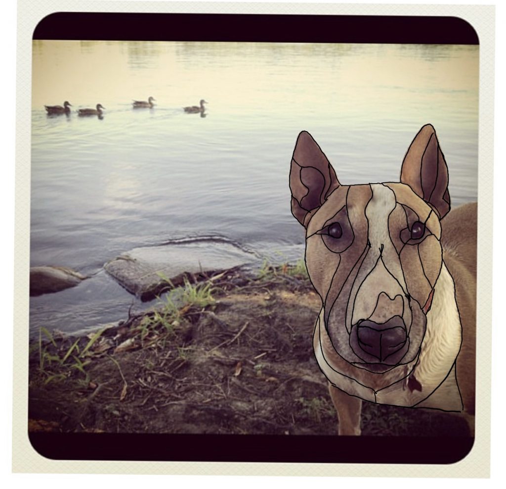
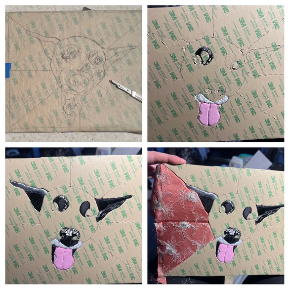
Then I traced those shapes onto a sheet of stencil paper. I taped it to the foam, and using a scalpel, cut out the shapes, leaving the sheet of paper over the sticky part.
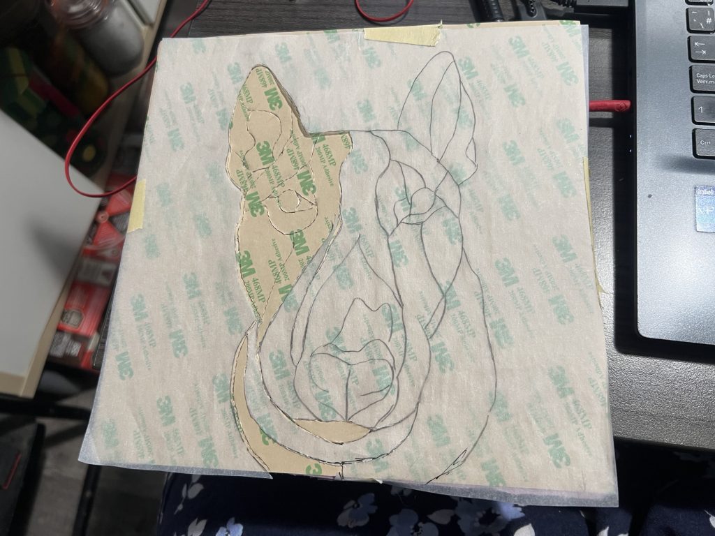
Then I went through the fabric I bought at VV (and washed in hot water, natch) as well as what I had on hand. Technically, her colour is what’s called smut, and finding a big huge chunk of fabric in that exact colour is hard, but I went with this bed sheet. I already had the pink, black, brown, curly white, and red fabric on hand. I wish I’d used more artistic licence to extend the red fabric (her collar) so the pattern was more visible. It’s Chinese brocade silk with dragons on it. I failed to realize that the sliver of red would be even smaller once I was done tucking. I could have extended that up farther and thicker, but anyway.
Then, section by section, I took off the paper, exposing the sticky side, and cut pieces of fabric around the paper side. With a stitch ripper, I tucked each bit of fabric in around where I had cut the line. Once you start tucking, you can trim the excess with scissors or a nipper.
I wanted to capture the different textures, and colours. In the picture, her fur is wet, ostensibly because she was just in that stinky lake (she was like that), so I used the curly white fabric to show fur texture, and break up the whites. Making a lot more individual slices was WAY better than just doing one flat face like I did for La.
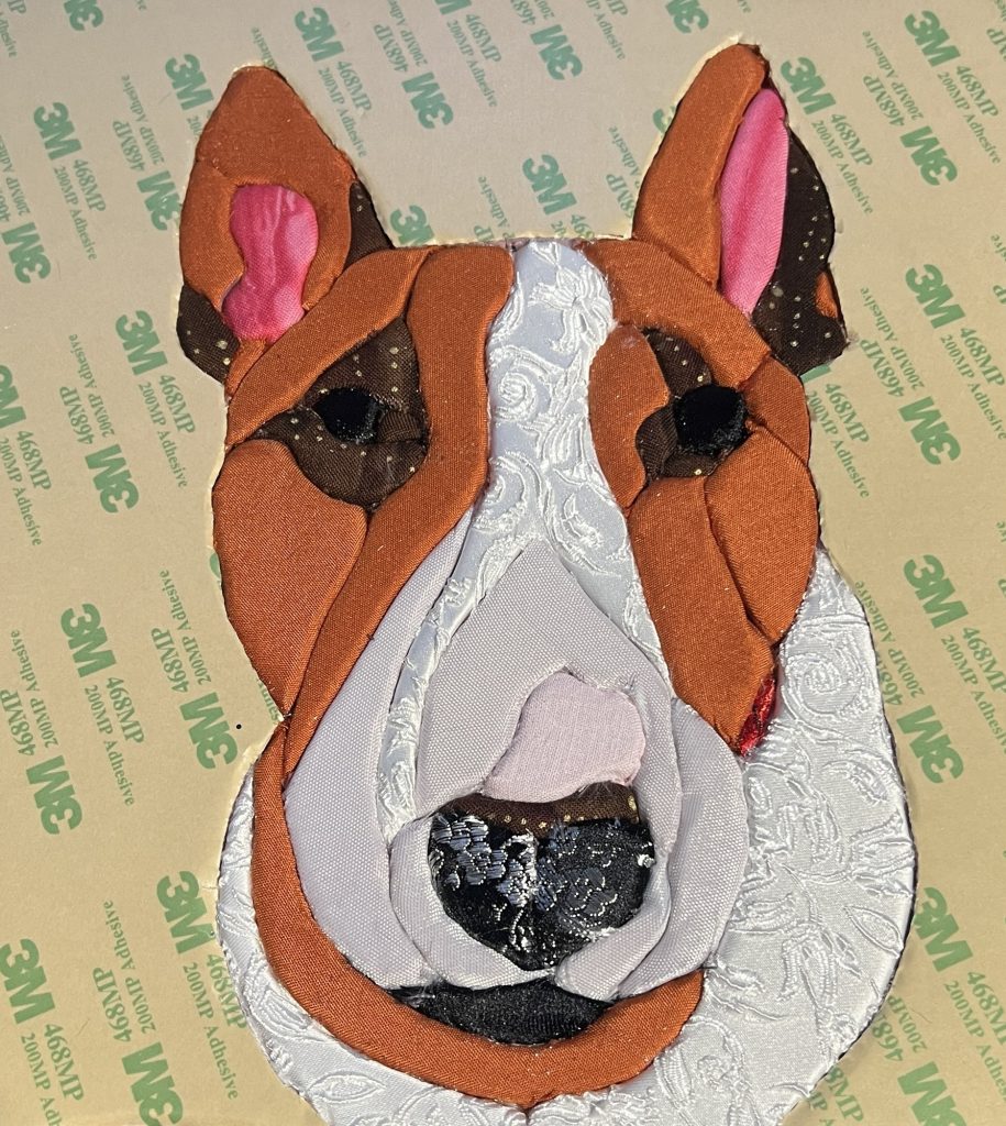
As I was looking for fabric at VV, I came across this cherry blossom shower curtain. I didn’t even bother looking at it, I just grabbed it right away. I knew I wanted it for the background, but I was slightly concerned that the blossoms were too big. They weren’t.
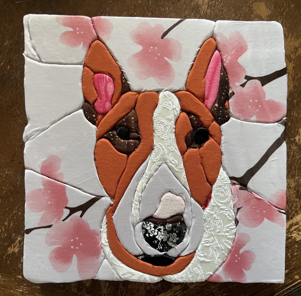
Learning from the Lala piece, I cut the edge pieces about an inch longer than necessary. Then I went along and extended the cut to the edges, and tucked the fabric in. I tried to overlap it so that if there was one shorter side, it got tucked in by the longer side, if that makes sense. Then I used some of the off cuts of sticky paper to adhere it to the back, and used painter’s tape to stick it all down. On the back, I used the rest of the sticky tape so I can mount it to the frame.
There are some weird tucks and folds in the fabric, but it IS a fabric craft, so I think that’s allowedsies. Also, the shower curtain was so delicate and would run if you looked at it sideways, but I think it worked pretty well in the end. In order to have a continued blossom or tree branch across a seam, I had to find two that were similar (which was impossible since the pattern was non-repeating), and then position them in such a way to look like they’re one. I had originally bought pink satin fabric for her nose, but I ended up pulling it off (and also the sticky, so I had to re-cut that piece) because it was too similar to the white from the shower curtain above her nose. This was a piece of leftover pink and red polka dot fabric that I had on hand, but if I were to do this again, I would probably try using the blossom from the shower curtain. I used the white from the shower curtain for the bridge of her nose because it was a bit see-through, and her that part of her nose isn’t entirely white white.
You can see that the block is a little wonky, but like, whatever. I can’t do anything straight, and everyone knows it. At this point, she was still missing white paint dots for reflections in her eyes, but it’s essentially done.
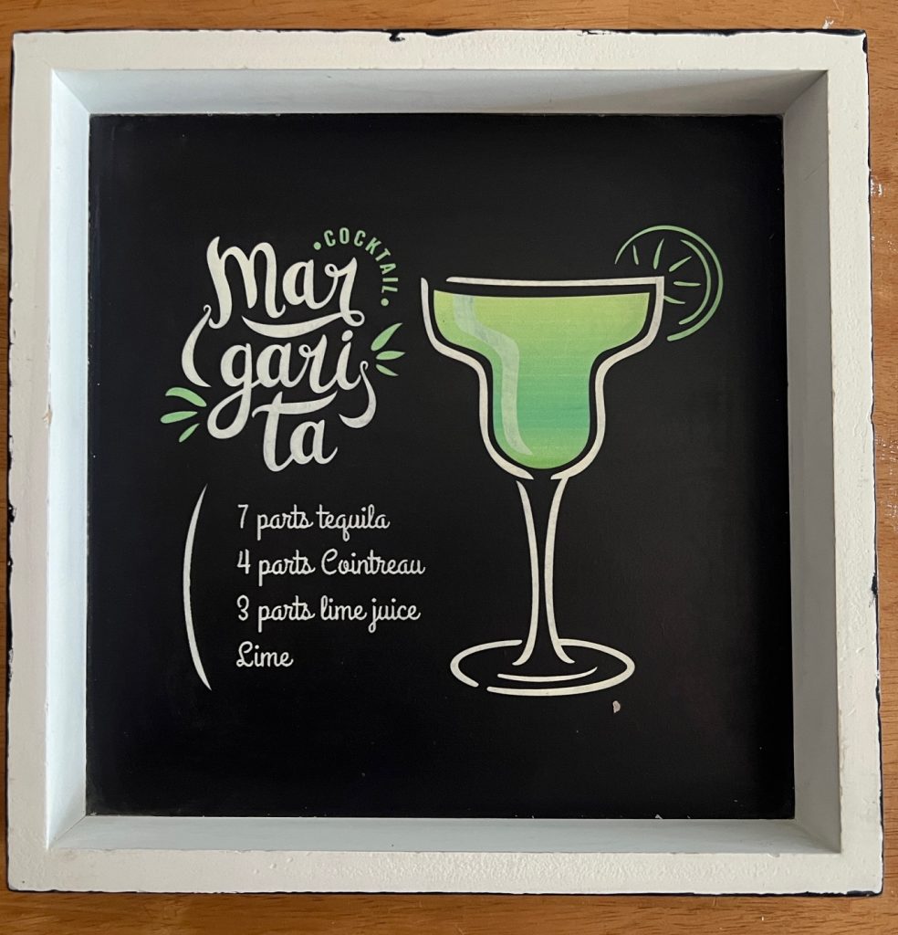
I had bought some frames at VV, but realized they were the wrong kind of frames and would require too much work to retrofit into what I wanted. Instead, I found three of these ones where the image is set at the back of the frame. You want it set in as deep as your foam so the piece is flush with the front of the frame. My foam was 1″ deep. This frame was in pretty rough shape, so I washed it down and sanded it with a magic eraser to get some of the grime off. Then I painted the back and sides black. I will probably leave the background as-is, because the piece should cover it. You can’t tell from the picture, but it’s sorta glossy and I don’t really want to fuck with covering that properly. I also coated it in glossy Mod Podge, because the black acrylic is just going to be flaky and I don’t want it to scratch or come off. On that note – anyone have tips for a streak-free finish? I tried watering it down a little, and did thin coats, and even tried using my finger, but it’s still rougher than I’d like. Anyway.
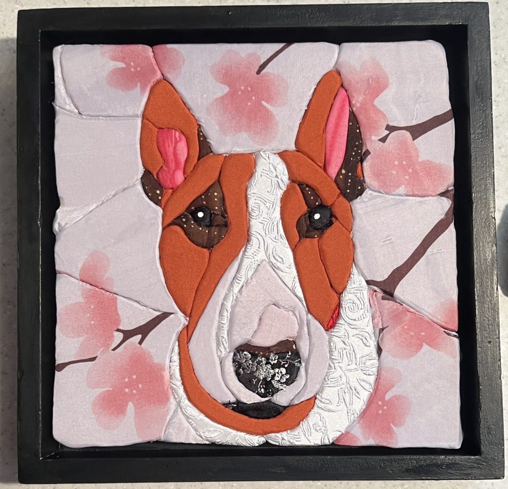
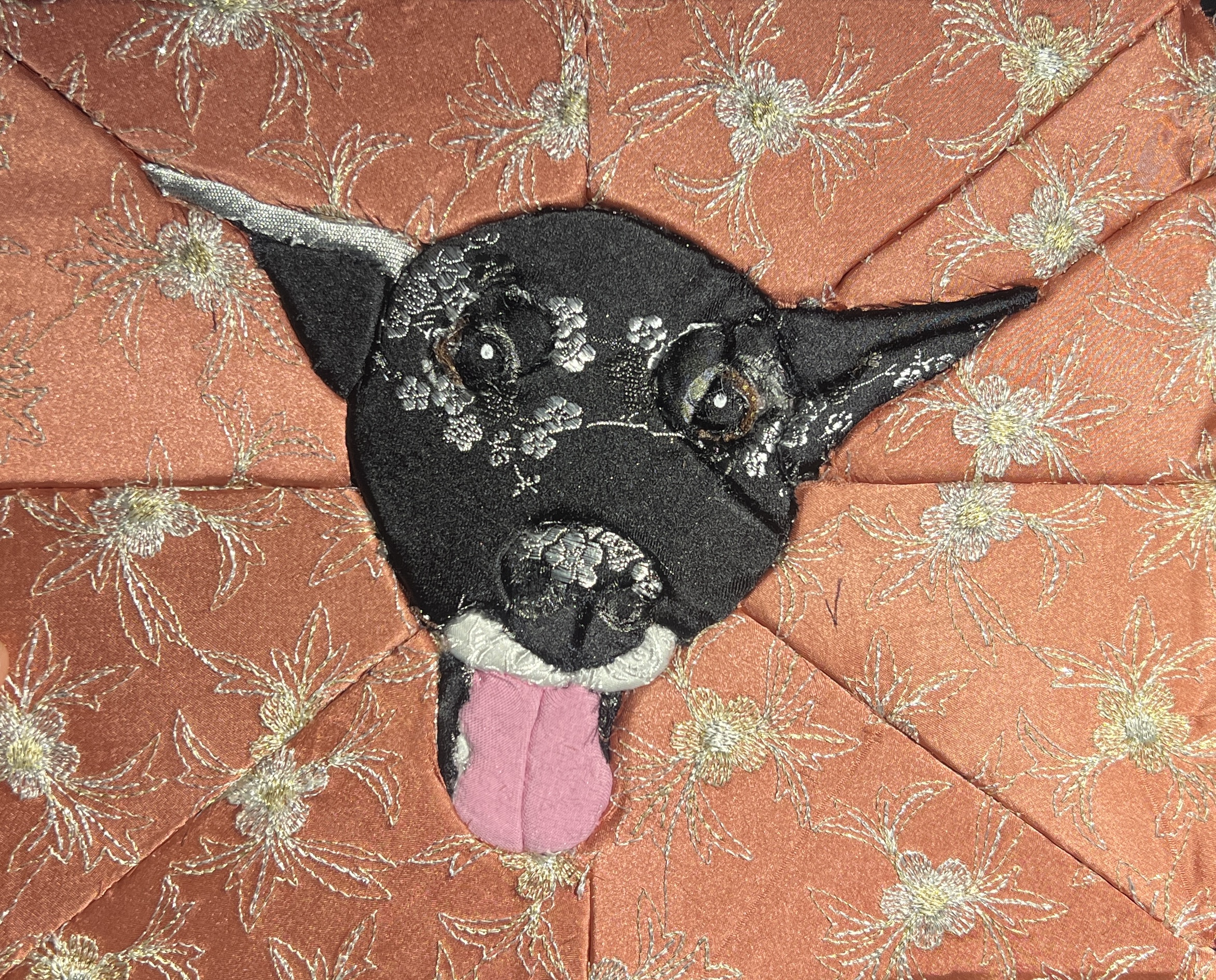
And here’s the finished piece! I’m pretty happy with how it turned out, all things considering. I still think her nose isn’t pink enough, but I don’t want to undo it a second time. I am often guilty of picking at a project after it’s done, then wrecking it as a result. I think the background is more dynamic than my first one, and I think more sections = better result. You can REALLY tell that the cut isn’t even/smooth, so I am looking into a heated foam-cutting tool so I can fix it on my next one. In any event, I hope my friend likes it!
I shelled out about $10 for the foam at Home Depot, and $20 for 5 sheets of sticky adhesive transfer tape on Amazon, and even though I’d never done this craft before, armed with half the confidence of a mediocre white man, I jumped in.
I started by cutting the foam and sticky tape to size, and sticking them together. Then I used my iPad as a light table and traced an image of Lala’s face onto tracing paper. I taped that tracing paper to the back of the foam, and used a scalpel to cut out the stencil.
Then I peeled the backing off and used that cutout as a guide to how much fabric I needed to cut for the piece. I trimmed it to size, and peeled off the backing and stuck it to the sticky tape. Then I went along the lines with a stitch ripper and tucked the ends in as I went along.
For never having done this before, boy did I learn things! You can see here that I had done her eyebrows first, and I was really happy with the fact that I used the silver cherry blossoms to mimic highlights in her fur. But when it came time to put the pieces down for the rest of her face, I had to guess at where the eyes were and it was much harder than I would have liked.
Also, pretty much as soon as I finished, the OP made a post about how to draw a stencil from a picture of a dog, and how she did the eyes made so much more sense. The key is to make more seams around the eyes so that you don’t have to fuss with sticking fabric into a circle. Smart. You can see in the finished product that I had a hard time getting the brown of her irises in there, so they’re pretty hard to see. I also added a seam under her cheek in order to get the fabric into a tight spot, but it makes the rest of the face look pretty flat. If I do it again, I will make more seams up the sides of her nose to give it a bit of depth.
The fabric you use is also very important. I’ve had the Chinese brocade silk for years, and the vintage 50s pink fabric even longer, so I wanted to use what I had on hand. The brocade is gorgeous, but I noticed that if I didn’t cut the fabric long enough, it would fray and come undone. A lot of the weave on the back came apart and I ended up with wisps of it floating through the air and getting up my nose. I also nicked it with my fancy sharp scissors a few times, so I had to be careful with how close I got with trimming.
I also used a chrome marker and some white paint to help identify her eyes better. It’s mixed media anyway, right?
I also didn’t cut enough fabric to trim the edges, so I think I will stick some thick black ribbon around the border so you don’t see the foam. I bought some frames but I think they’re too shallow/the foam is too thick, so the next step is to try to router out the inside supports for the frames, and then cut the foam in half. Had I been thinking, I would have bought the 1/2″ foam, but I sometimes get fixated and want to get the exact same supplies as the example.
I got the idea to make these mason jar bunnies from a reel I saw on IG. I picked up six mason jars and six plaster bunnies from the dollar store. Six, because there are 3 people on my team, 2 TLs, and my boss. I usually make something more elaborate for my immediate team, and then something thoughtful for the rest, because I don’t want to make 15 elaborate gifts for everyone :\
I went to Michael’s to get some spray paint. I initially was going to do a chalk pastel colour, but I didn’t like anything they had. I fell for this gorgeous teal colour, but was suspicious of it’s opaqueness. Two ladies there repeatedly and wholeheartedly assured me it was indeed opaque. It was not. I had suspicions because I had fallen for a similar black finish last year. No matter, I had the teal paint on hand, it was just another step I had wanted to avoid.
So I glued the bunnies to the lid with Gorilla Glue (first time I worked with it – there are pros and cons), then painted them with two coats of teal, then spray painted them with the teal glitter. Now I’m not good at spray paint, and I realized the bunnies had this white cloud on them. Turns out, that’s called bloom and it happens if it’s too cold when you spray, it’s too hot when you spray, if you spray too close, if you spray too far, if it’s Tuesday, if it’s raining, whatever. I don’t honestly know. The only way to fix it is to sand and re-spray.

I didn’t want to do that because the bunnies are plaster, so I ended up re-painting the bloom spots, and re-spraying.


Then I used some ribbon I’ve had on hand for probably close to 20 years, and glued it around the bottom of lid. I filled the jars with paper Easter grass and chocolates. If there’s anything I’d do differently, I’d pay attention to how the lids closed. If you don’t have a rabbit on the lid, it doesn’t matter where they line up when you close them. But if you want the front of the bunny to face the front of the jar (with the writing on it), then you need to make a mark on the lid to align the bunny with the mark. I don’t think anyone will care, but it’s just one of those things I realized after I was done. I also realized I didn’t care enough to fix it. Oh well. Lesson learned for next time.
For the rest of the team, I picked up treat bags and filled them with grass and chocolates. I also made little business card sized cards with a stamp on it to identify who the present was from, but I didn’t bother photographing them.

Then I made six cards to go with the six bunnies. It’s probably the most layered and complex card I’ve done in awhile, so they took FOREVER, but I bought new paper so was excited to use it. I of course didn’t NEED new paper, but whatever. Michael’s had a saaaaale.

Then last night, I snuck into the office with my bestie to deliver the presents because I like making sure folks get the gift before the actual holiday. I was happy to deliver them because I started this project back in February, so it was good to get them out of the house.
And that’s Easter, 2026! Next event will be Canada Day, but we’ll see if I end up making something elaborate or if I just get everyone Canadian flag boppers or something.
]]>Around the time that I was doing the coke lobster, I saw a reel of a woman who put a fish on her bunny hug. I was going to start with that project first because it was for me and I could get all my mistakes out and make a perfect one for my buddy. That did NOT happen.
It started by sourcing materials at Value Village.

I really liked the blue fabric and how it played with the other two. What I didn’t like was that blue fabric frayed like frigging crazy. The dogs were walking around wearing threads. Threads ended up in my entire house. I had to re-cut it with pinking shears the second time around because it frayed so much. It was ridiculous. Also, my stupidly long monkey arms. Why are my arms so long? Do you know how hard it is to sew that much fabric in a straight line in a garment that’s already assembled?? VERY HARD. Also, sneak preview of another project I finished last weekend.

Good joke, right??
What’s hilarious about this is I expected to have all kinds of issues with the coke lobster. Turns out I had one single issue where the bobbin was too small and was bouncing around, screwing up the stitching. Otherwise it was absolutely smooth sailing. Whereas THIS mofo had ALLLLL the gee dee issues. I again had bobbin issues (user error, I hadn’t pulled the thread up properly), the fraying OMG the fraying. I also don’t really like how the tail fin came out, but whatever. It’s done and I’m happy with it and I make the joke every second I can.
]]>First step was to source materials. I knew I wanted it to have Saskatchewan on it, so we hit up two different Value Villages to see if I could find something suitable. I managed to find t-shirts and hoodies from every single province BUT SK, as well as many states and even the NWT. Ridics. The only thing I found that had SK on it at all was a Terry Fox t-shirt but the font was entirely too small. I managed to find this brand new shirt that said “Sometimes I feel ugly then I look at my brother and I am OK” which is funny on it’s own, but more importantly, held all the letters I needed but one – the C. Do you know how many letters are in the word Saskatchewan?? TWELVE. Anyway, it was a better option than buying 3 or 4 different shirts that had all the letters I needed. I ended up converting one of the Os to a C by cutting out the inside. I had to stitch around the C on a piece of black fabric so that it looked complete.
This pic is bad but 1. is the donor bunny hug (a hoodie without a zipper is called a bunny hug in SK and that’s the cutest thing EVAR). 2. was the shirt I got from VV. 3 is the fabric I already had on hand (I thought I’d craft my stash for this but I ended up buying most of the fabric. Sigh. Fabricland had a 55% off sale, so it would have been offensive NOT to). 4. is the new red fleece fabric. 5. is shiny fabric that looks like a mirror (confirmed by the Fabricland lady). 6. is Dr. Seuss fabric I’ve had on hand for at least 10+ years. Probably more like 15. 7. was new fabric I bought. 8. was new ribbons. Other things not listed: new buttons for eyes, fabric glue so I didn’t have to baste, and the wooden block to flatten seams. I used it more to flatten the fabric I glued down.
I free-handed the lobster, and cut out all my fabric and letters. I laid the gingham pattern down first, then sewed on most the lobstery bits. Then I sewed the mirror down, the antennae on top of that, then I made the razor blade out of the ribbon, and sewed the white fabric on the mirror and nose. I put a green straw in one claw because I couldn’t find any fabric with money printed on it. Last step was sewing the letters on. I wanted the stitching on the letters to look uneven and like a ransom note.
Looking at it now, I probably could have done a better job on the body (the second and third sections could probably have been bigger), but you’re your own worst critic and he loved it so I consider that a win.


Then I made a cute little watercolour card.
]]>I mixed up some resin with sand and a bunch of glitter, and poured it into the mould. I should have let that sit for several hours, but of course I didn’t. Then I mixed up two batches of resin with opaque blue dye and paint, and one with white paint. I layered it into the mould and used a heat gun to mix it up and create the lace effect I was after. I was pleased enough with how it looked on the back, but realized the mould wasn’t full, and I wanted to add more resin.
I let it harden over two days, and then couldn’t leave well enough alone. I mixed up some resin with transparent blue and green dyes, and a batch of resin with white paint. I should have used transparent white dye instead of opaque white paint, because it obliterated any lace work I had achieved. Whoops.
I used the rest of the resin to make two little trinket boxes with the same ocean theme. I still need to trim the raw edges, but then they will be done.
I was happy enough with the end result, and will probably make another set of three coasters for a full set of six. This time, I will try letting it dry between layers. I found the sand mixed with the surf, which is fine, but the sand is not opaque like I wanted. We’ll see what happens this weekend. They move at the end of May, so I’ve got time.

