In the spring of 2019, Safari 12.1 became the first browser to support dark mode on the web. A lot of people love using dark mode, but not every website has a dark version. Almost 40% of web page loads are from users in dark mode, and yet only 10% of page loads support it. If you love dark mode, you’ve probably hit a site that felt particularly bright. Adaptive Dark Mode is designed to close that gap, providing a consistent dark experience across the web.
You can try it today in Safari 27.3 beta. To enable, first make sure your system appearance is set to dark. Then browse to a website with a bright background. Safari will offer a preview of Adaptive Dark Mode. Tap ‘Try’.
For websites that signal support of dark mode with
<meta name="color-scheme" content="light dark">in HTML orcolor-scheme: light darkin CSS, Adaptive Dark Mode does not change a thing. For the rest of the web, it quickly analyzes the page, looking at colors and estimating whether it’s predominantly light or dark. If the page generally has a dark background with light text, nothing is changed. When a page has a light appearance, Adaptive Dark Mode adapts the page to be dark.
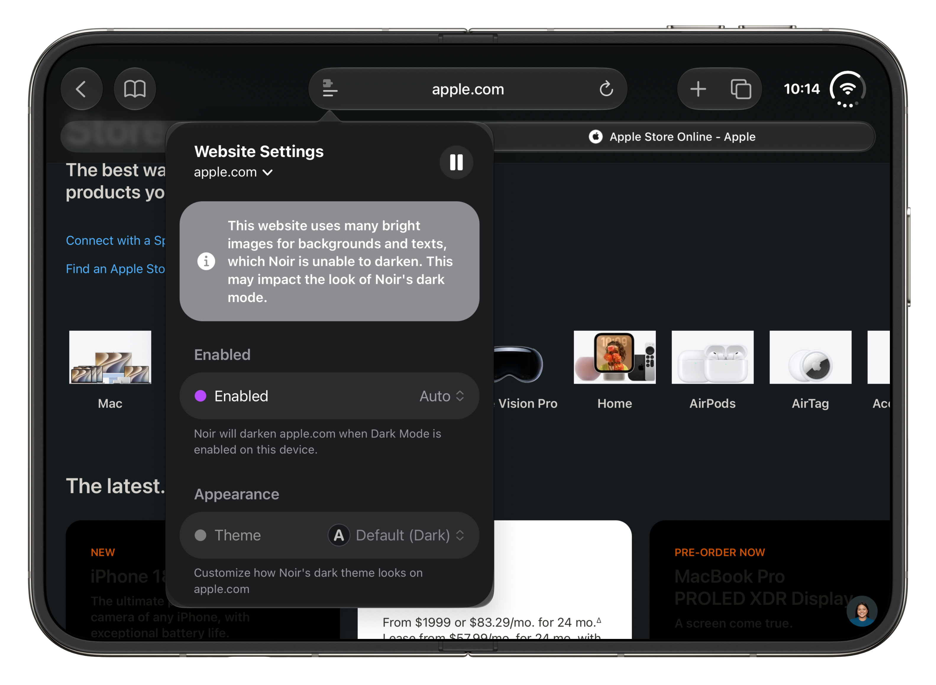
For years, I’ve used Noir to force a dark mode onto websites that don’t support it. It is a great app, but even great apps can’t overcome web design that doesn’t seem to consider dark mode at all, like Apple’s own website:
WebKit’s implementation seems to have similar issues. Here is the same page, on an iPhone Air running iOS 27.3:
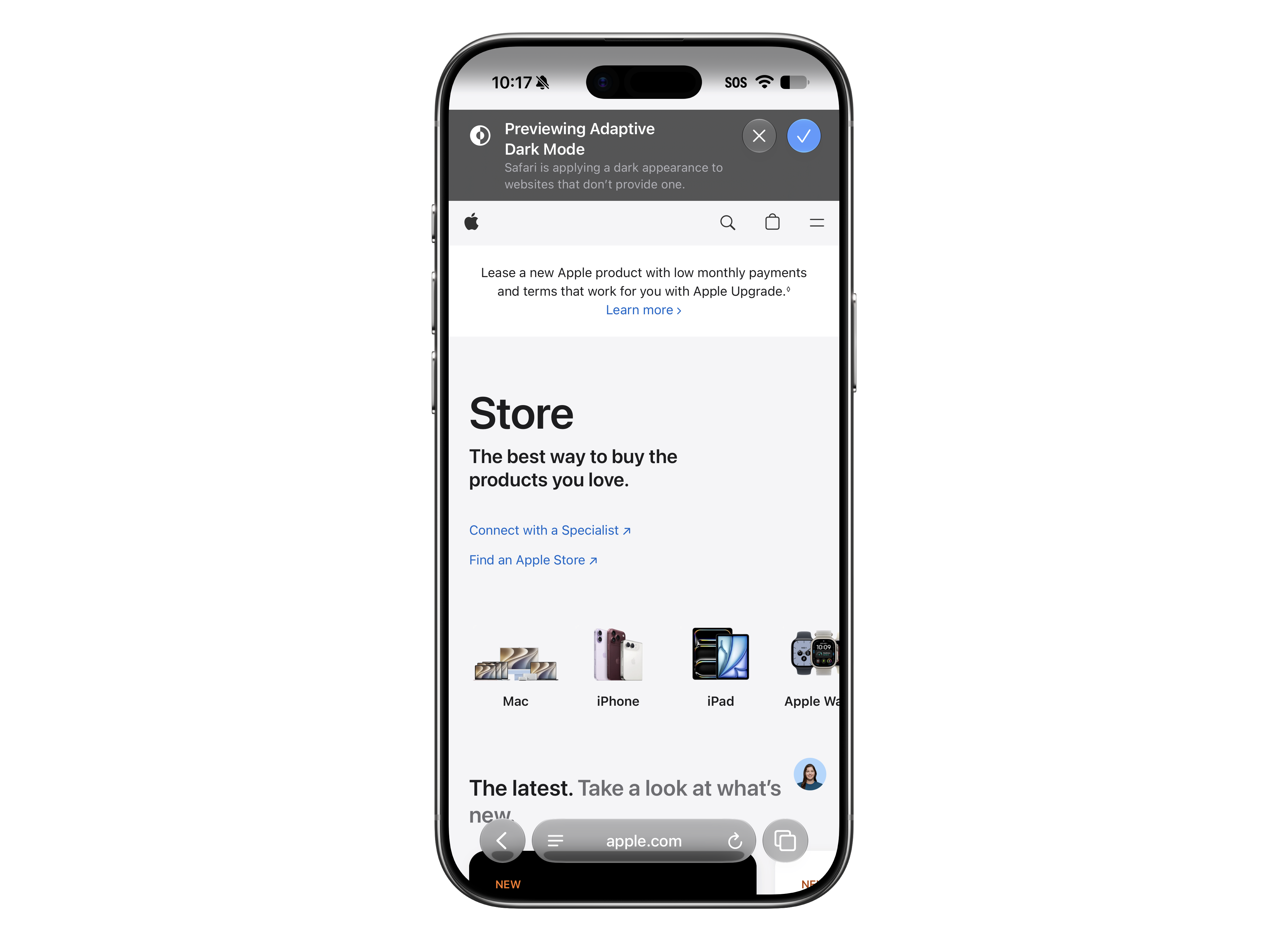
Clearly, this isn’t perfect, but for a lot of people, it should be better than using the web without an extension like Noir.
Jason Snell wants to see Apple push this harder:
]]>This is a great feature that’s long overdue as a part of Safari. But Apple needs to not stop here: HTML email in Apple Mail is also a disaster in dark mode. Also, this change doesn’t affect in-app WebViews today, which means your in-app browser sheet will still shout at you in the dark. Once this shakedown cruise in Safari is done, Apple needs to put these smarts everywhere.
One aspect of the iPhone Duo that I am enjoying is akin to this. If I’m working on the inside screen, I want to shut the phone and have it lock, ready to go back in my pocket. This move says, “I’ve done the thing I needed to do, and now it’s time to move on.”
Sadly, the iPhone Duo doesn’t agree; shutting the phone simply transfers whatever is on the inside display to the outer one.
Even after a week, I have not gotten used to this, and have found myself accidentally interacting with the outside display, either as the phone was folding or as I was putting it in my pocket.
Thankfully, Stephen Robles has created a Shortcut that makes the Duo work exactly how my brain says it should:
- If the inner display is on the Home Screen, lock the phone when it closes.
- If the inner display has an app on it, transfer the app to the outer screen and keep the phone unlocked.
The whole Shortcut is really simple:
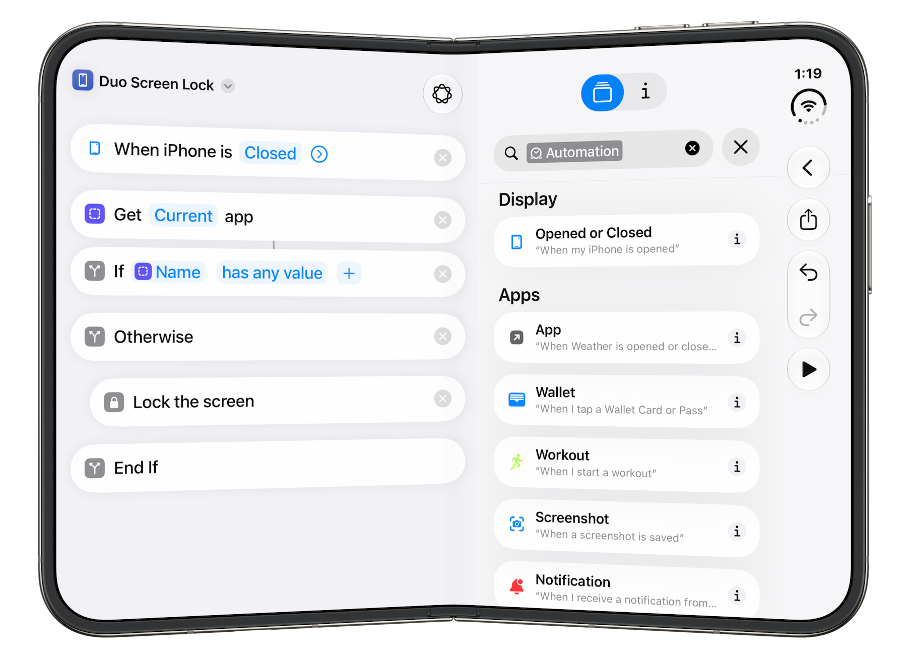
You can download it from Stephen here.
-
This is what passed for rizz in 2005. ↩︎
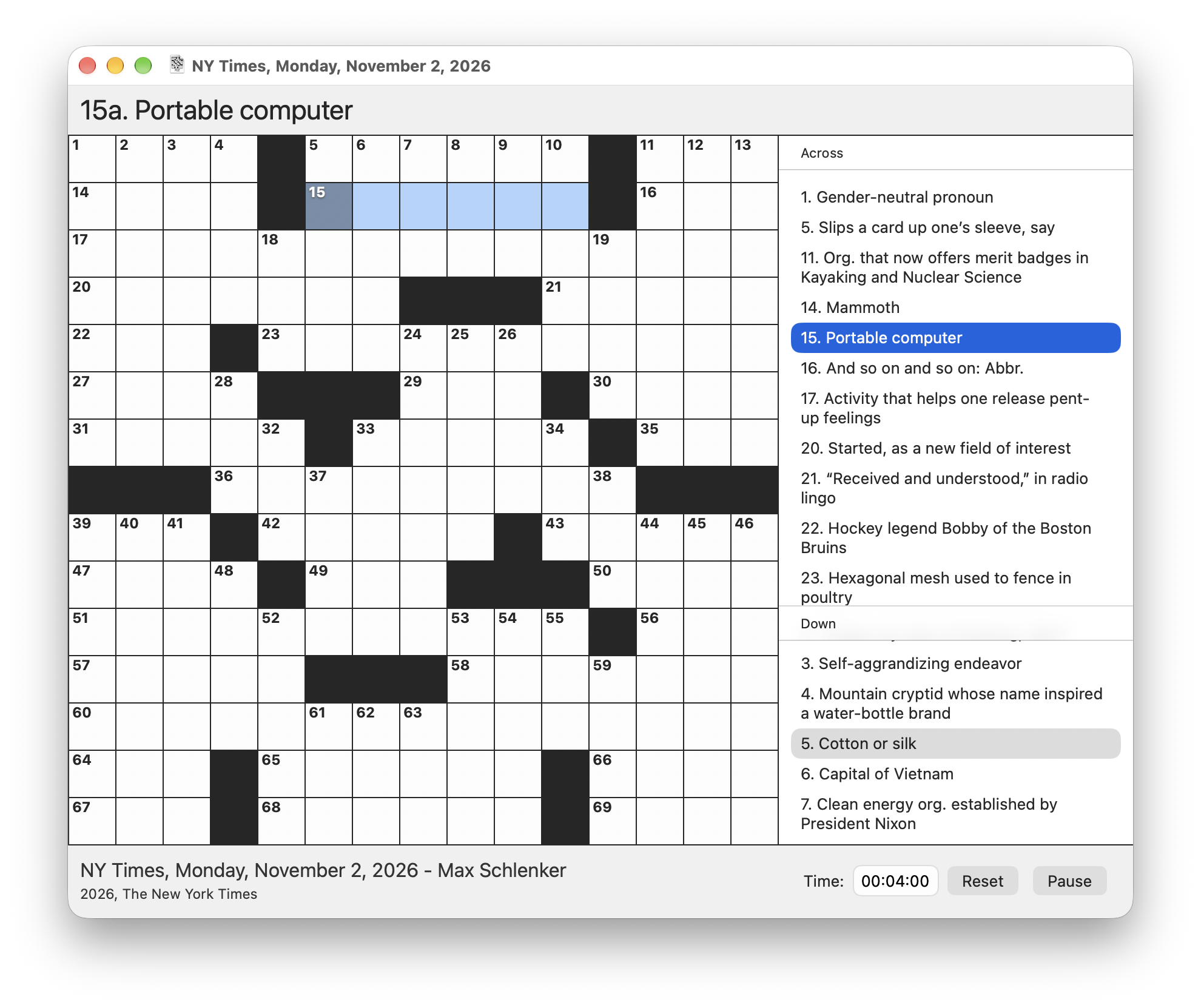
The beta also includes an innovative new “share solving” feature that is unique to Black Ink. As you solve, the app records the order and timing of your own personal progress, so that it can replay your solving process when you’ve finished. You can easily copy the solve as an animated GIF, with or without spoilers, to share with your friends and family. Check it out in action here!
During the beta period Black Ink’s premium features are free for all, so go check it out and see what you think!
]]>Adding touch to that should have been treated as the biggest change to the Mac in more than half a decade. Instead, Apple presented it as more of a routine upgrade — rather than an opportunity to build something new. The updated models are significantly lighter and slightly thinner, with better heat management and a redesigned cooling system. Yet they look much like the tried-and-true 2021 versions and run the same M5 Pro and M5 Max chips introduced this past spring.
Apple has finally made a touch-screen Mac but is offering few new reasons for customers to take advantage of the feature. As expected, the software implementation is largely about tapping, swiping, pinching, zooming and scrolling. The most interesting application I saw was using the touch display to test iPhone apps in development, which is hardly a mass-market selling point. In some cases, the touch controls are even too small to be easily tapped.
Rather than enabling a new paradigm, the addition instead serves several marketing and financial purposes: It closes a gap that Windows laptop makers have highlighted for years; accommodates consumers who grew up with iPhones and iPads and find it strange that a pricier Apple laptop won’t respond to touch; and gives the company another feature to market to prospective upgraders. The change also makes interactions across Apple’s products more consistent.
He goes on from there, but his overall point is that Apple didn’t push the MacBook Pro far enough when adding touch. That’s a point I disagree with; Apple’s way of treating touch as a nice addition atop an already-beloved machine was the right call.
The last time Apple totally reworked the MacBook Pro, it did not go well, and reworking macOS for touch would invite a lot of the issues Microsoft has had with Windows when trying the same thing. Stability is the name of the game with a product like this.
]]>
]]>MacBook Pros can be touched, iPad mini chips can be binned, and John Ternus can change the world.
]]>I’d argue that the Mac’s lack of touch is a liability at this point. Its omission has turned from a deliberate design decision that made sense for its time to a choice dictated by inertia and, perhaps, an unwillingness to challenge the status quo. Which is especially funny since the “status quo” of Apple is that of a company that sells millions of touch-enabled devices every year and considerably fewer trackpad-only ones. The lack of touch on the Mac feels like a self-inflicted problem that has no reason to exist anymore, and which John Ternus is rightfully rectifying for the modern age.
As someone who has spent the past decade working on an iPad, and is now increasingly shifting his workflow to the Mac, I think it’s great that we’re getting touch as an option on the Mac. I’ve always been in favor of hardware that can adapt to the user instead of the other way around.
The MacBook Pro getting touch support feels like another step in the long arc of Apple meeting users where they are – even if it means “contradicting” a quote from 2010. We’re moving on, and it’s about time.
I ask if Apple is about to break a long-imposed taboo and introduce a Macintosh with a touch screen.
Ternus beams. “Who knew?”
We are referring to the new MacBook Pro with PROLED XDR Display that Apple is releasing today at an event in Los Angeles. It’s got a mighty M5 Pro or M5 Max chip and a show-stopping tandem OLED screen. (A tandem screen has multiple light-emitting layers, producing more dramatic contrasts.) But its most conspicuous feature is one that’s been deeply woven into iPhones, iPads, and even Apple Watches for years but not Apple’s laptops: a touch display. After years of resistance, a Mac screen has finally gone digital.
As in fingers.
This turnaround is a big deal to Apple fans. Ternus shrugs off the drama. “The Mac is first and foremost an indirect input device, built around the trackpad and keyboard. But I think there’s times when it’s comfortable and handy to have touch.”
Levy goes on:
Joswiak, who holds Schiller’s old title of SVP of worldwide marketing, concedes that touch was overdue, at least for users with sophisticated needs. Its pro customers—engineers, scientists, software developers, and media creators—were impatient with Apple for its failure to let them interact directly with the screen. “Most pros own an iPad, and almost every pro owns an iPhone,” Joswiak says. “So this is something that they’re natural with. There’s a generation of young creators and young people using our MacBook Pros that expect to touch.”
That last reason is the most important one.
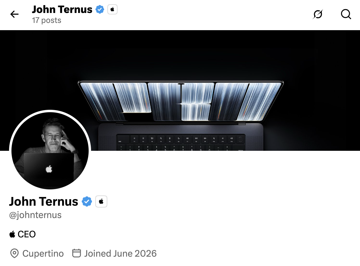
]]>The most important thing about this laptop is that the Apple logo lights up on the lid. I will never forgive Jony Ive and Tim Cook for taking that away ten years ago. I understood it on the 12-inch MacBook in 2015, but taking it off the MacBook Pros was in poor taste.
John Ternus’ new X (gross) profile photo is all about this detail:
In terms of specs, the two classes of MacBook Pros are very similar. Both use the M5 Pro or M5 Max,2 and both top out at 128 GB of unified memory. The OLED model can be had with a 16 TB SSD for a cool $7,000. Here are the main areas in which the specs differ:
| MacBook Pro with PROLED XDR Display | MacBook Pro (Liquid Retina XDR) | |
|---|---|---|
| Max Storage | 16TB (M5 Max) | 8TB (M5 Max) |
| Max RAM | 128GB (M5 Max, 40-core GPU) | 128GB (M5 Max, 40-core GPU); M6 tops out at 32GB |
| HDR Peak Brightness | 2000 nits | 1600 nits |
| SDR Brightness | 1000 nits sustained, 2000 nits peak (outdoor) | Up to 1000 nits (outdoor) |
| XDR Reference Modes | P3-2000 nits; P3 + Adobe RGB-2000 nits | P3-1600 nits; Apple Display (P3-600 nits) |
| Additional Reference Modes | Adobe RGB D50/D65, HDR Photography, DICOM 350/600 nits | — |
| 14" Weight | 3.0 lb (M5 Pro) / 3.1 lb (M5 Max) | 3.4 lb (M6) / 3.5 lb (M5 Pro) / 3.6 lb (M5 Max) |
| 16" Weight | 4.0 lb (M5 Pro) / 4.1 lb (M5 Max) | 4.7 lb (both) |
The big story here is the display. Here’s a bit from that press release:
The new MacBook Pro debuts the PROLED XDR display, which uses tandem OLED technology and advances it with breakthrough innovations in every layer, advanced algorithms in the display engine, and a state-of-the-art factory calibration process to deliver Extreme Dynamic Range (XDR) and stunning visual fidelity. With exceptional brightness, striking contrast, and vivid true-to-life colors, PROLED XDR offers the ultimate front-of-screen performance, enabling a new level of visual acuity and precision for content creators, photographers, colorists, and designers who need a reference-caliber display on the go.
PROLED XDR is the world’s best laptop display, delivering true-to-life color and unparalleled brightness and contrast. The PROLED XDR display offers tandem OLED technology unlike any other, with deep innovations in its layers that keep brightness and grayscale uniform across the entire display, while minimizing internal reflections common in traditional OLED designs. It’s all backed by advanced algorithms in the display engine that precisely control each pixel in real time, plus a meticulous manufacturing process and precise calibration of every panel for consistency from display to display.
PROLED XDR offers up to 2000 nits peak HDR and SDR brightness, allowing specular highlights to shine with stunning intensity. And through optimizations in the tandem OLED panel and custom compensation techniques, combined with precise control of light across the display, the PROLED XDR display achieves an industry-leading 10,000,000:1 contrast ratio, so even the deepest shadows reveal incredible detail, bringing HDR content remarkably close to reality.
The tandem panel is built for professionals, and I think it shows. Its wide color gamut will be appreciated by some, as will the 2000 nits peak SDR brightness.
The notch of the current design is gone, and the Dynamic Island has washed ashore on macOS. I dig it.
…but this display won’t be remembered for any of that stuff. It will be remembered for this:

Back to Apple:
Thoughtfully designed for Mac, Touch introduces a whole new way to interact with your work. The Touch sensor is built directly into the display panel — not layered on top of it — reducing latency so you feel like you’re touching the content itself. Everyday experiences like scrolling and pinching to zoom feel natural and responsive. And new, intuitive interactions let you do even more, like manipulating 3D objects or playing virtual instruments.
macOS hasn’t followed Windows in overhauling its design for touch. There are some minor tweaks like increased menu spacing, pop-out window controls, and small animations to assist when touching the UI, but this version of Golden Gate is very, very similar to the one we’re all running today.
I think this was exactly the right way to add touch to the Mac. As someone sticking with his M4 Max MacBook Pro, I don’t feel like I’m missing out on the future of the Mac. I’m sure this will be cool when I eventually upgrade from this notebook.
Jason Snell compares this strategy to one where Apple makes some convertible machine that’s more like an iPad when folded around:
If Apple wants to make that laptop in the future, it can—and it can add a more complex touch mode then. Instead, this interface strikes me as Apple doing right by its own MacBook Pro users by making the touch interface nice, but also acknowledging that for most people, touch will be an additive part of interfacing with their Mac, on top of keyboard and trackpad.
That said, one portion of Apple’s intro video showed a developer using Xcode to test an iOS app, and they were touching the app in the iOS simulator. That… is a really cool use case. For the first time, developers will be able to touch their apps right on their laptop screen during development.
The chassis is both thinner and lighter on this machine, but not to the detriment of usability. Mercifully, all of the ports have survived, and Apple is boasting about an even better sound system than before.
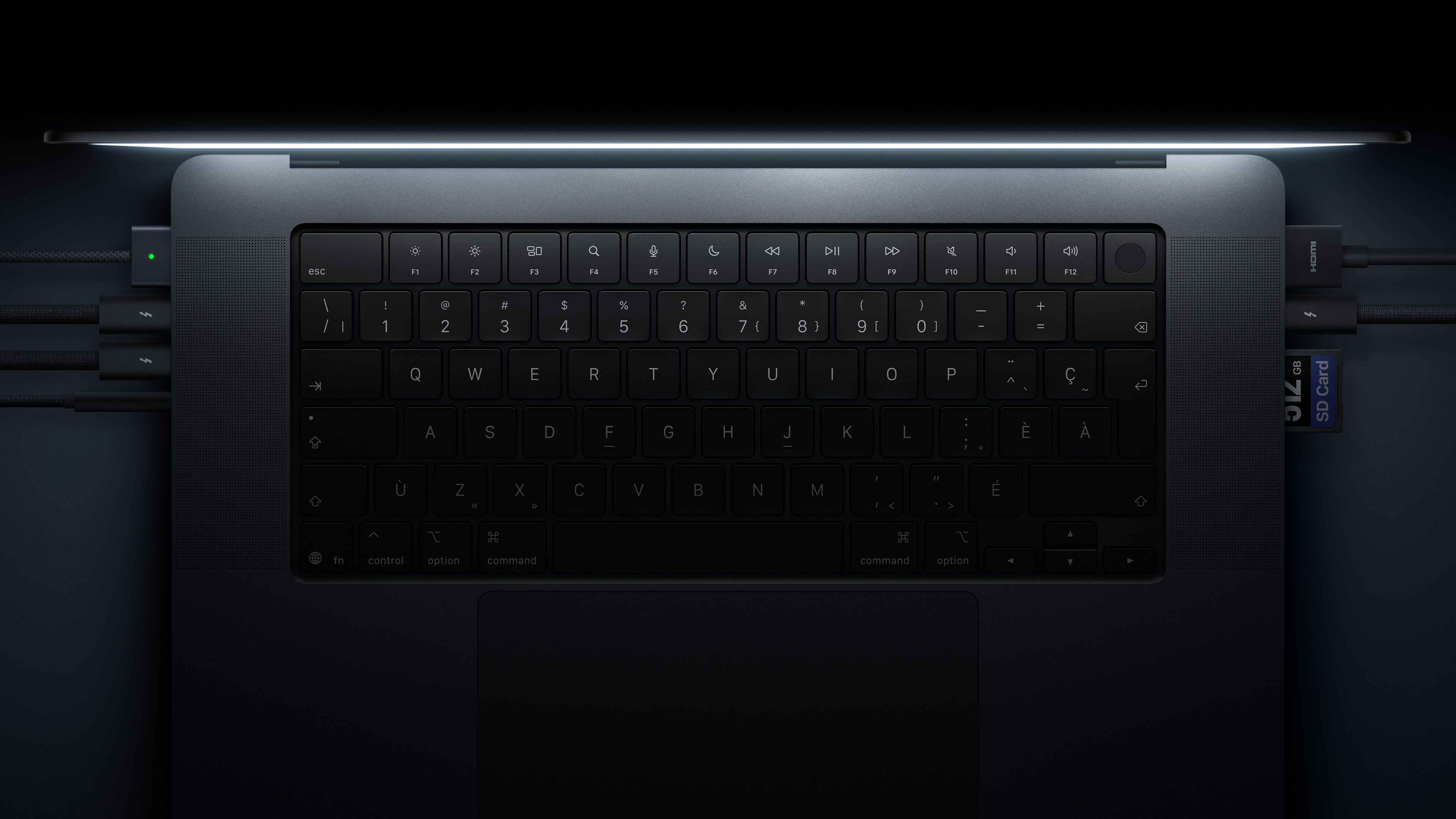
All in all, this is exactly what most people expected, and I think that’s great. In the past, big swings with the MacBook Pro have led to some serious misses. Playing it safe — while still moving things forward — is the right call for such an important product.
These new machines are more expensive than the regular MacBook Pro, but not by as much as I feared. The PROLED models start at $2,899 for the 14-inch and $3,399 for the 16-inch, both with the M5 Max. The existing MacBook Pro starts at $2,499 and $2,999, respectively. Pre-orders are up now.
-
I am thankful for clarity in the name, but in the history of dumb Apple names … we may have a new winner. ↩︎
-
Mark Gurman has reported that the M6 Pro and M6 Max have been tossed overboard to move more quickly to the M7 generation of Apple silicon. Time will tell if he’s right, but it sure seems like he may be. ↩︎
Turns out, it is wild. Tom Owad wrote about it back in 2004:
The Apple Network Servers are high end servers built by Apple that run IBM’s AIX variant of UNIX. Pictured above is the Apple Network Server 700, Apple’s top-of-the-line server with a 180 MHz PPC 604e processor, two power supplies, 7 removable drive bays and 2 fixed drives. The ANS 500 had a slightly lesser configuration, with a 132 MHz 604e, only one power supply, and 7 removable drive bays. Both have locking wheels on the bottom (handy since the unit weighs about 80 pounds!) and a locking/sliding 3-position translucent door to cover the drive bays. The power supplies are removable via a handle behind the purple removable “grille” in the bottom. These units were specifically designed to be highly serviceable yet very secure.
The ANS 300 had the same architecture as the 500 & 700, but was an easily rack-mounted unit intended for Internet/FTP/Mail/Web serving, departmental and small database servers, etc, and consequently had less expansion. It has two removable drive bays and one fixed drive (behind the LCD). Much of the serviceability & security was abandoned for the sake of size. For instance, there is no obvious way to secure the drive bays, or the motherboard tray from being removed. The power supply is fixed and would be slow to field repair. The fixed hard drive mounted behind the LCD is very hard to reach, etc. The key lock on the front controls only the “on, lock, service” options, unlike the multiple key lock controlling those functions plus doors and security on the full size 500/700 units. These issues ceased to be important, however, as the ANS 300 never shipped.
Here are some images of the machine in all of its glory:
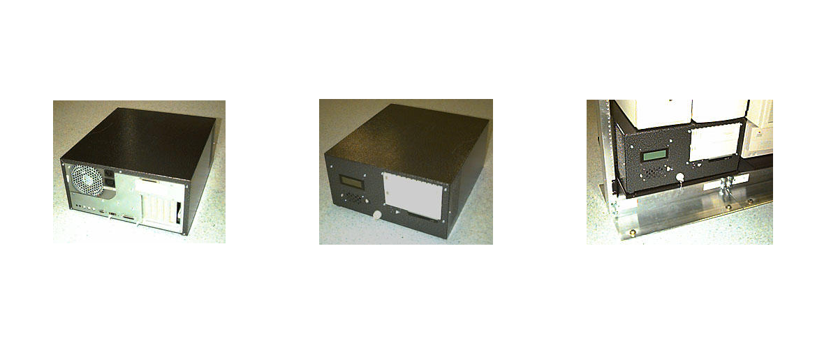
Owad continues:
]]>Code named Deep Dish, the ANS 300 is essentially an Apple Network Server without the large drive array. As a consequence, the computer is only four rack-units high. The logic board is in the bottom of the unit on a slide-out tray. There are two standard ANS removable trays on the right side of the unit’s front. The Deep Dish also has one fixed internal drive, and the floppy drive is fixed, as well. Apple also had plans to produce an external drive array for the machine, which is why there is an ultrawide SCSI port above the PCI slots.
I have like 90 minutes of time with it, but uhhhh this phone is weird.
]]>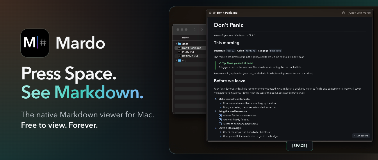
Then watch it come alive. Leave that preview open while Claude Code, Codex, or any other app rewrites the file, and every change arrives in real time, right there in Quick Look, without moving you from the line you were reading. And when a file gets enormous, Mardo doesn’t flinch. It opens a 50 GB Markdown file in about an eighth of a second and lets you jump anywhere in it instantly.
Mardo can do all this because it draws every page with its own engine, MarkEngineV3, which Floof Logic wrote from scratch for the Mac. There’s no web view anywhere inside, and it launches faster than Apple’s own text view. Nobody asked for a Markdown viewer this fast or this careful. Floof Logic built it anyway, because the files you read every day deserve it, and so do you.
Reading is free, forever, with no account. When you’re ready to write, Mardo Pro adds editing and export for a one-time $29.99, and 512 Pixels readers save 20% with code 512MARDO through November 30.
Download Mardo free, press Space on your first file, and see for yourself.
]]>But of course, they did exist, and were announced ten years ago this week. Here’s a bit from Apple Newsroom back on October 27, 2016:
Apple today introduced the thinnest and lightest MacBook Pro ever, along with a breakthrough interface that replaces the traditional row of function keys with a brilliant, Retina-quality Multi-Touch display called the Touch Bar. The new MacBook Pro features Apple’s brightest and most colorful Retina display yet, the security and convenience of Touch ID, a more responsive keyboard, a larger Force Touch trackpad and an audio system with double the dynamic range. It’s also the most powerful MacBook Pro ever, featuring sixth-generation quad-core and dual-core processors, up to 2.3 times the graphics performance over the previous generation, super-fast SSDs and up to four Thunderbolt 3 ports.
The Touch Bar places controls right at the user’s fingertips and adapts when using the system or apps like Mail, Finder, Calendar, Numbers, GarageBand, Final Cut Pro X and many more, including third-party apps. For example, the Touch Bar can show Tabs and Favorites in Safari, enable easy access to emoji in Messages, provide a simple way to edit images or scrub through videos in Photos and so much more.
(The video of this event is available on YouTube.)
The 2016 machine replaced the original run of Retina MacBook Pros, which many believed was the best Mac notebook of all time. That included Marco Arment, who wrote this in 2017:
Apple has made many great laptops, but the 15-inch Retina MacBook Pro (2012–2015) is the epitome of usefulness, elegance, practicality, and power for an overall package that still hasn’t been (and may never be) surpassed.
Introduced in 2012, less than a year after Steve Jobs died, I see it as the peak of Jobs’ vision for the Mac.
It was the debut of high-DPI Macs, starting down the long road (which we still haven’t finished) to an all-Retina lineup. And with all-SSD storage, quad-core i7 processors, and a healthy amount of RAM all standard, every configuration was fast, capable, and pleasant to use.
The Problems
The 2016 MacBook Pro was not pleasant to use. A decade later, I would lump its issues into four main categories, ranked from least bad to worst.
A Confusing Lineup
Before this announcement, Apple had the 12-inch MacBook, the non-Retina MacBook Air, and two sizes of the MacBook Pro. It was a little messy, but Apple’s biggest sin in this era was leaving the MacBook Air to die on the vine.
As part of this announcement, the company doubled down with a new entry-level model that diluted the MacBook Pro name and made the MacBook Air look even worse.
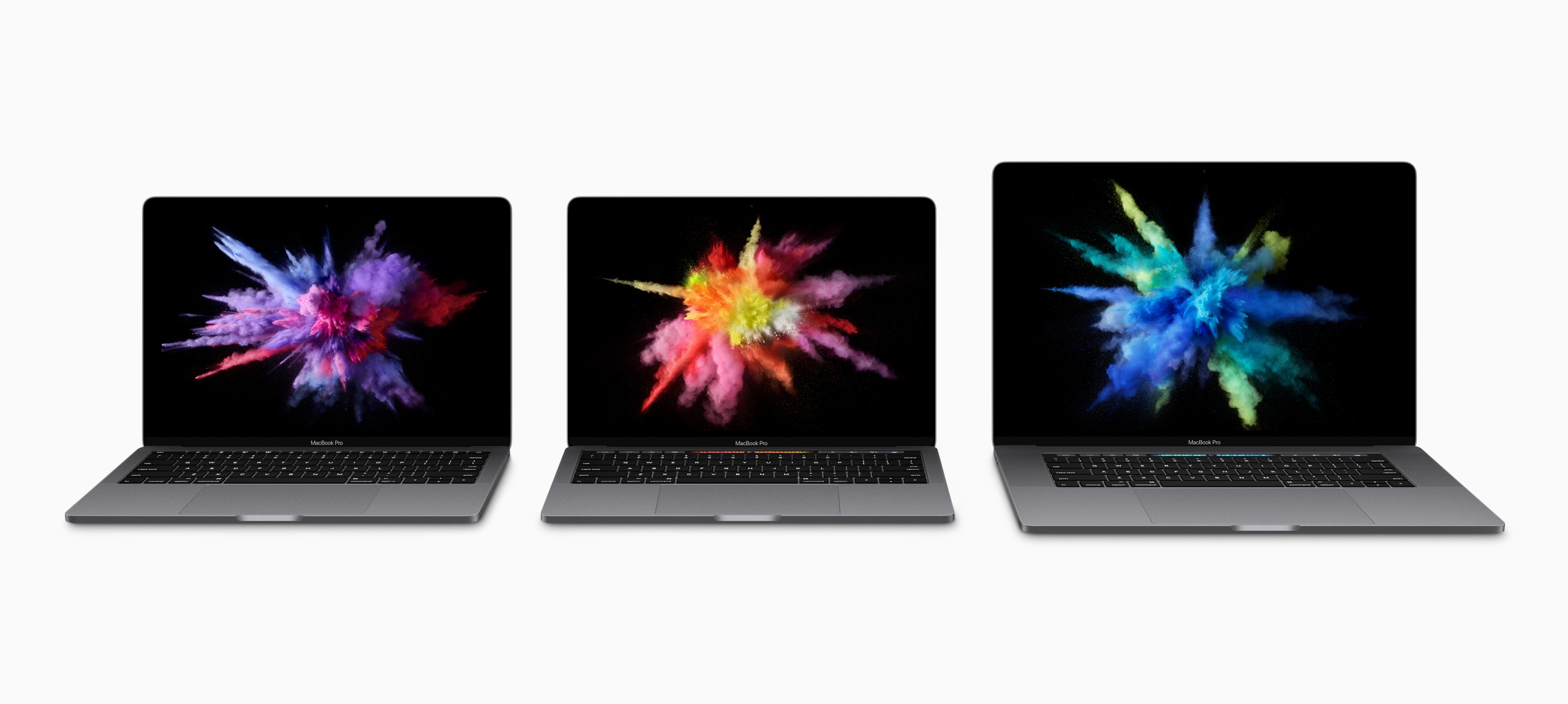
I complained about this a lot at the time, but in hindsight, it was the smallest problem created by the 2016 MacBook Pro.
The Touch Bar
When announcing OS X Lion, Steve Jobs mocked touchscreen notebooks, saying they made your arm want to fall off,1 then went on to praise Apple’s newest trackpads and their gesture support.
When introducing this new laptop, Phil Schiller doubled down, touting the Touch Bar as the perfect solution. Since it was just a screen, its UI could change to meet the moment. Dealing with email? Tap a mailbox’s name and file a message away in an instant. Editing a song in Logic? Just tap a virtual button to make a cut instead of using a keyboard shortcut. Using the perfect emoji was just a swipe away.

In many ways, this was an echo of the plastic-keyboards-are-bad argument about the original iPhone, just applied to the Mac.
In my hands-on with the machine, I wrote this about the Touch Bar:
I liked that it surfaces things in complex applications like Final Cut Pro X and Numbers, but the inconsistent usage and mode switching that has to take place to find things would need to be second nature before I considered it helpful day to day. I think there’s a ton of potential here, though, and it’s still early days of this thing.
Sadly, the Touch Bar never lived up to that potential. Some third-party developers did clever things with it, and the Control Strip allowed for customization beyond what traditional function keys could offer, but those things weren’t enough.
Many apps — including those bundled with macOS — offered wildly different experiences, and some apps ignored the Touch Bar altogether. Apple never figured it out, and the Touch Bar quickly grew stale.
That doesn’t even get into other issues, like the fact you had to take your eyes off the screen to hit the right button, or that it sometimes just froze, or that the Escape key (for a while) was locked away in software.
I know some people loved the Touch Bar, but it didn’t change the way the vast majority of people use their Macs, and it rightfully died in the move to the current design.
A Lack of Ports
Here we’re starting to run into real issues. I carried around this set of dongles for years.

USB-C and Thunderbolt are amazing, but the world wasn’t ready to go all-in. Sometimes cutting old features works out, but it did not in this case.
I think it’s very telling that the current models brought back MagSafe, HDMI, and the card reader. The arrangement is perfect, here ten years later.
The Butterfly Keyboard
The best only good part of the keyboard on these machines is that it introduced Touch ID to the Mac, something millions of people use every single day.
The tale of the Butterfly Keyboard has been told before, but in short, Apple designed a new keyboard switch for the ultra-thin MacBook, then used it across its notebook line. It was unreliable and fragile, and Apple tried to fix it with things like membranes under the keys to keep dust out.
The whole thing was miserable, and it took Apple way, way too long to replace it.
…but replace it they did!
A Partial Solution
In November 2019, something wonderful happened. Apple PR:
Apple today unveiled an all-new 16-inch MacBook Pro — the world’s best pro notebook — designed for developers, photographers, filmmakers, scientists, music producers and anyone who relies on a Mac to create their life’s best work. The all-new MacBook Pro features a brilliant 16-inch Retina Display, the latest 8-core processors, up to 64GB of memory, next-generation graphics with up to 8GB of VRAM and a new advanced thermal design, making it the most powerful MacBook Pro ever.
Featuring a new Magic Keyboard with a redesigned scissor mechanism and 1mm travel for a more satisfying key feel, the 16-inch MacBook Pro delivers the best typing experience ever in a Mac notebook. The 16-inch MacBook Pro also includes a six-speaker sound system, longer battery life, Touch Bar, Touch ID, the Force Touch trackpad and the Apple T2 Security Chip.
I picked one of these machines up, and it was pretty great. It ran cooler than my previous MacBook Pro, and the keyboard was an unbelievable improvement over the garbage fire that was the Butterfly Keyboard.
The new Magic Keyboard slowly spread across Apple’s line, with the MacBook Air getting it in March 2020, and the 13-inch MacBook Pro getting updated a couple of months later.
A Return to Sanity
That 13-inch-with-a-Touch-Bar-and-Magic-Keyboard-but-just-Thunderbolt-ports MacBook Pro survived the Apple silicon transition, receiving the M1 in November 2020, and an M2 in June 2022. By then, it was the low-end model, with much better machines as bigger siblings.
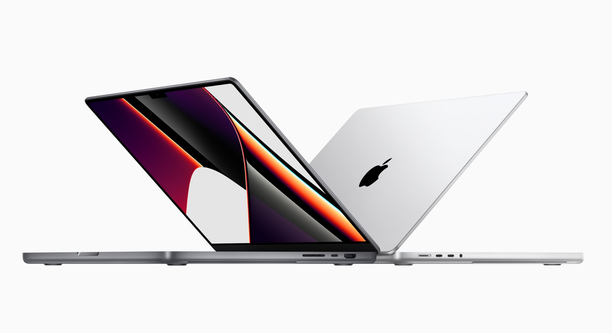
The current 14- and 16-inch MacBook Pros are incredible machines, and I believe they live up to the hype of the beloved 2012-2015 models. They have the right IO, a great keyboard, amazing battery life, and are mind-blowingly powerful. My current M4 Max 14-inch is by far the best laptop I have ever owned, even if macOS still doesn’t really know how to handle the stupid notch.
In hindsight, it’s hard to believe the same company that shipped the 2016 class of machines made the current crop.
What Comes Next
If rumors are to be believed, we are on the precipice of a new generation of MacBook Pro that will usher in the Mac’s touchscreen era, with new OLED displays, updated chassis, and even more powerful SoCs.
I am extremely curious what it will be like to touch macOS, but this article is about the hardware. On that front, I expect Apple will do the right thing by the MacBook Pro. MagSafe is here to stay, and I bet the other ports are as well. Eyeballing the side of my machine, there’s a little room to be thinner without needing to remove the HDMI port or SD card reader.
The company’s hardware chief is its new CEO, and it seems that his old department has been firing on all cylinders for a long time. I’m excited to see what they have cooked up for the next MacBook Pro.
]]>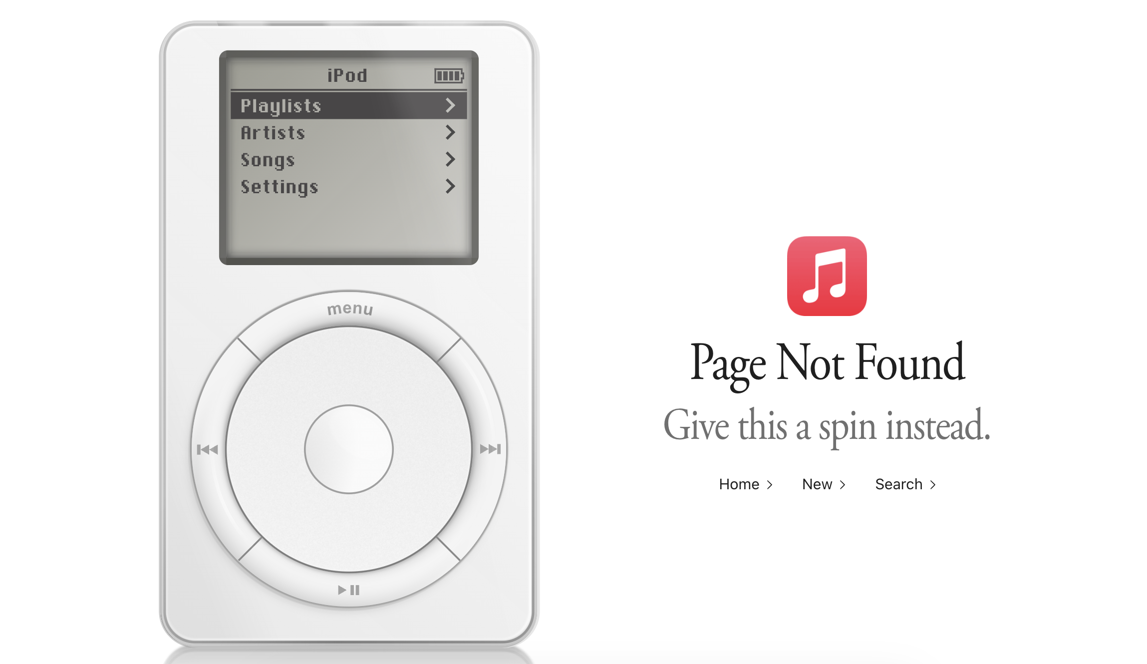
In researching the Designed in California series, I was struck by just how quickly the iPod’s importance was overshadowed by the iPhone. There are barely more than five years between the launch of the iPod and the launch of the iPhone. While both products took time to grow into their markets, I think it’s still the case that the true “iPod era” was only a handful of years long, and it’s been entirely overshadowed by the product that came after it.
That’s a shame, in a way, because I think people who didn’t live through this era don’t understand just what a hit the iPod was. It completely changed Apple’s fortunes, rehabbed its brand identity, gave people reasons to go into Apple’s relatively new retail stores for the first time, and taught Apple lessons that it needed to learn before it could build a smartphone. (The iPhone’s hardware was largely built by the iPod team, even if the software came from the Mac.)
Don’t miss his article for Tom’s Guide, either.
]]>While I was learning to build for the Duo, I wanted to make an app that made sense in ALL the different poses. So of course I made a weather app! After a 10-year hiatus, Check the Weather is back, with a delightful new design that’s as flexible as the weather is changeable.
I’m a big weather radar nerd and wanted an app that put radar front and center, while still giving quick access to all essential info.
Matthew Skiles’ new icon is awesome, and Rafa Conde absolutely killed it on the design side. It looks great on boring old slab iPhones and really great on the Duo:
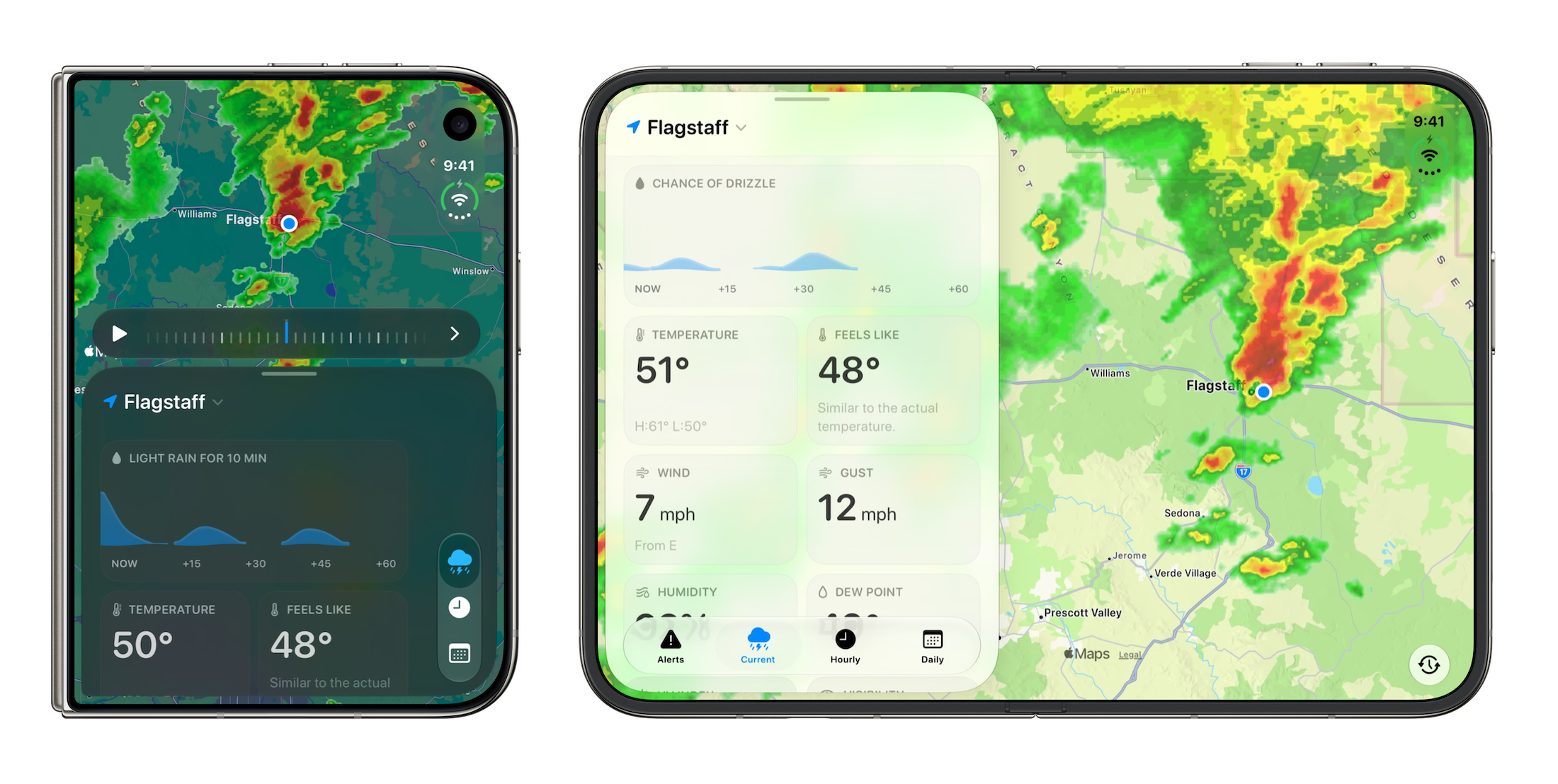
Getting this app together has been a blast, as we got to rethink and rebuild it from the ground up. It’s wild that I reviewed the first version nearly 14 years ago and got to work on its new iteration. I would encourage you to go check it out in the App Store. It’s got a free 7-day trial, then it’s $1.99/mo or $19.99/yr.
]]>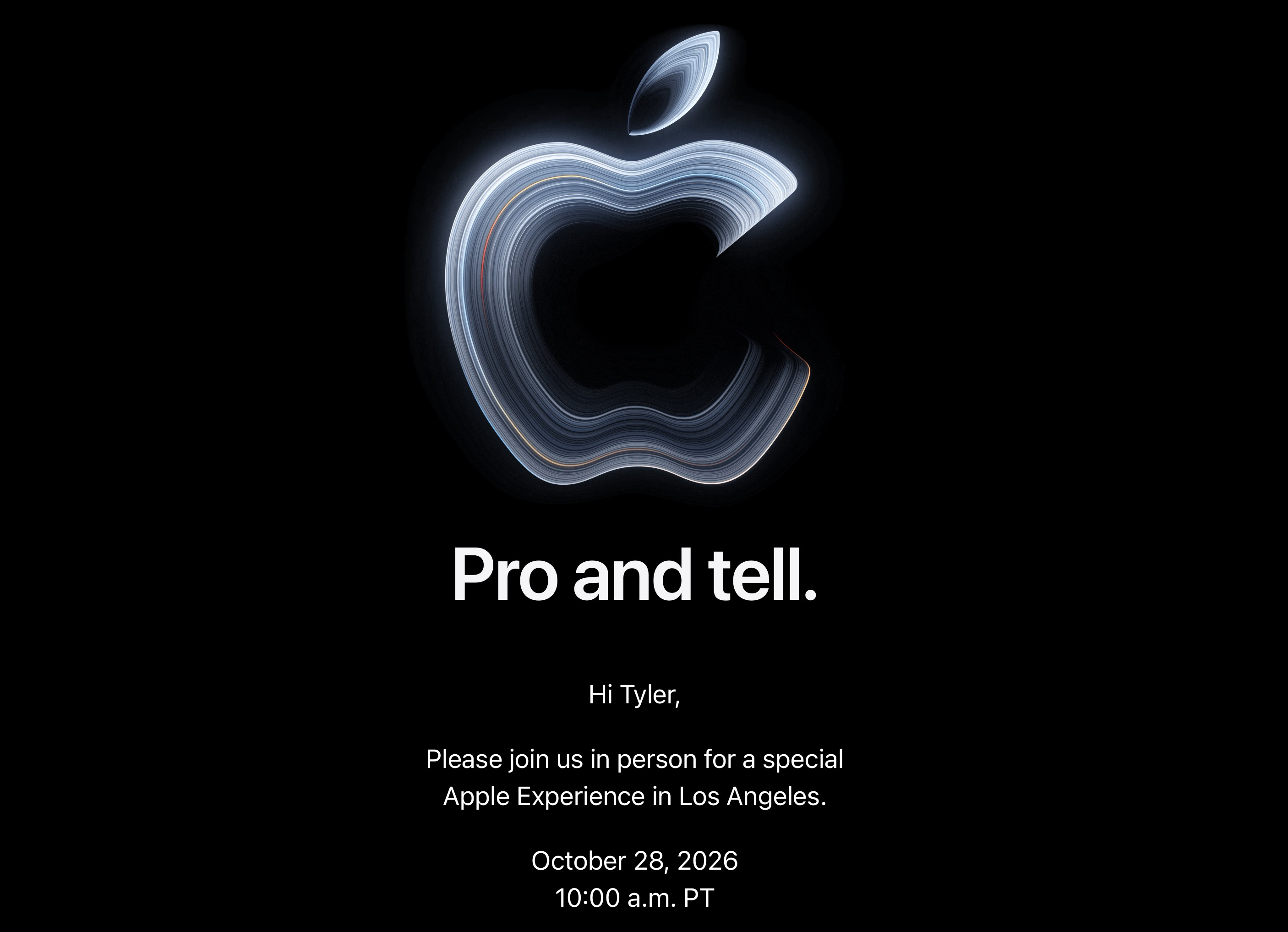
I think the MacBook Pro is about to enter its touchscreen era.
]]>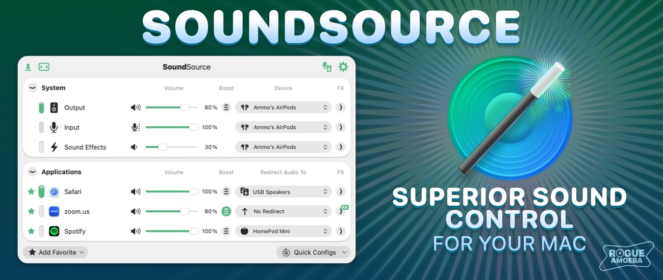
It starts with volume controls for each and every app on your Mac, all in one place: your menu bar. Turn down noisy websites without affecting your music, or boost a quiet video call past the usual maximum.
SoundSource does much more than just volume, though. Use it to send any app’s audio to a different device, so your music plays through your desk speakers while your calls stay in your headphones. Built-in effects like Magic Boost and Headphone EQ bring better sound to the tiniest speakers and your favorite headphones, and experts can even use it to apply powerful Audio Unit plugins to any app.
Once you’ve used SoundSource, it’s hard to imagine your Mac without it. Try it free before you buy. And, as a 512 Pixels reader, you can save 20% on SoundSource with discount code 512SOUND in Rogue Amoeba’s online store through the end of the month.
My thanks to Rogue Amoeba for sponsoring 512 Pixels, and for more than two decades of great Mac audio software.
]]>]]>Apple Store employees told MacRumors that they have been advised that there will likely be no iPhone Duo stock available for walk-in purchases on launch day. Staff have been instructed to discourage customers without pre-orders from coming in expecting to buy the device, warning that they will be disappointed.
Apple’s online store tells customers to check back on Saturday, October 24 for pickup availability. Pickup reservations were briefly available when pre-orders opened before the option was disabled.
The October 24 message does not guarantee stock will be available that day, and it remains unclear how firm the warning shared with employees is and whether it applies worldwide.